client
Tô Gia
year
2022
Sector
Real Estate
Scope
Overview
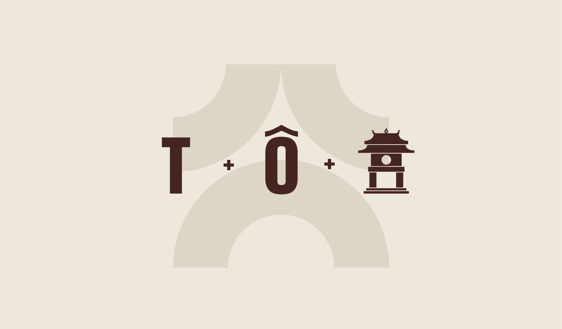
Tô Gia is a Hanoi-based real estate investment company dedicated to bringing Hanoi cultural elements as a means to prosper communities. Our challenge — is to bring the thousand-year Hanoi culture to life across story and visuals. This partnership aims to establish a multi-phase project that defines the core branding identity of Tô Gia - a family-owned real estate group - and explore both strategic and design approaches to advance the company's brand ecosystem further.
Challenges
Goals
While most companies rely on great branding to be successful in today’s digital world, branding for real estate is particularly important. Their customer are dealing with one of the most important investments they will ever make, and one of the biggest purchases or sales of their lives.
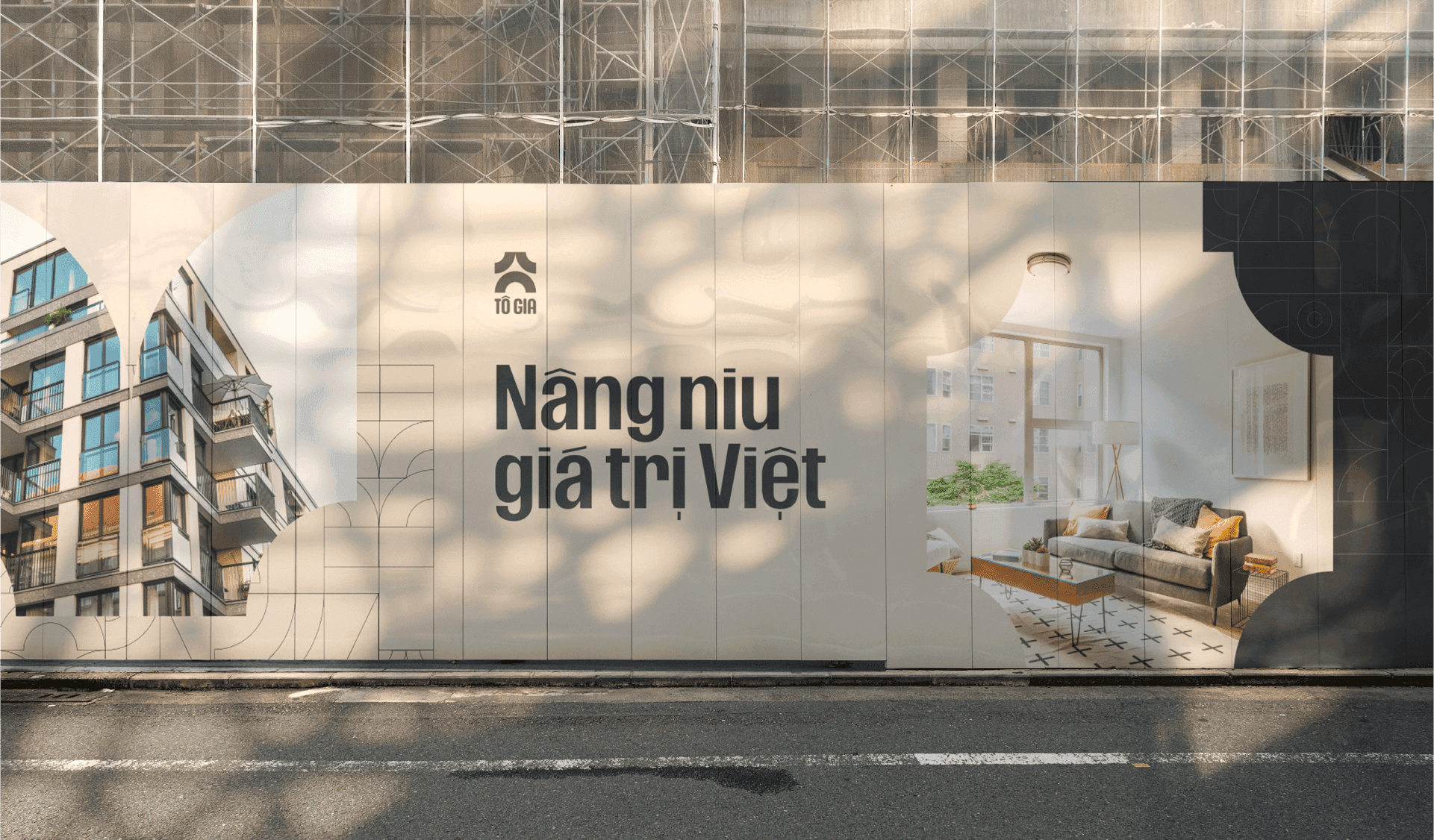
A robust branding system can give Tô Gia's clients the peace of mind they need, make them distinctive, establish trustworthiness and efficiently present the company's mission to strengthen the Viet cultural identity in each home they make.
Visual Concepts
Our Approach
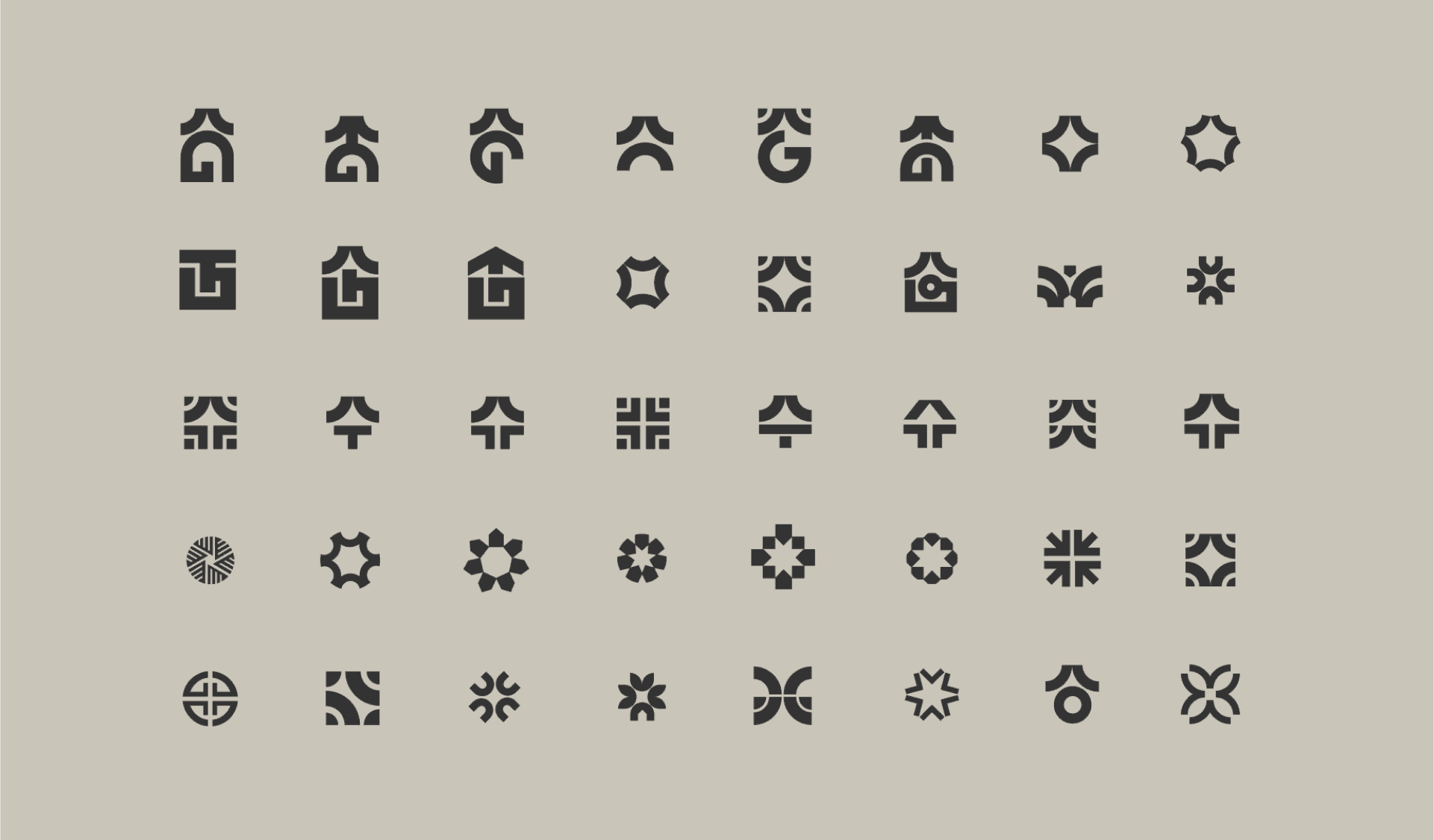
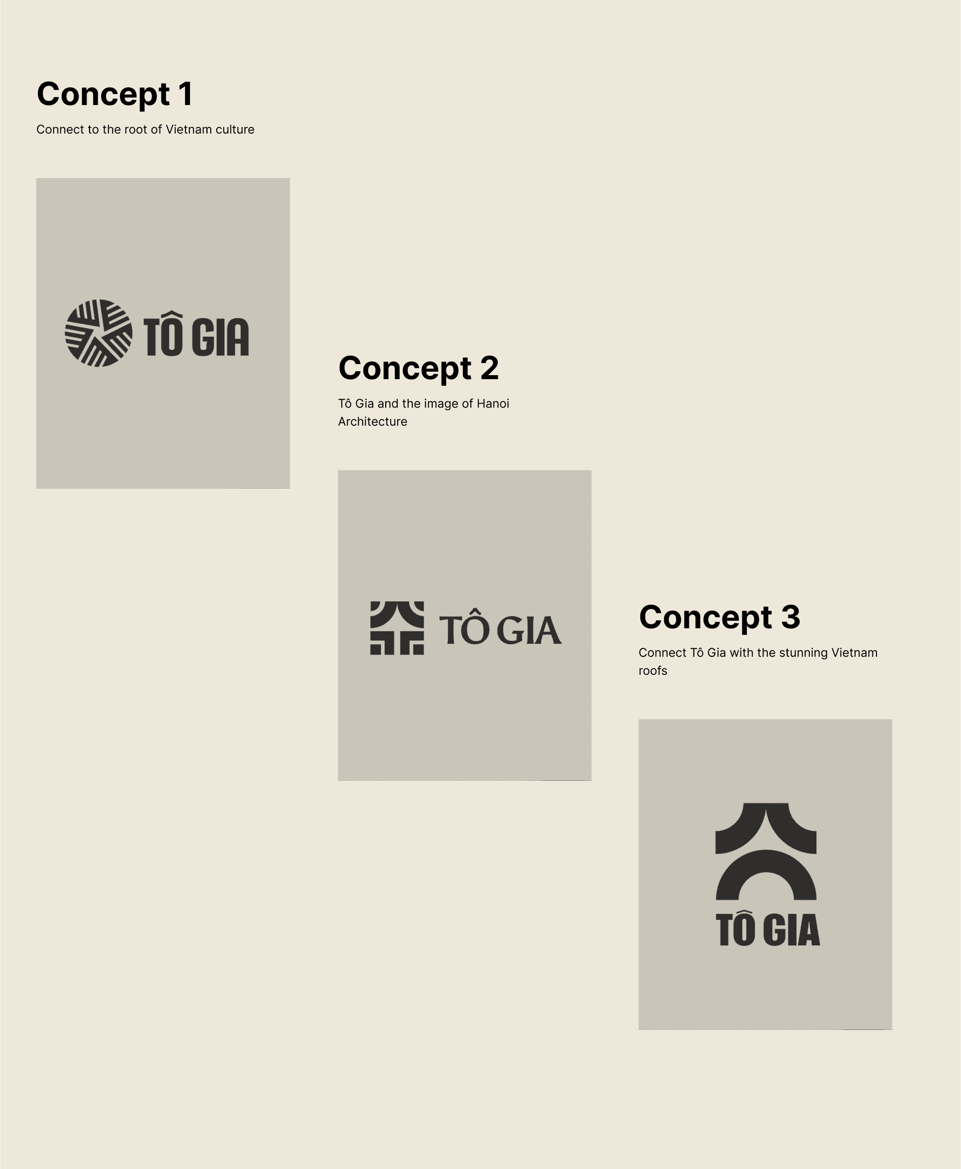
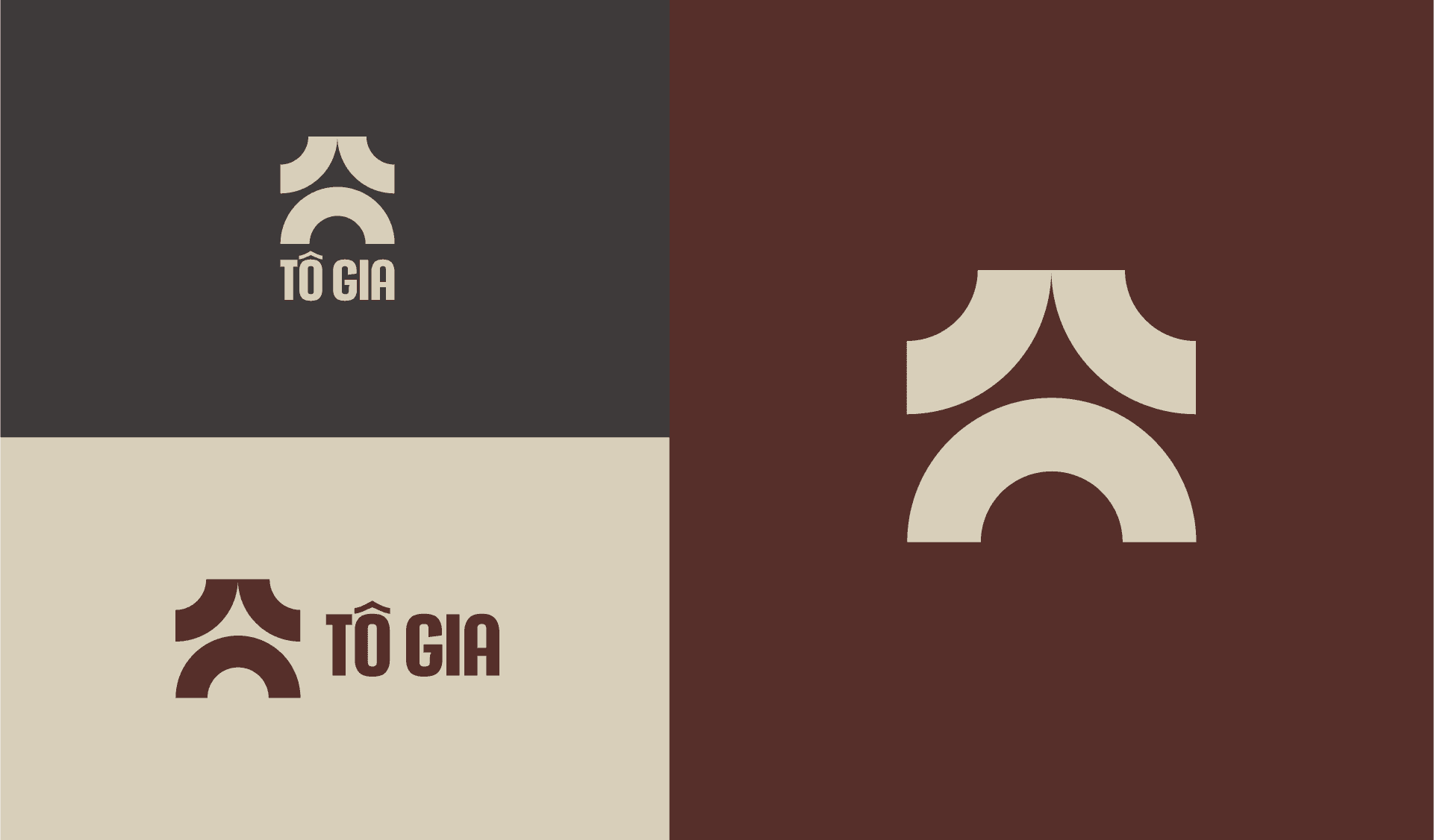
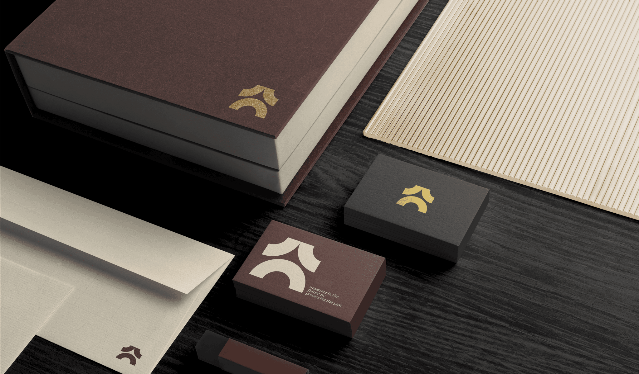
After an in-depth investigation into the brand of To Gia, we pinpointed certain qualities we wanted to embody in our design. Through several sketches and iterations, we were able to develop a range of potential logos that reflected these qualities. Through careful deliberation, we decided on the top three logos that portrayed a concept that would be cohesive with their brand image and create a strong visual representation to connect with their target customers.


Color Palette
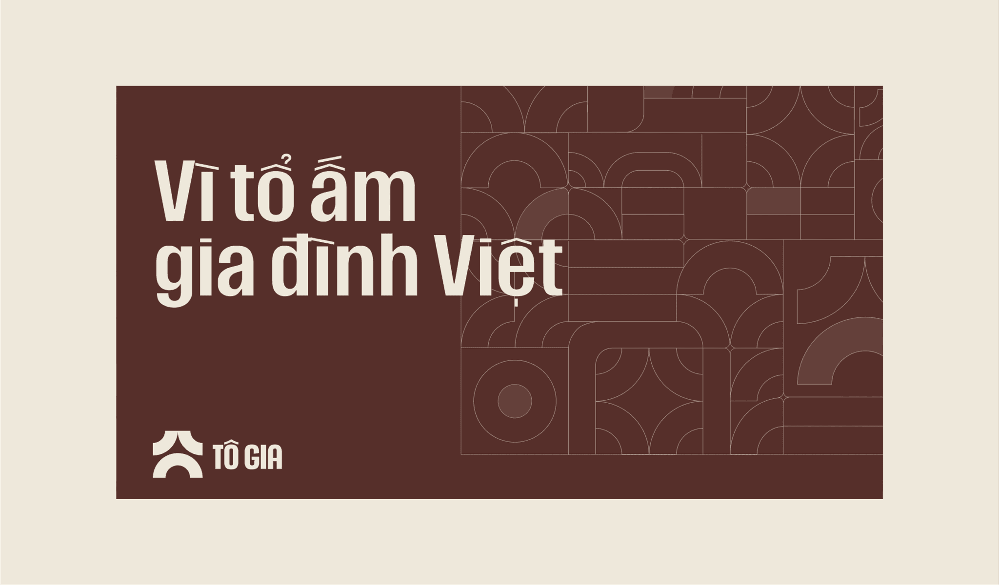
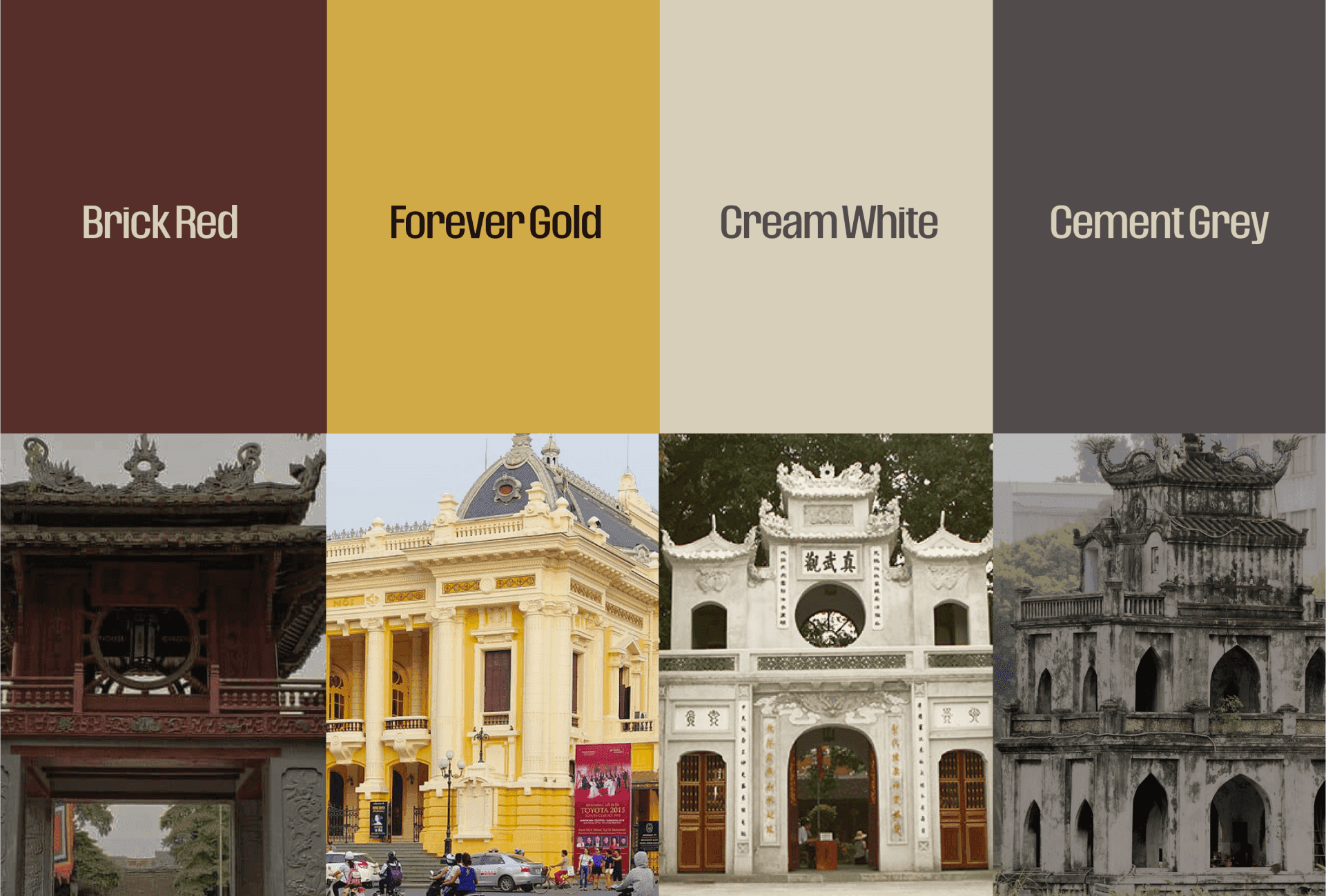
The colors selected for the brand were carefully chosen to reflect the cultural essence of Hanoi. The color palette drew inspiration from the hues used in ancient architecture, capturing the timeless elegance of the city. The brand's visual identity was designed to be striking yet subtle, creating a sense of sophistication and modernity while maintaining a strong connection to the city's cultural roots.
Typography System
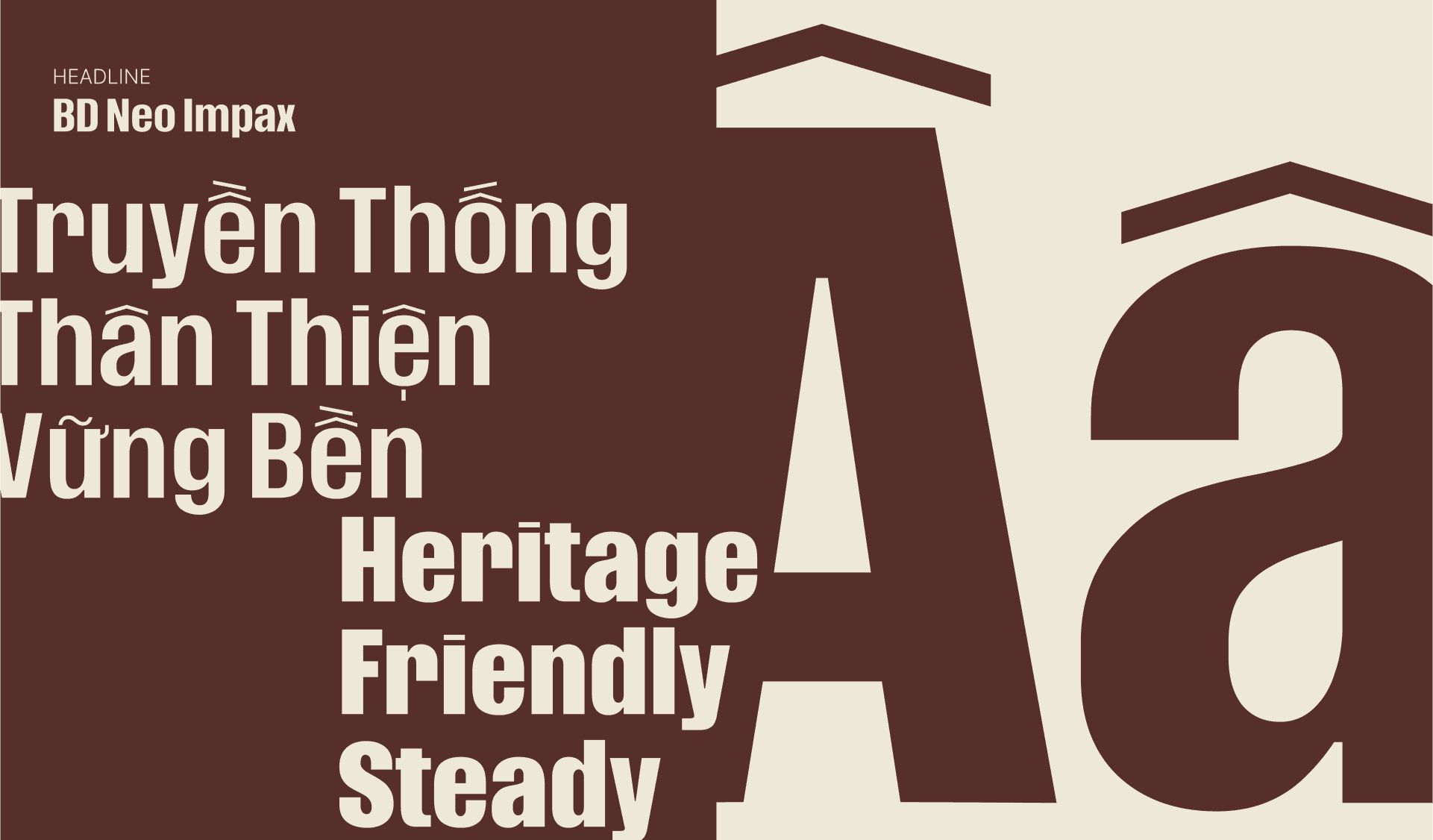
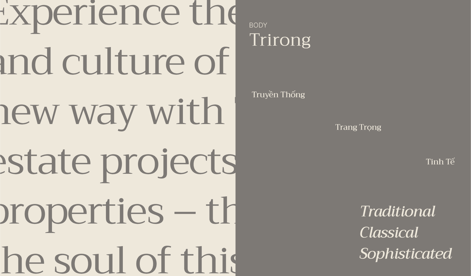
BD Neo Impax by Harry Dinh is chosen as the primary typefaces for To Gia's branding identity for its solid, friendly and traditional look. Its simplicity and legibility helps enhance To Gia's core messages.
While Trirong Family by Cadson Demak is chosen as the body typeface for its sophisticated forms and classical sensibilities. Its legibility helps express To Gia’s story and brand messaging.
Visual Motif
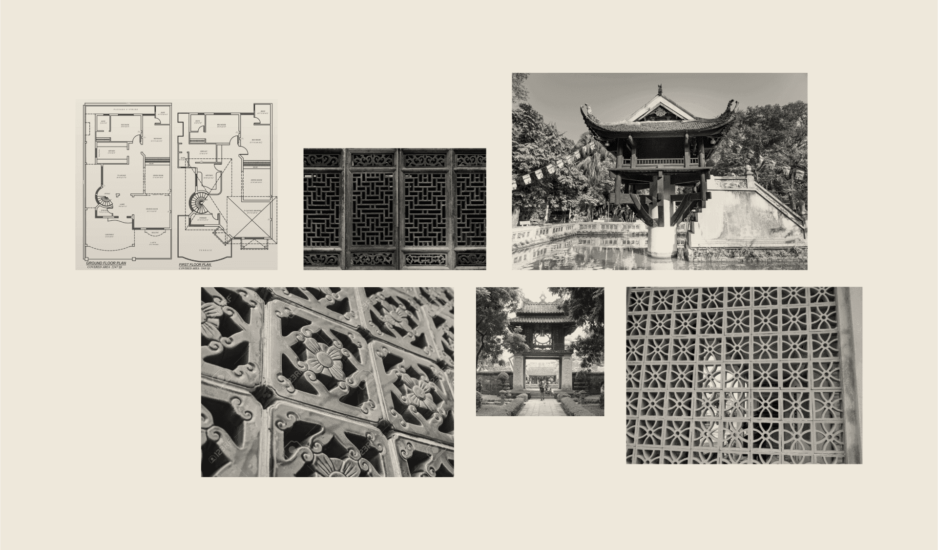
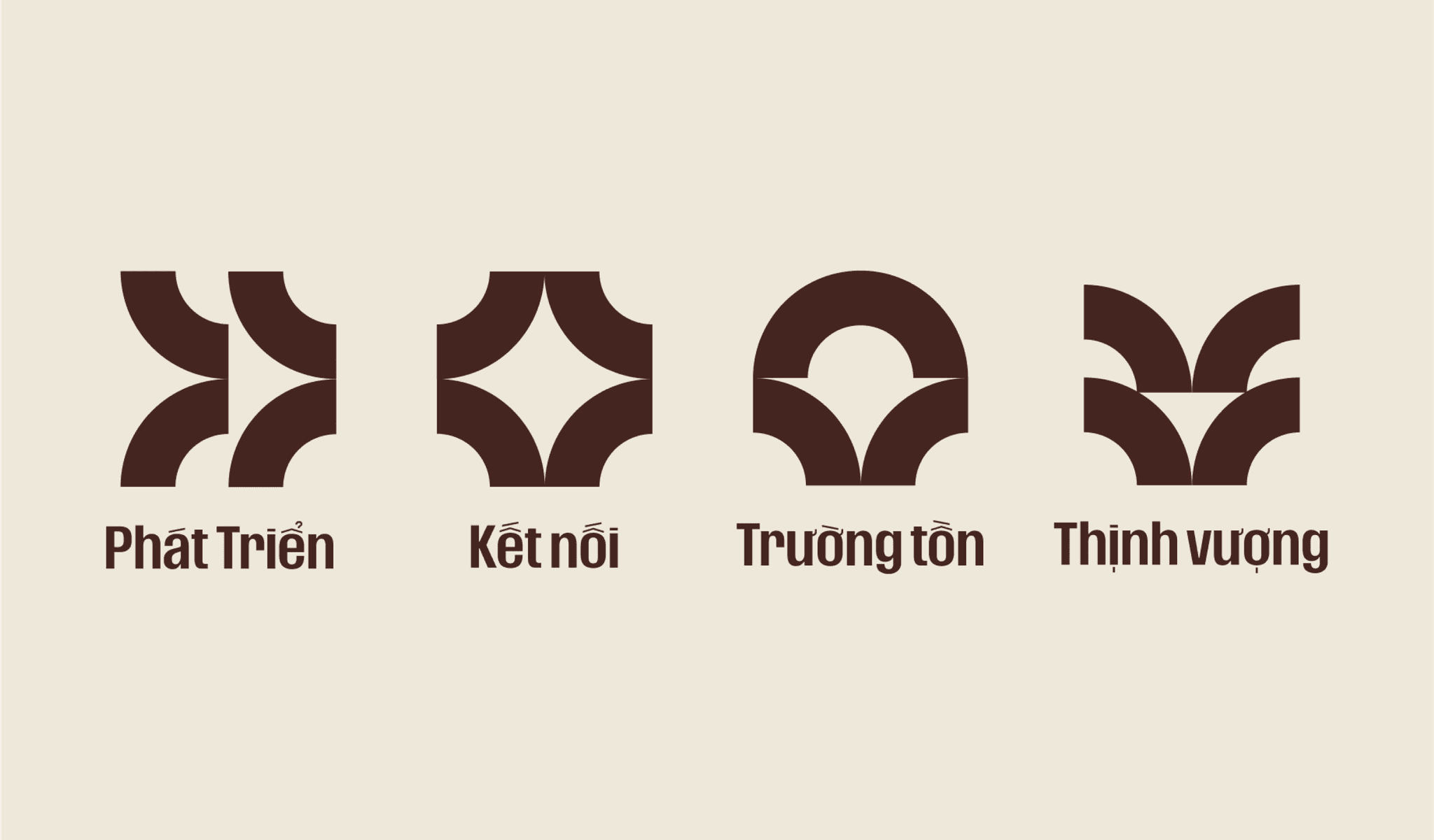
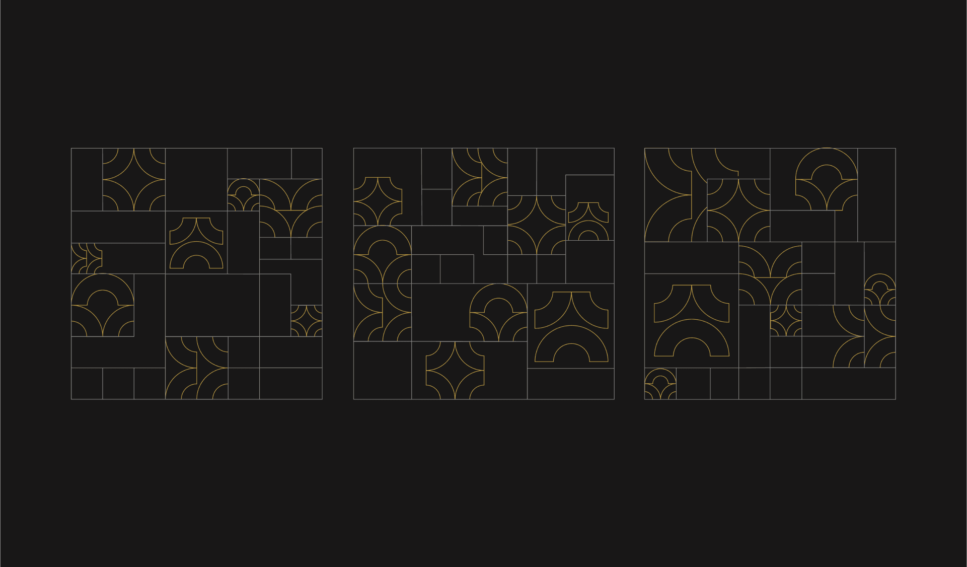
Using geometric line art graphics inspired by window frames and traditional Vietnamese brick patterns, we create a graphic system that represents the core values of the brand.
Brand Application
