client
Green&Flow
year
2024
Sector
Tourism & Eco-product
Scope
Overview
Green&Flow, supported by the Dong Long Fund, embodies the future of community-based eco-tourism and sustainable agriculture. Collective Design Agency proudly contributed to shaping their brand identity, highlighting our mission to promote sustainable growth and celebrate the beauty of Vietnamese culture. This initiative not only uplifts livelihoods in rural areas but also deepens connections to the natural world, local cultures, and communities.
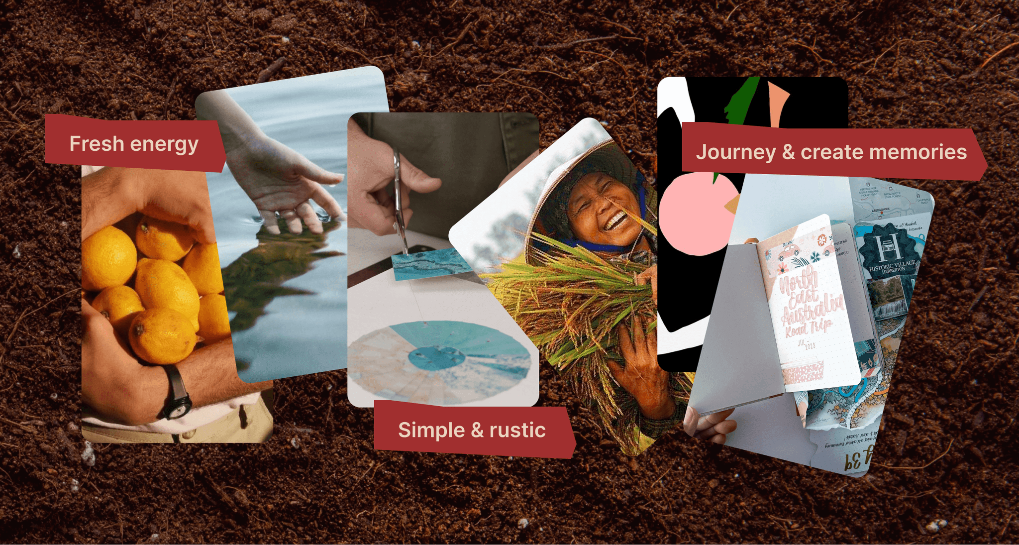
Moodboard for Green&Flow inspired by agriculture
Goals
The primary goal was to develop a brand identity that resonates deeply with both local and international audiences, encouraging them to engage with eco-tourism and sustainable agricultural practices. The branding needed to capture the essence of the natural, pure, and authentic experiences that Green & Flow provides, while also being versatile enough for diverse applications.
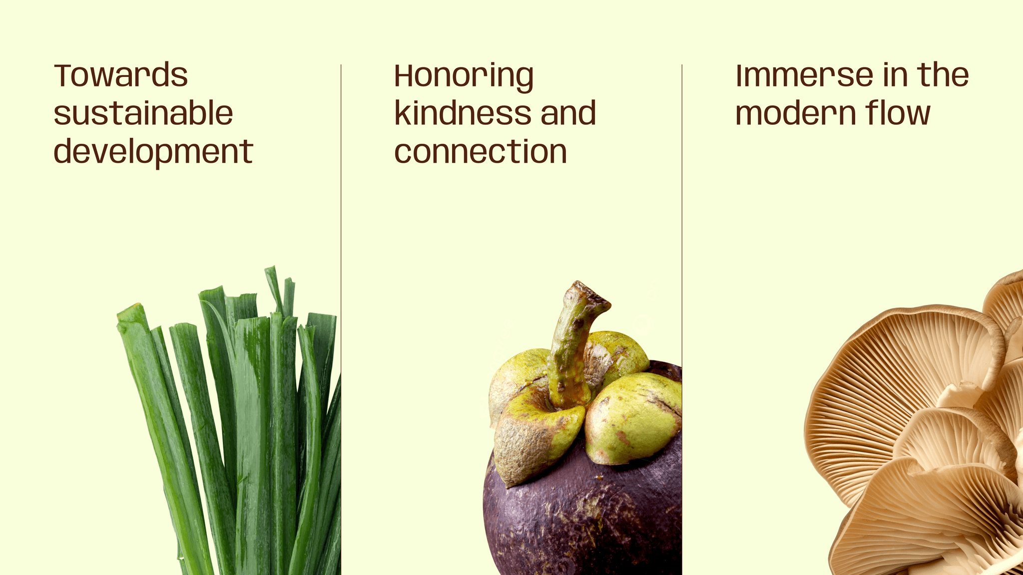
Inspiration behind Green&Flow's brand design
Memories of the Journey
Our first concept captures the essence of travel through the nostalgia of cherished memories, emphasizing authentic experiences and sincere local life. It features a papercut motif with vintage colors and highlighted handwritten elements, embodying the rough and genuine interactions that define memorable journeys.
Concept 1: Memories of the Journey
Natural Flow
The second concept is themed around 'Natural Flow' - from our heritage in the past to an eco-friendly future where everyone contributes to enriching nature. This concept uses dynamic colors to mirror the energy and movement inherent in this flow, suggesting a vibrant, ongoing journey towards sustainability. Textures borrowed from nature are stylized in a contrasting manner, emphasizing the interaction between the old and the new, and the role of each individual in fostering a healthier planet.
Concept 2: Natural Flow by CDA for Green&Flow
Final Concept
After careful deliberation and creative rounds with Green & Flow, we decided to merge the strengths of both initial concepts to forge a unified brand identity. This integration combines the dynamic spirit of Concept 2 with the traditional visual patterns from Concept 1.
This cohesive approach allows us to depict a brand that is both forward-looking and deeply rooted in tradition, reflecting a commitment to sustainability and community engagement.
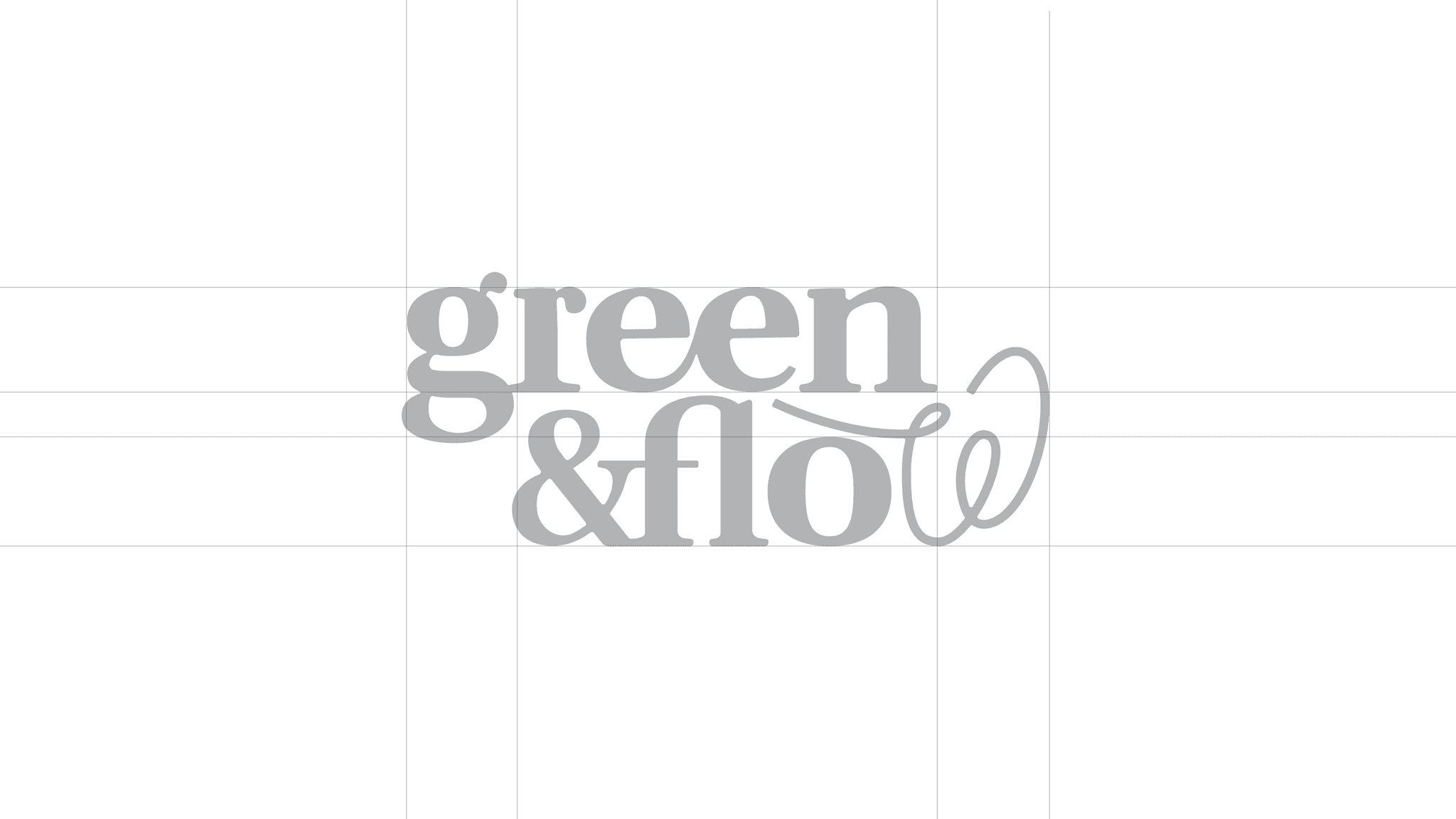
Green&Flow Logo: Gateway to Cultural and Sustainable Development
Green & Flow serves as a gateway to unique cultural journeys through authentic agricultural experiences, enhancing sustainable development and deep connections with nature, culture, and inner peace. The logo combines a stable serif font, representing tradition and reliability, with a freely styled "w" that symbolizes growth and the seamless connection between humans and nature. This design reflects the brand’s commitment to sustainable, community-centered eco-tourism.
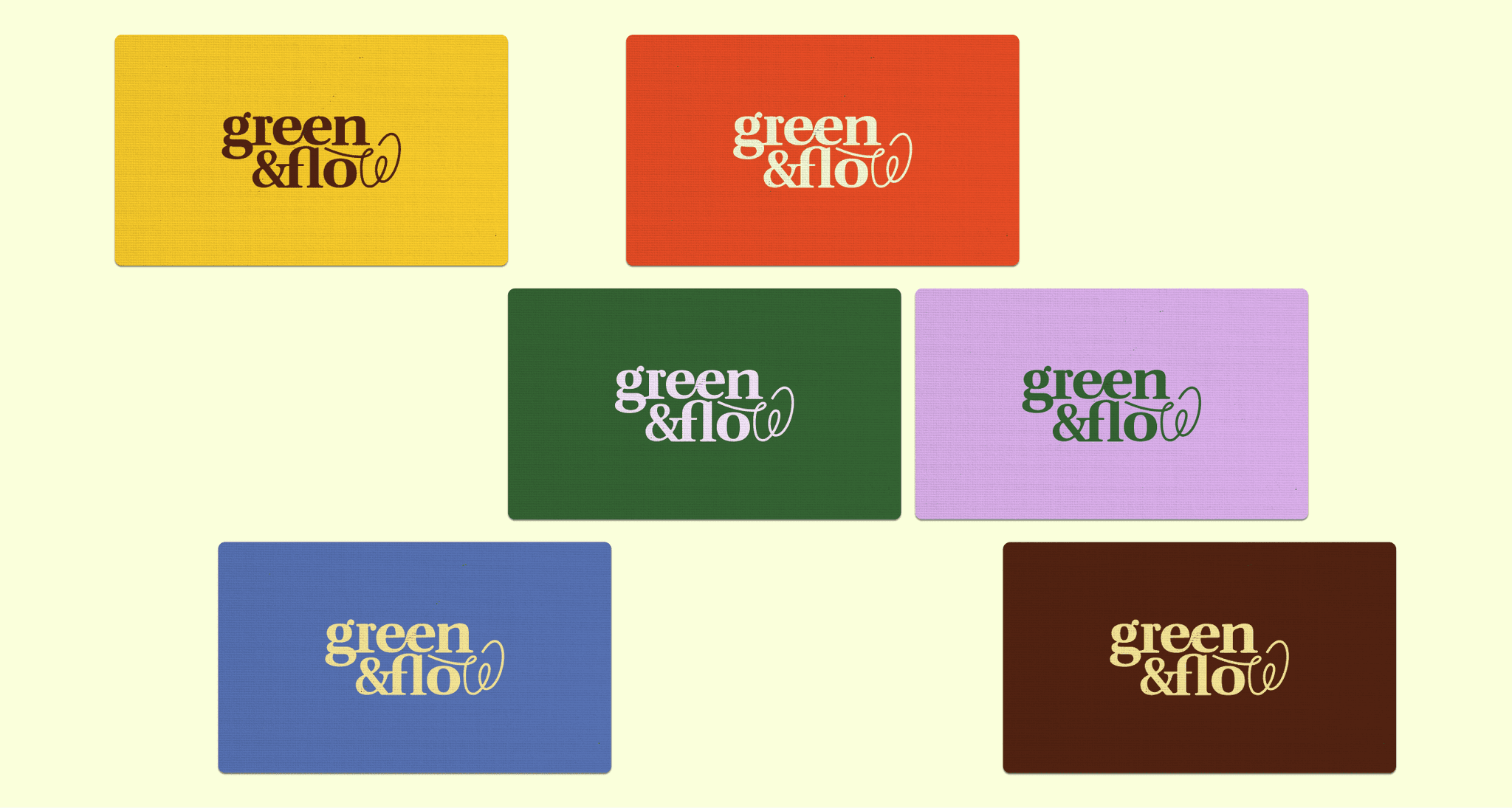
Green&Flow logo variations based on the final concept
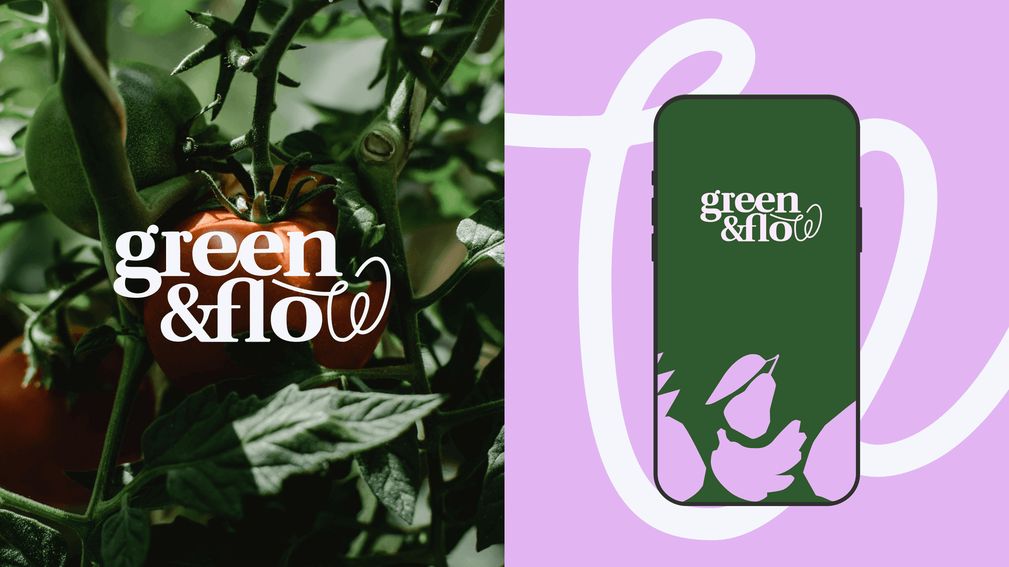
Green&Flow logo variations based on the final concept
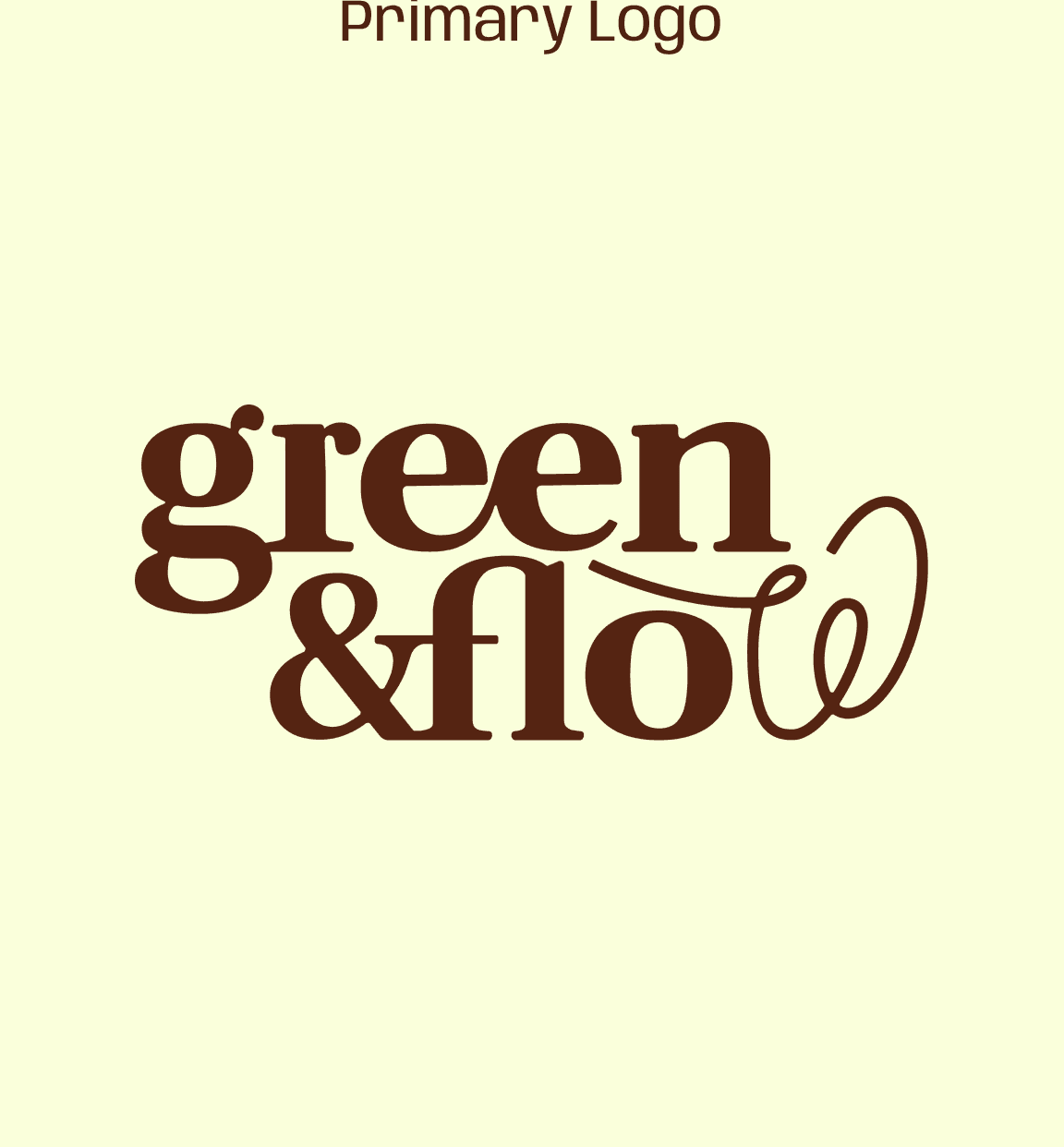
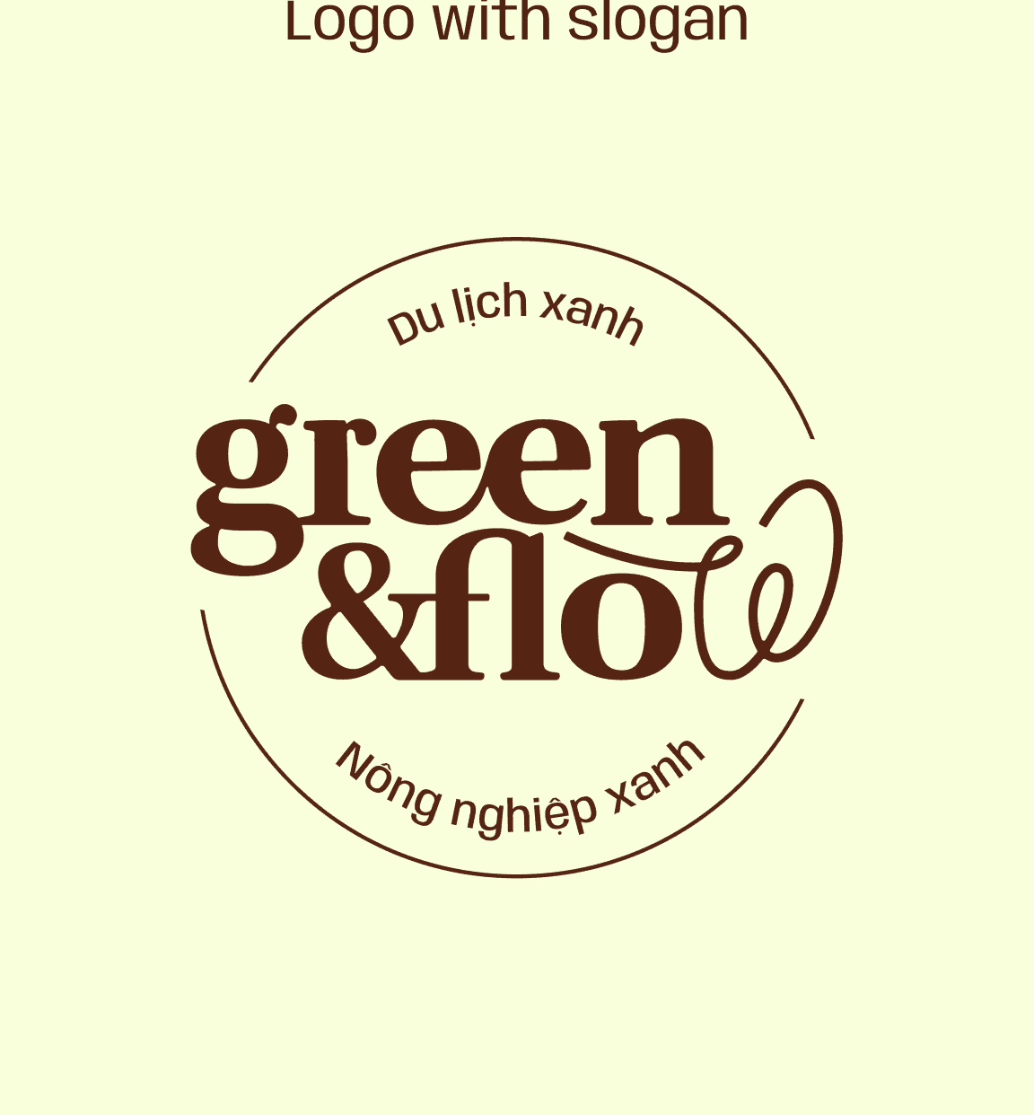
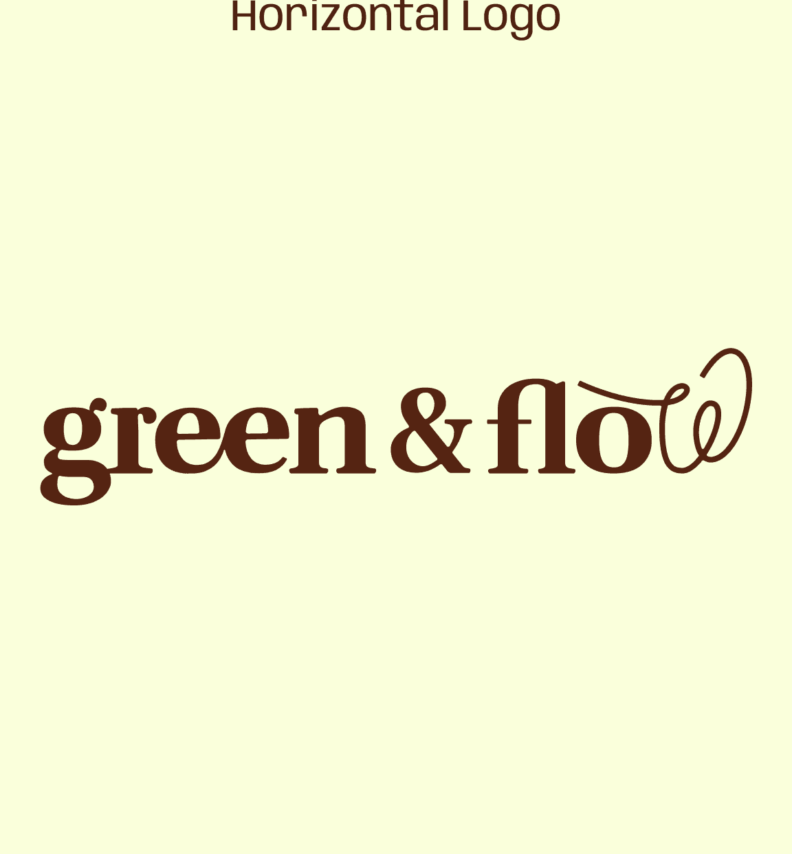
Green&Flow logo variations based on the final concept
color system
The color palette of Green & Flow embraces modernity and vitality, combining deep greens and vibrant earth tones that reflect the youthful energy of Vietnam's natural landscapes. These colors are chosen to inspire dynamism and a fresh connection with nature, positioning the brand as forward-thinking and innovative in its approach to eco-tourism.
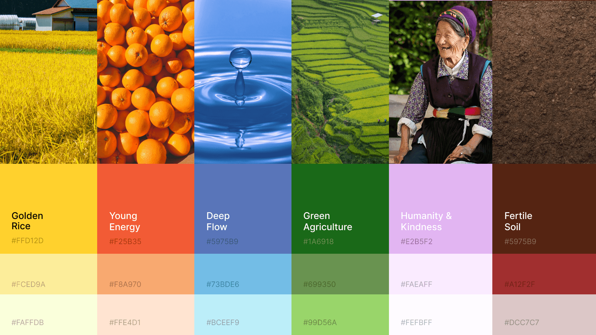
Green&Flow color system inspired by Vietnam's natural landscapes
typography system
Branding typography system of Green&Flow
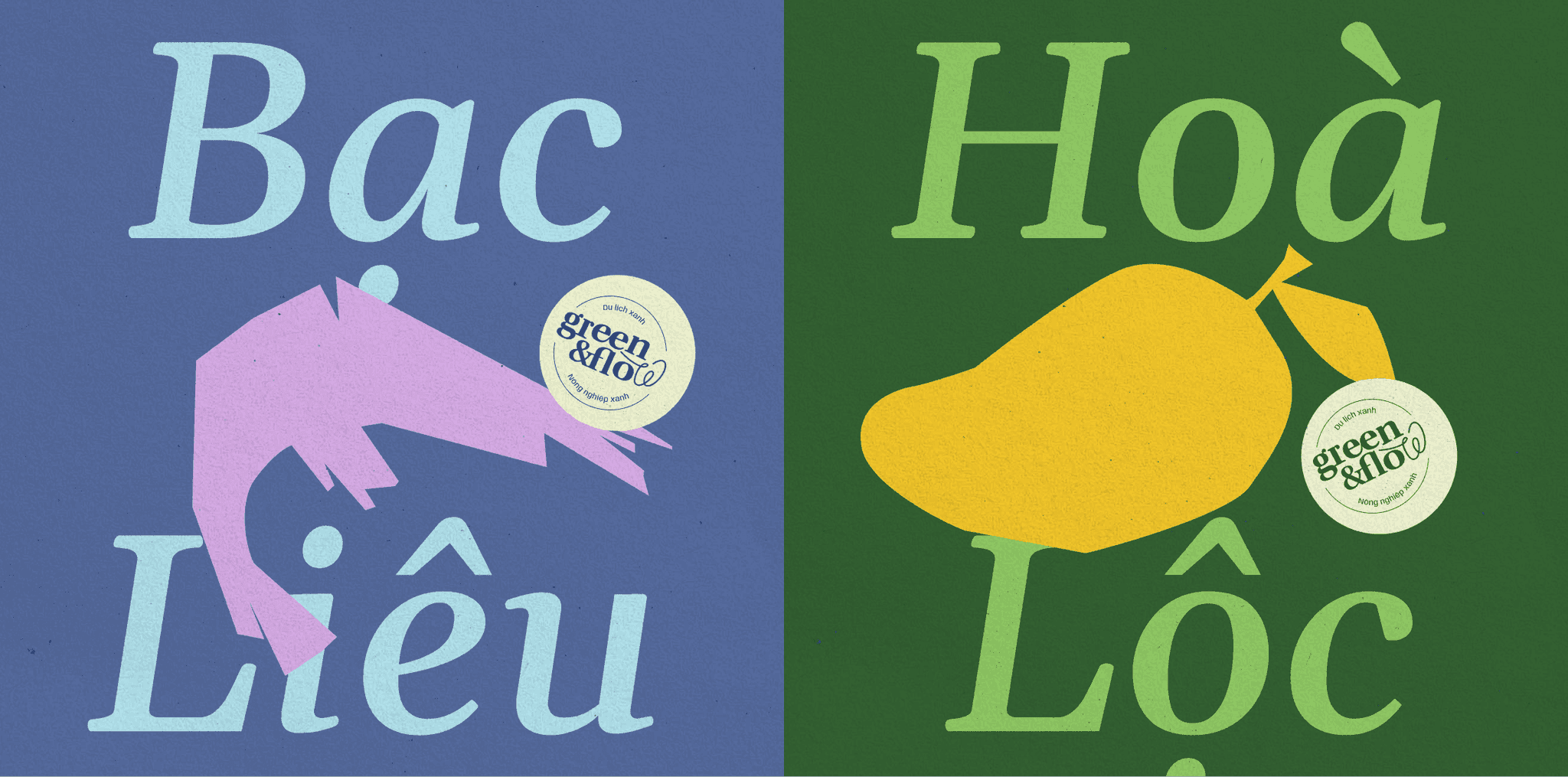
Branding typography system of Green&Flow
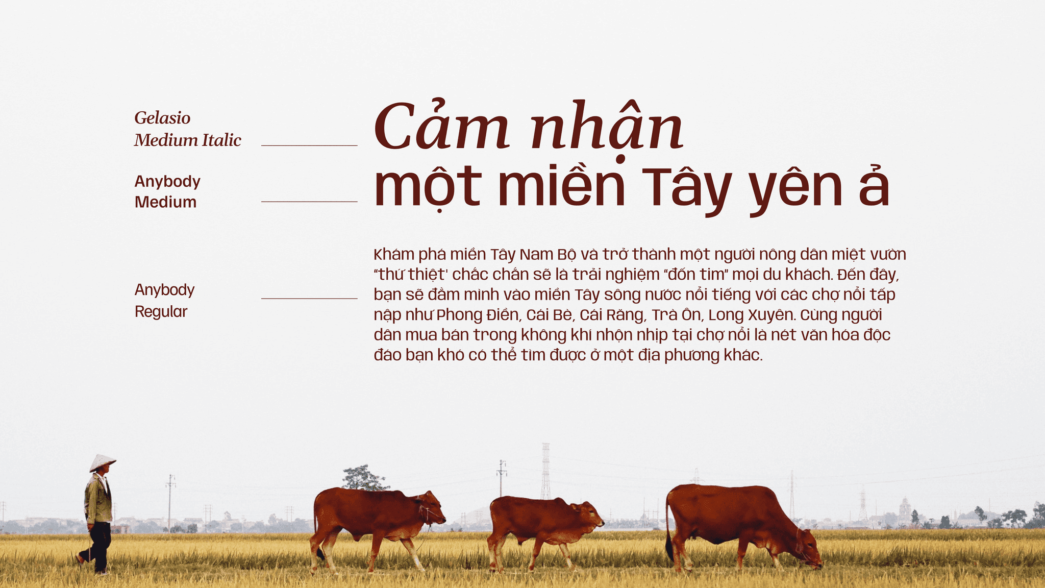
Branding typography system of Green&Flow
visual motif
Motif 1: Illustration
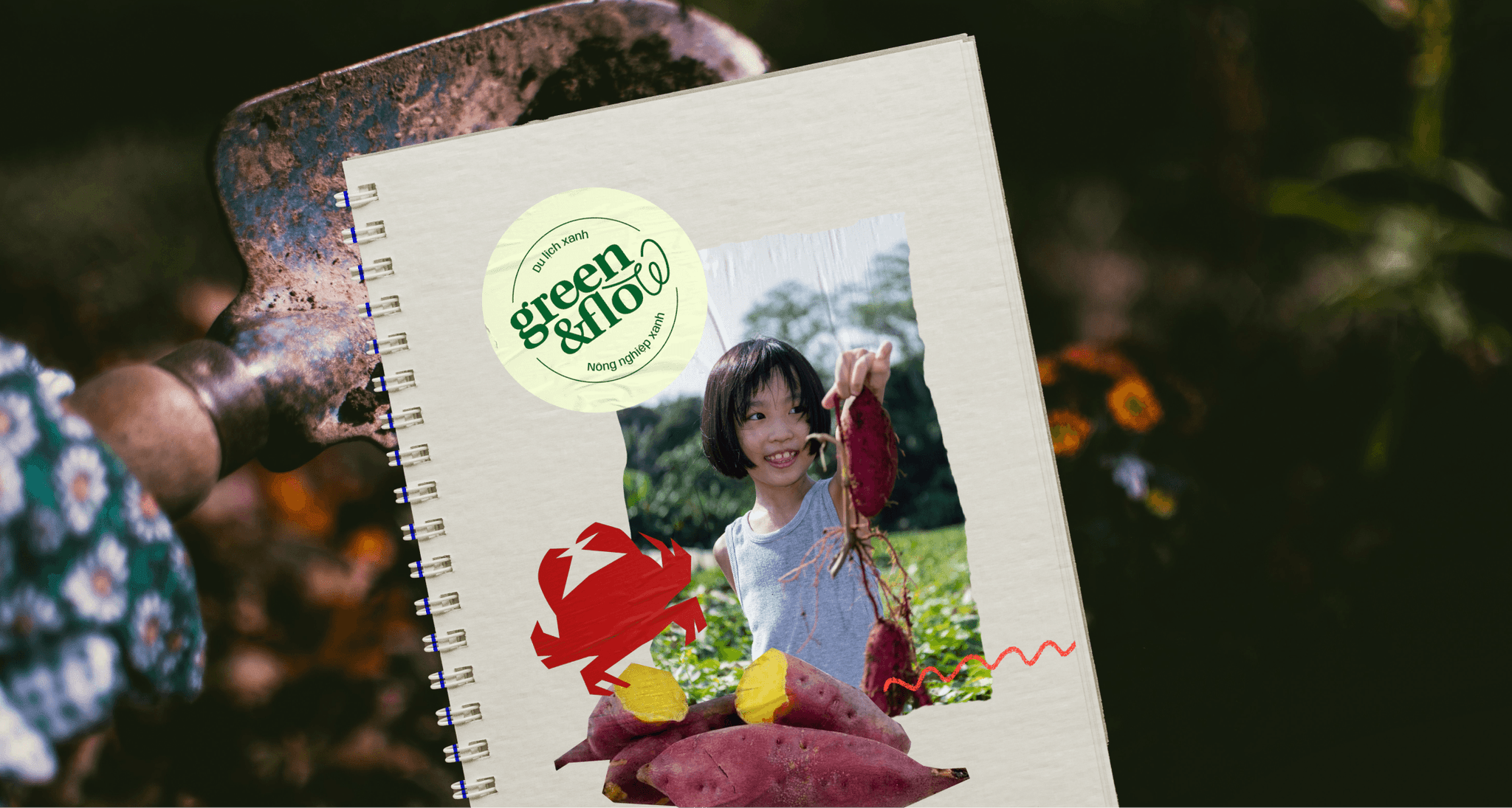
The visual system for Green & Flow features a unique "papercut" style, crafting rough, natural shapes inspired by rice grains and fruits, symbolizing rural life and natural bounty. These elements are complemented by flowing curves that highlight connections between people, nature, and life cycles. This style vividly embodies the brand’s commitment to community-centered eco-tourism and sustainable growth.
Green&Flow visual motif inspired by papercut style
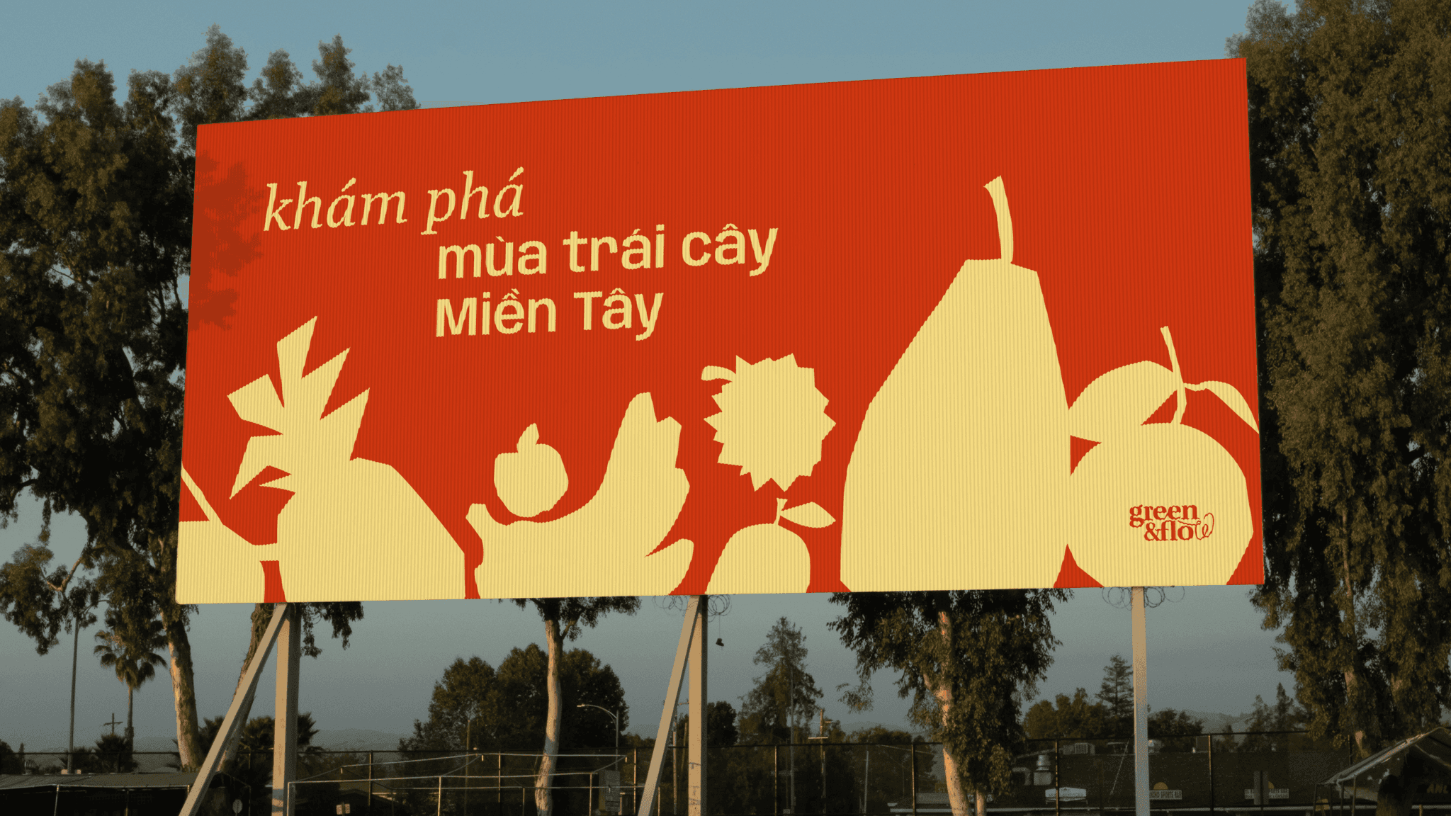
Green&Flow visual motif inspired by papercut style
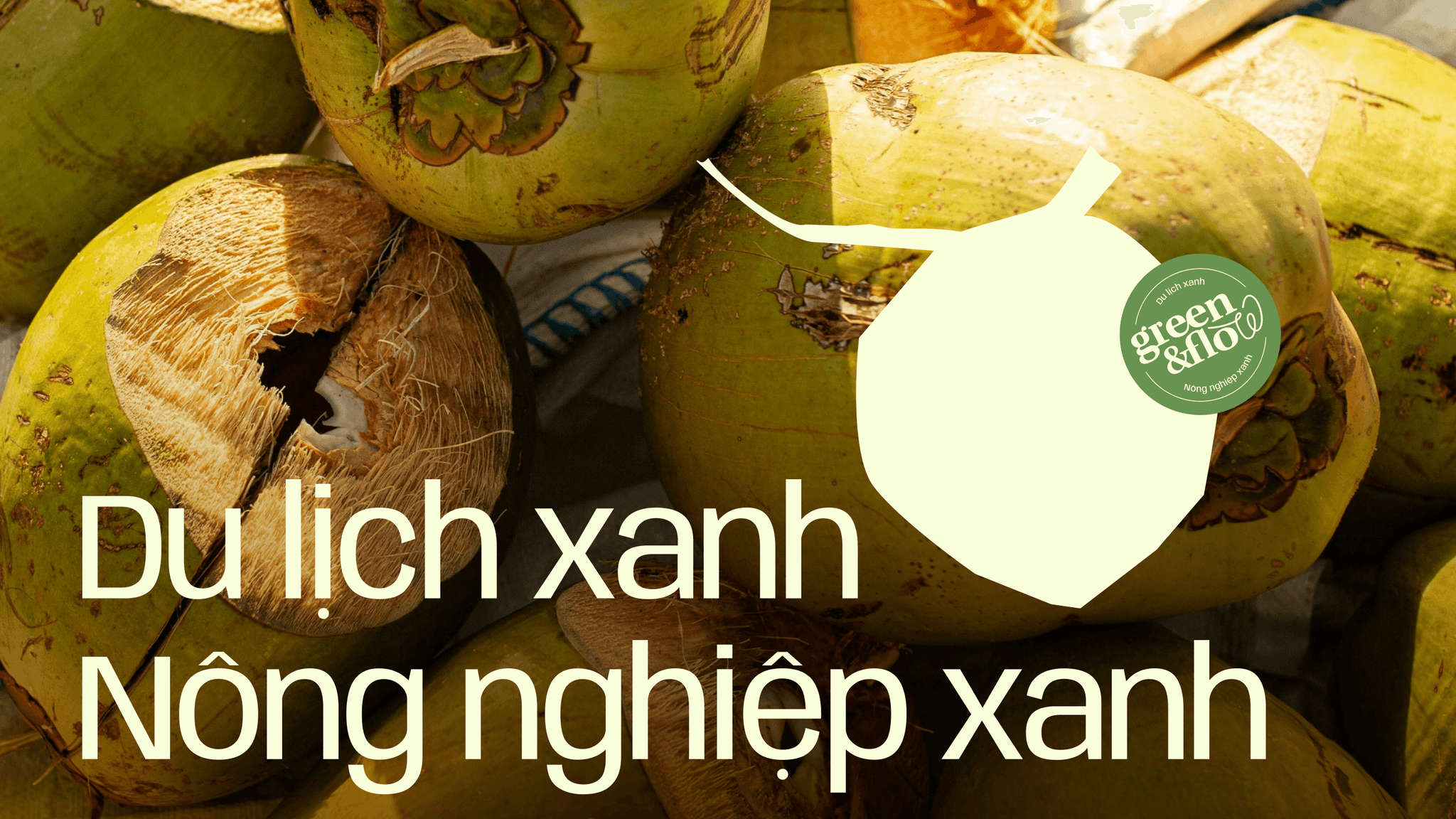
Green&Flow visual motif inspired by papercut style
Papercut motif style with natural fruit shapes
Motif 2: Paper Tear
The Paper Tear style is strategically used to frame the design elements within the Green & Flow branding, providing a consistent and distinctive border that enhances the natural and organic feel of the brand.
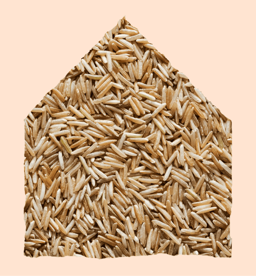
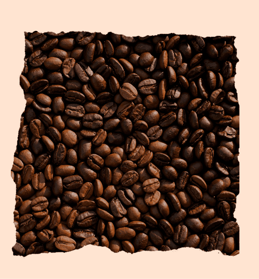
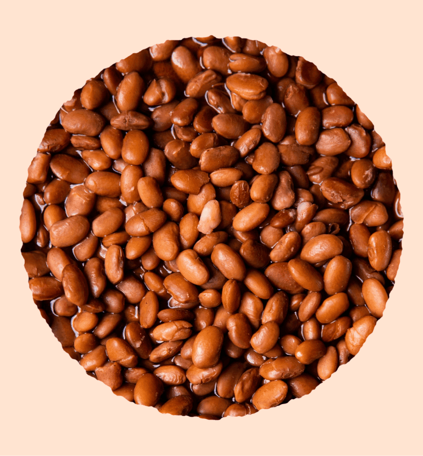
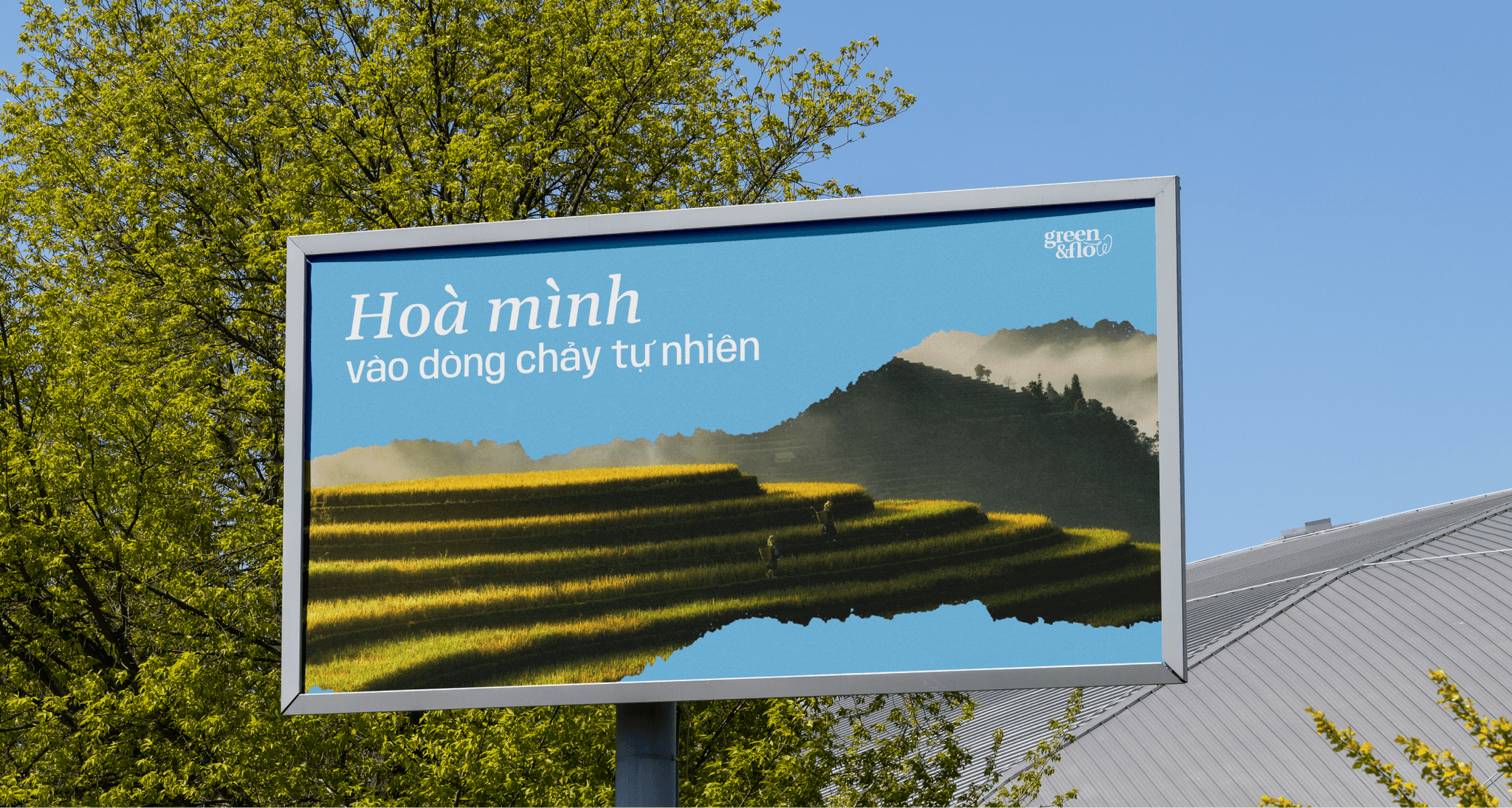
Green&Flow visual motif inspired by paper tear style
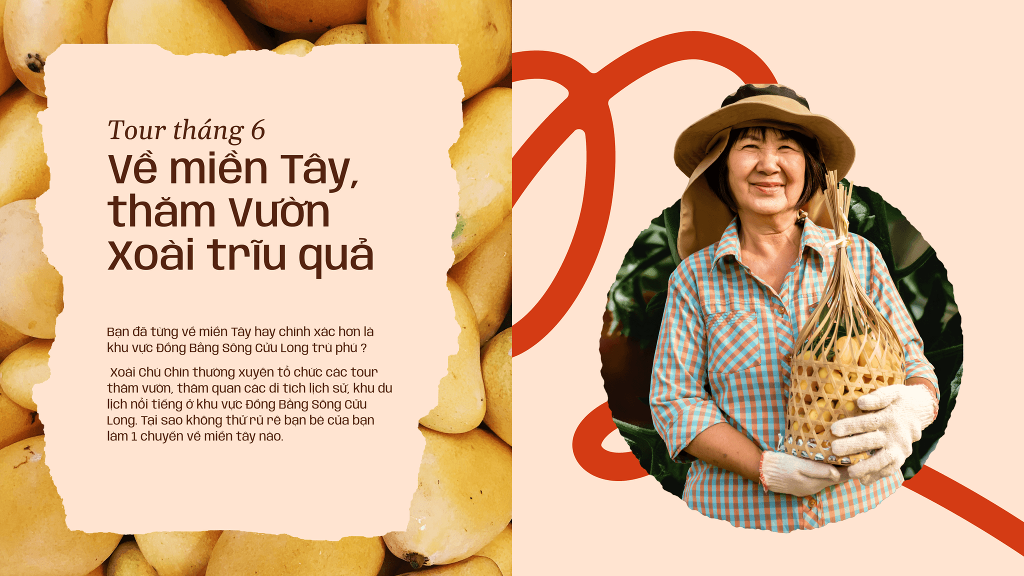
Green&Flow visual motif inspired by paper tear style
brand applications
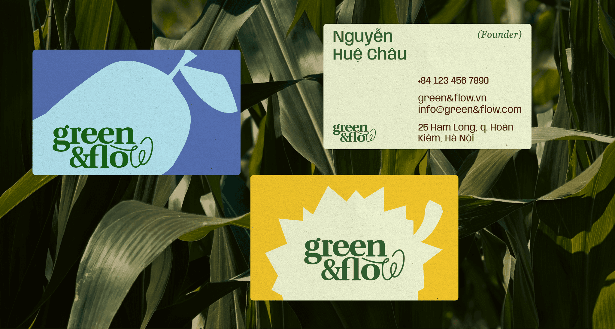
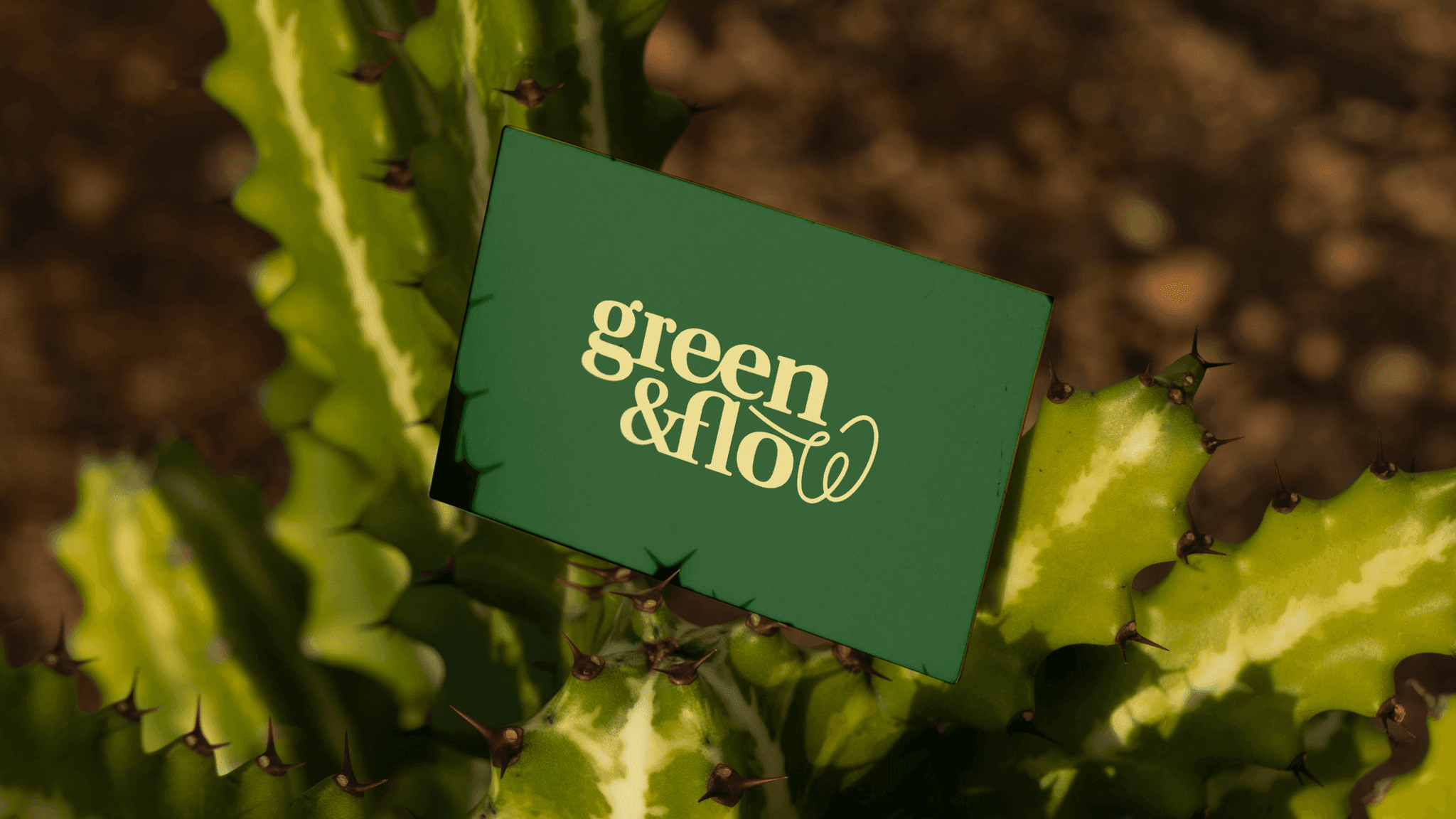
Green&Flow brand application on business cards
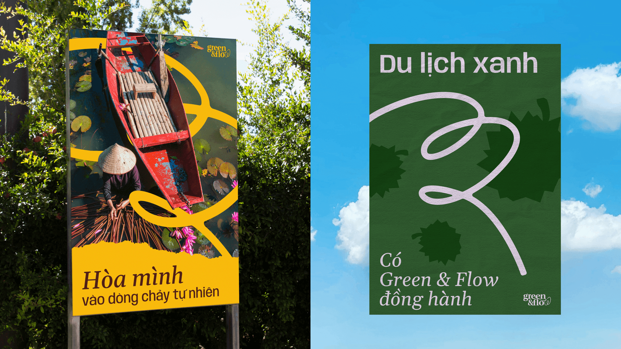
Green&Flow brand applications developed by CDA
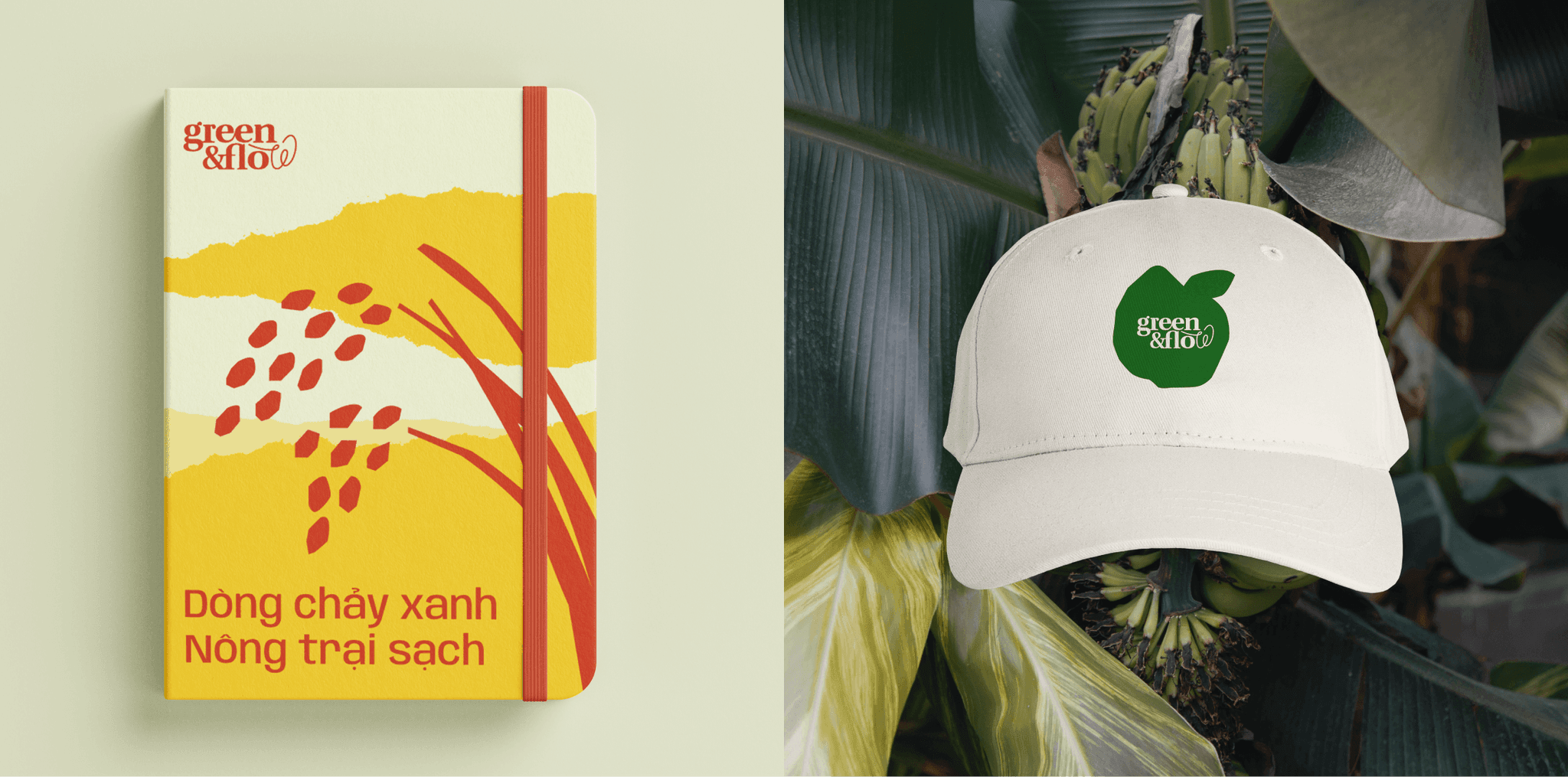
Green&Flow brand applications developed by CDA
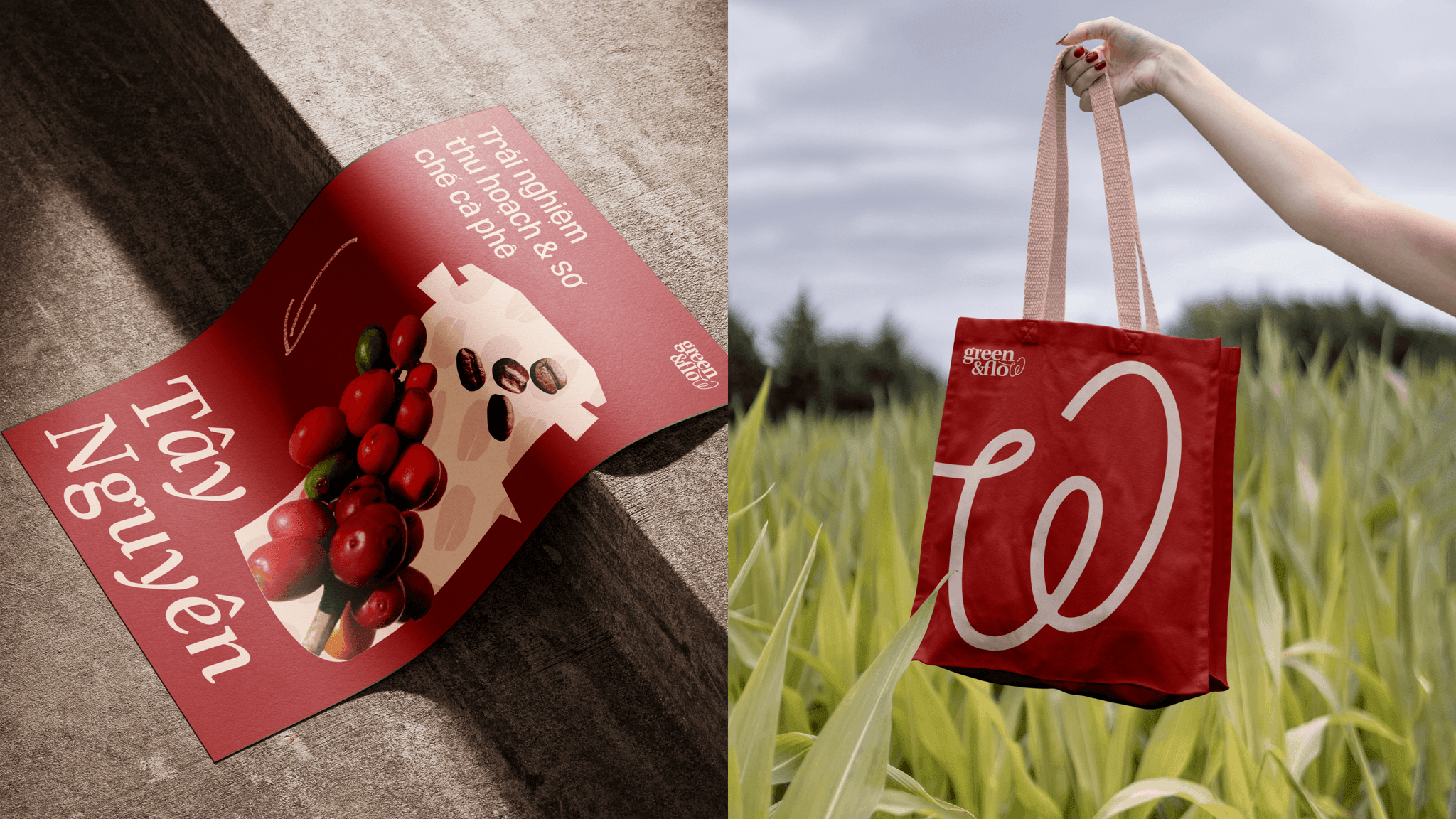
Green&Flow brand applications developed by CDA
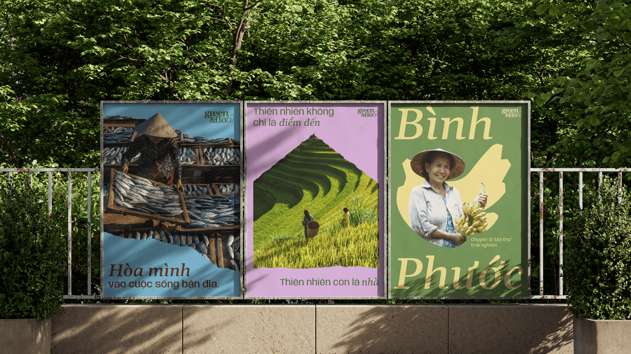
Green&Flow brand applications developed by CDA
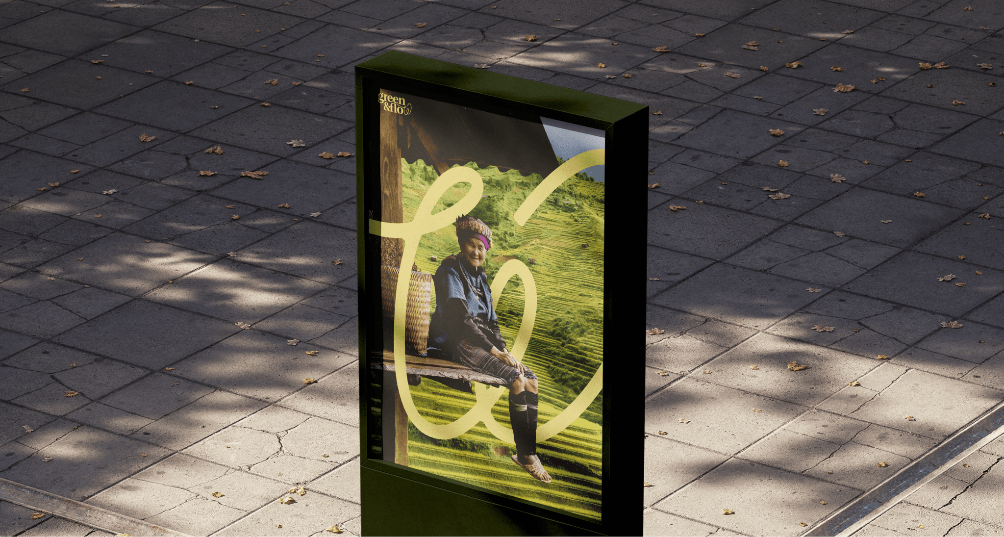
Green&Flow brand applications developed by CDA
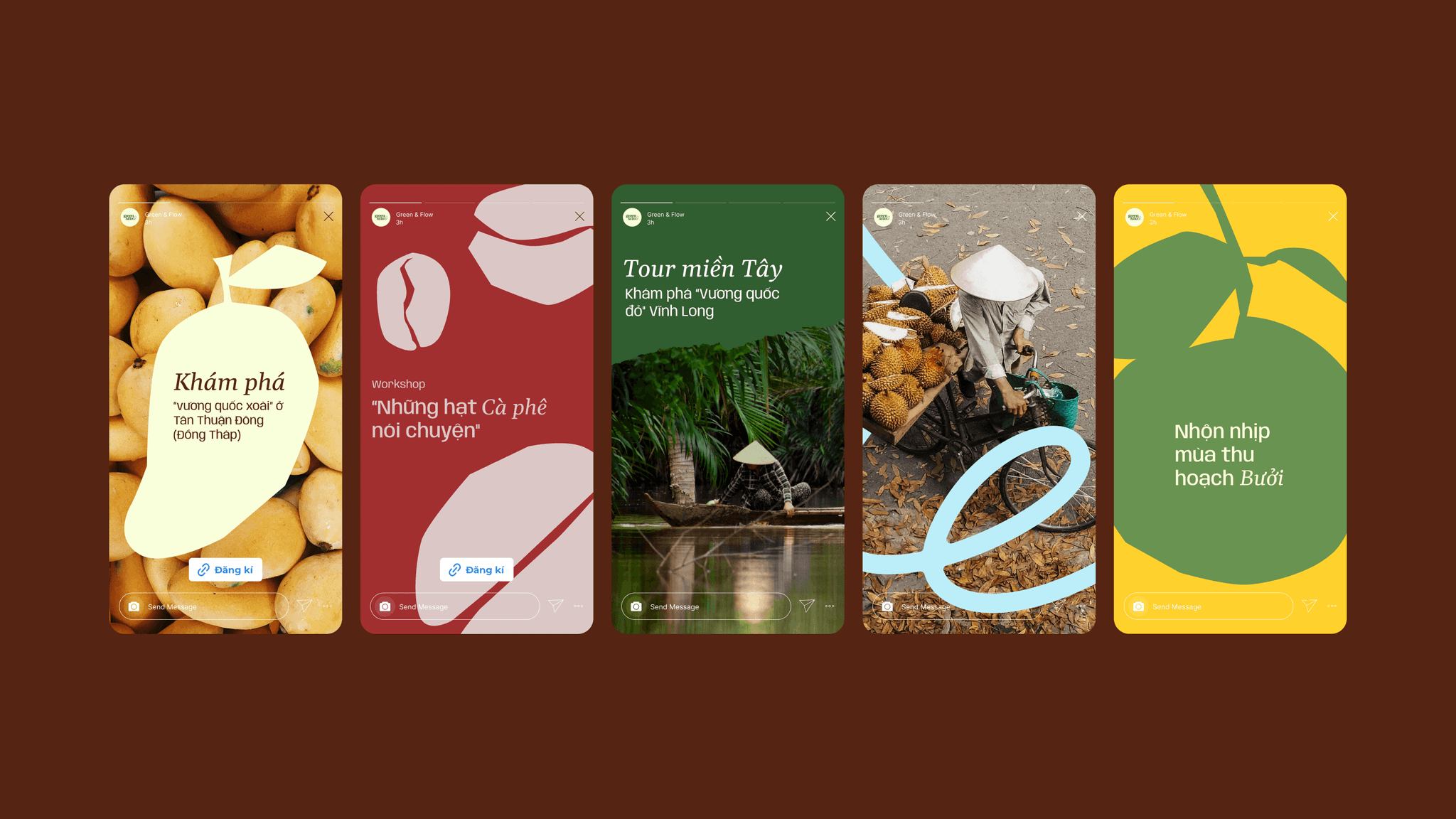
Green&Flow brand applications developed by CDA
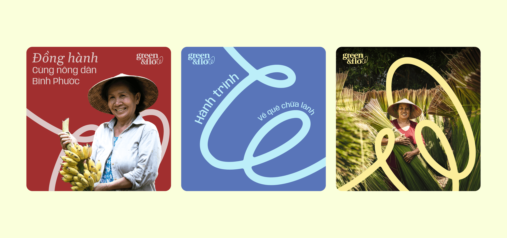
Green&Flow consistent branding on social media
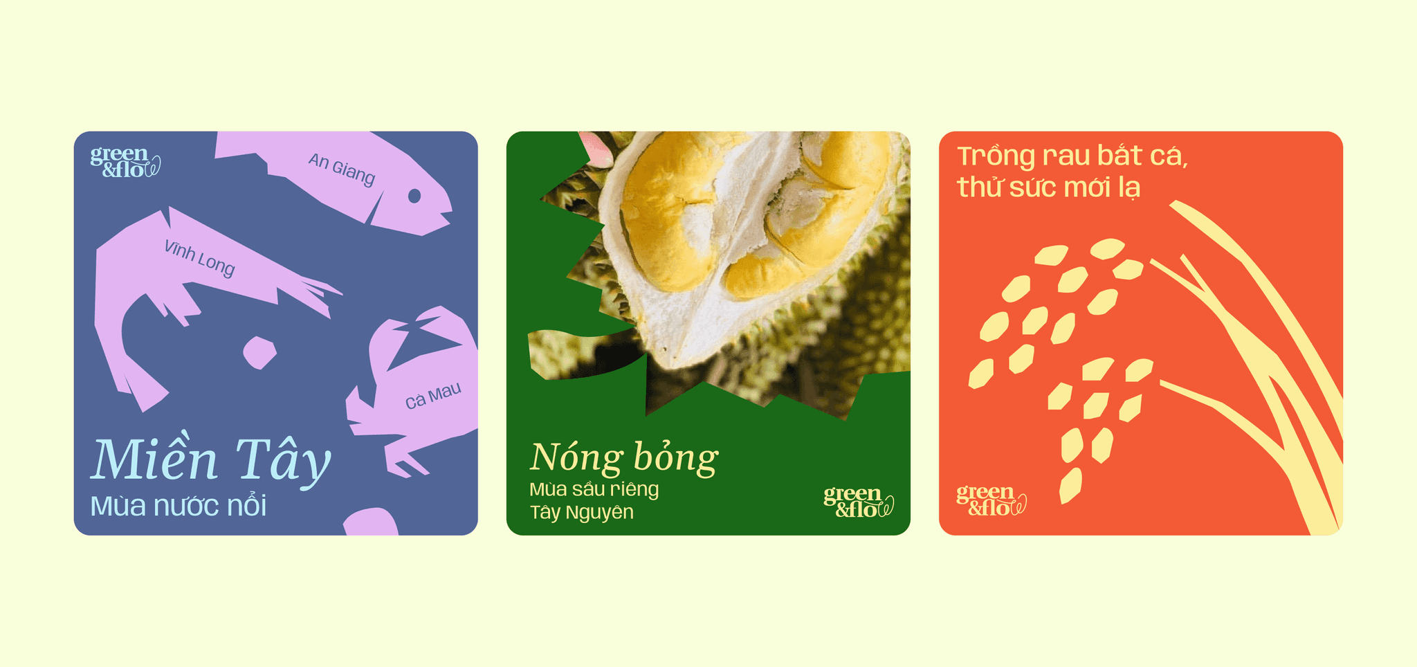
Green&Flow consistent branding on social media