client
ENTO
year
2022
Sector
Food/Insect
Scope
Overview
Aiming to introduce insects as a sustainable and delicious alternative to conventional protein sources, Ento sought to create a flavorful experience that invites audiences into the wonderful world of insects, emphasizing the environmental benefits of insect consumption. As a digital storytelling creative studio, Collective has partnered with Ento to educate the public (especially its audience) and establish itself as a revolutionary insect food brand through branding and packaging.
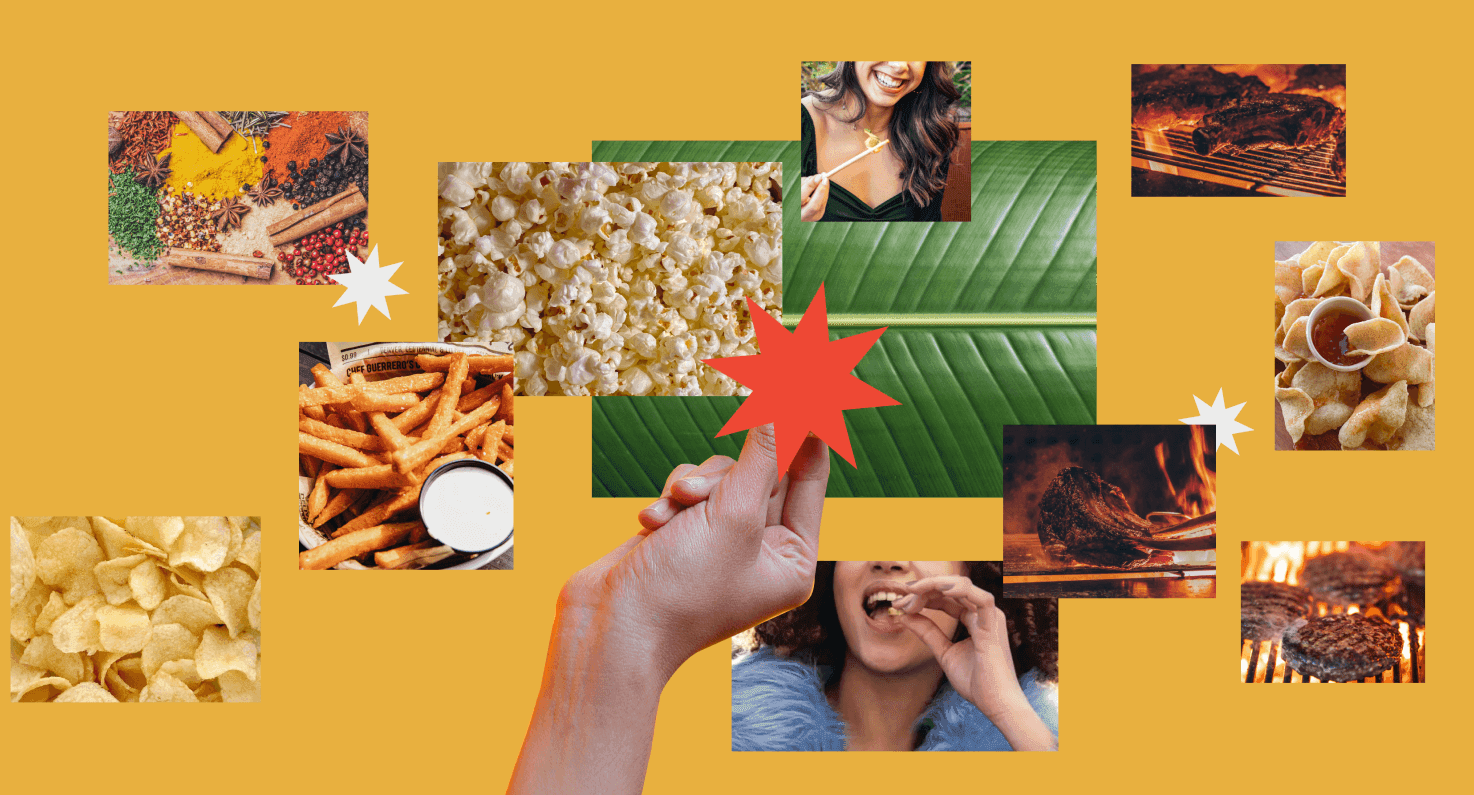
Moodboard that captures the flavorful essence of insect-based snacks
Challenges
Goals
For this project, the challenge was to conceive a product and packaging concept that promotes and introduces a more environmentally-aware lifestyle to the American public. The culmination of this effort is Ento – an insect snack brand that presents insects as a viable and appetizing alternative protein source.
Aiming to introduce insects as a sustainable and tasty alternative to traditional protein sources, Ento aspired to offer a flavorful experience that draws audiences into the extraordinary world of insects while highlighting the environmental advantages of consuming insects.
How do we rewire our brains to think of creatures that wiggle, swarm, and crawl as nutritional, tasty food?
logo design
The logo mark is designed to evoke quirkiness and boldness, thus utilizing a strong bold sans-serif with some fun tweaks.
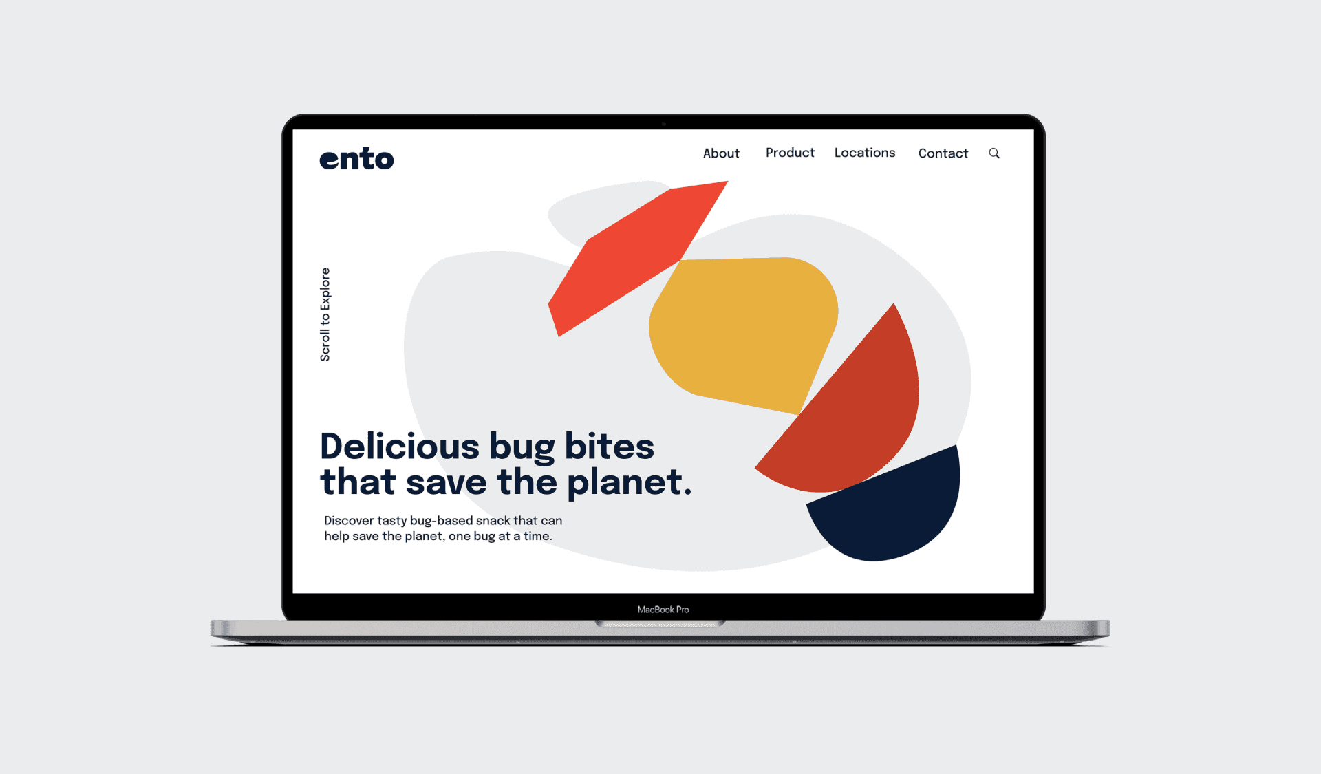
Ento Logo Design: Simple and Modern Typography
Ento logo design
Variations of the Ento Logo
color palette
The colors are chosen deliberately to suggest fun and personality, inviting the audience to try something new.
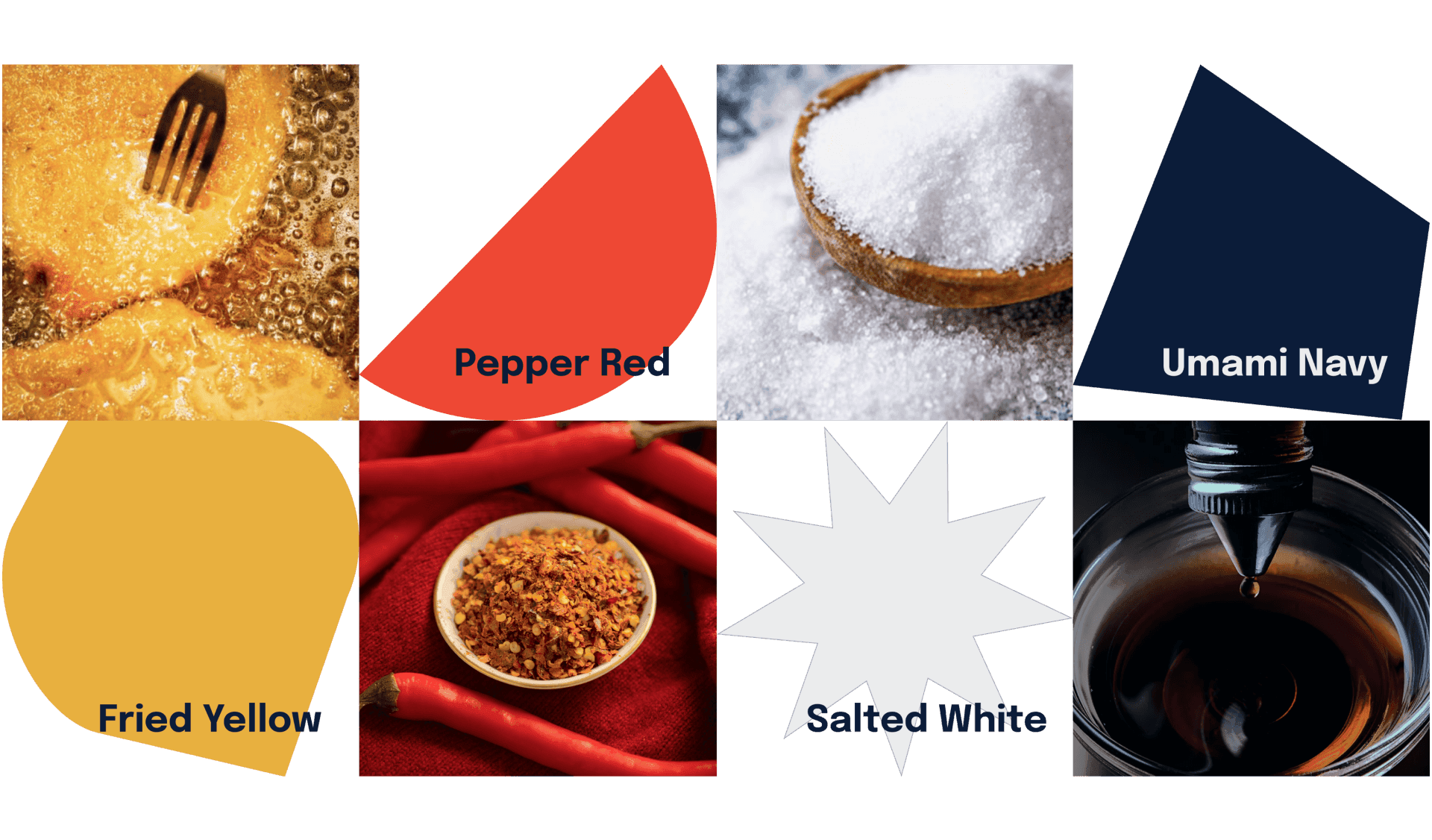
Color inspiration for Ento branding identity
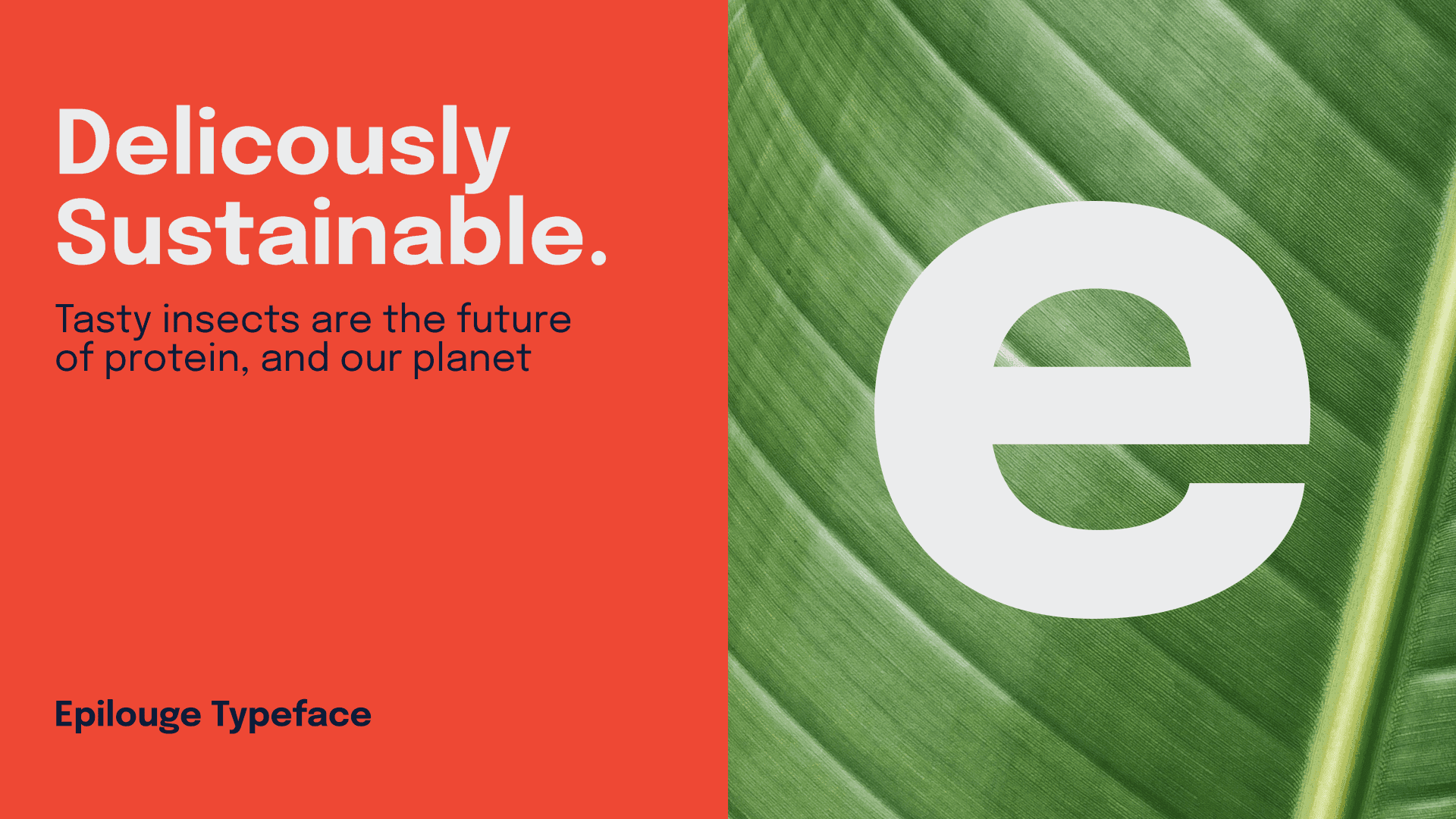
typography system
The typography system use the Epilogue family for its legibility and fun grotesk letter-form that add some personality.
Refreshing the Ento Brand image
Refreshing the Ento Brand image
visual motifs
Refreshing the Ento Brand image
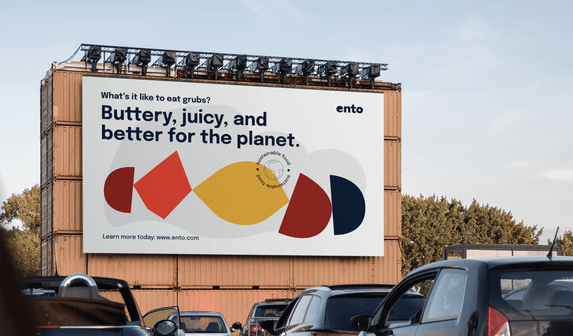
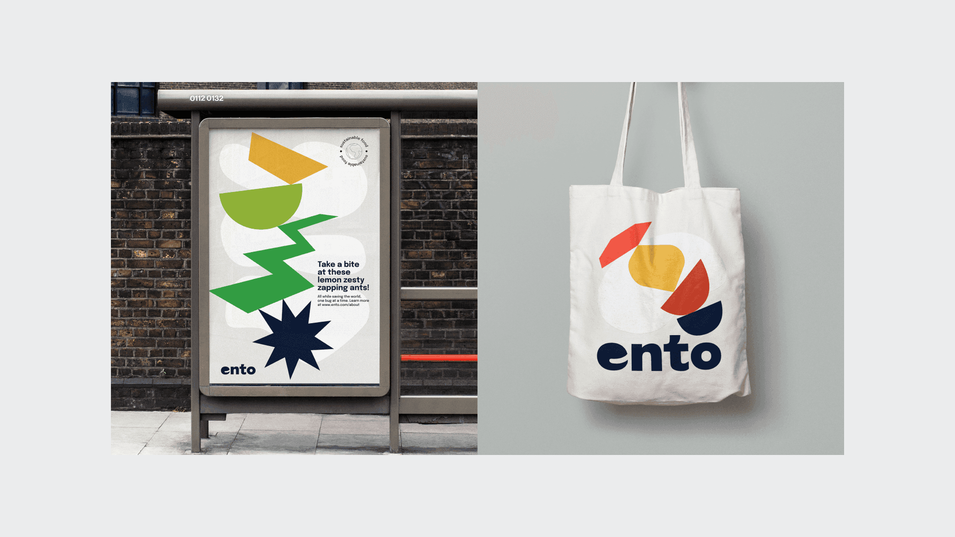
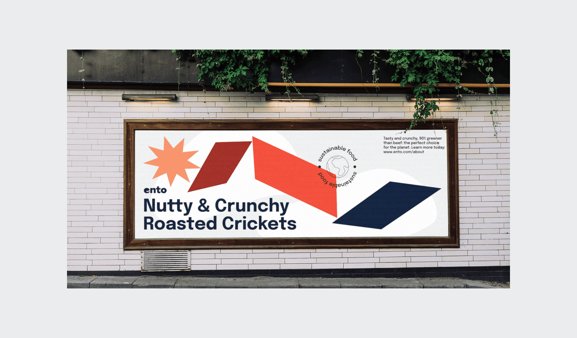
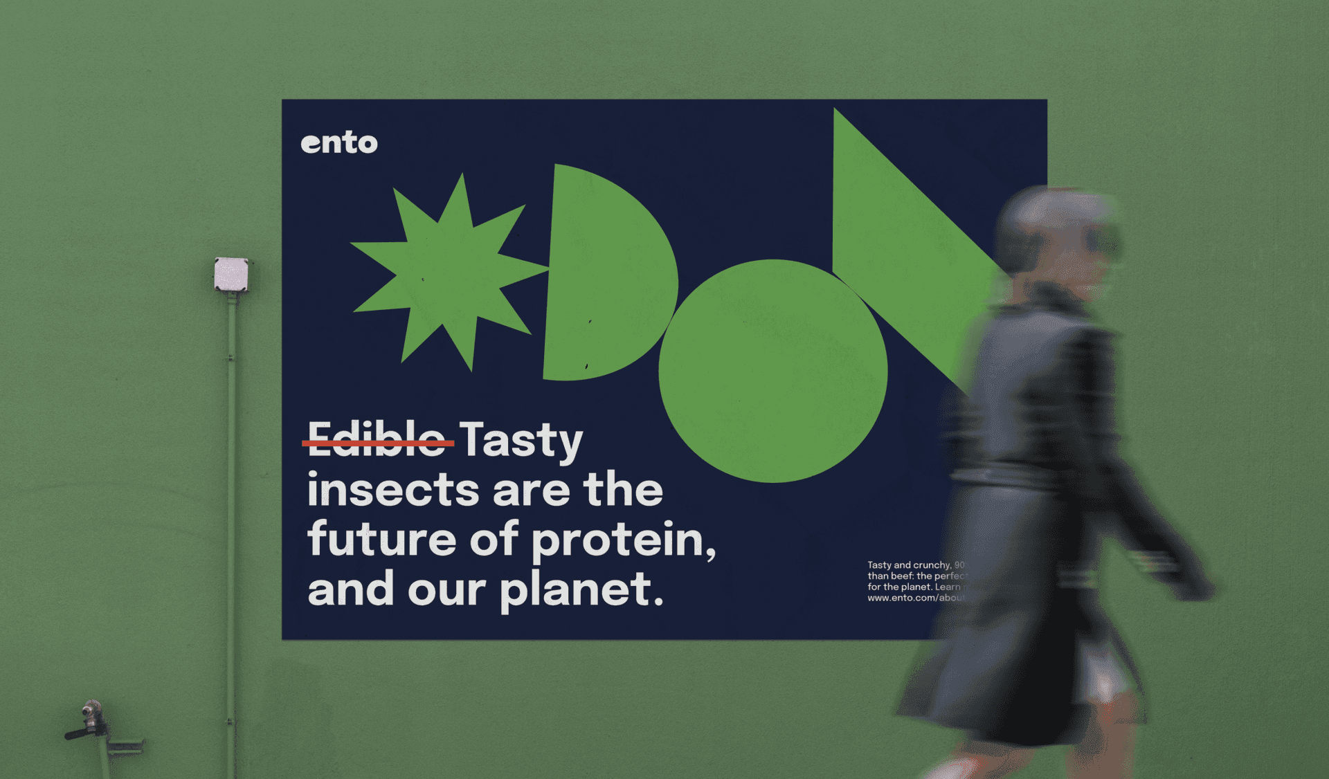
Focusing on the insect-eating experience, the graphic system employs geometric shapes to represent the various flavors of the insects. These form come together to form an insect-like shape that evoke fun and invite the audience to try these delicious snack out.
Embracing Innovation
At CDA, we recognized that featuring edible insects prominently might challenge conventional appetites. Therefore, we shifted our creative direction towards a more engaging and approachable graphic system. By reimagining the edible insect experience, we aimed to reshape consumer perceptions and highlight the innovative spirit of Ento's brand.

Geometric Delight
Our design strategy centered around the use of vivid geometric shapes that symbolize the diverse flavors derived from insects. These shapes not only represent the unique taste profiles but also assemble into an inviting, insect-like figure. This approach was designed to spark curiosity and dismantle preconceptions, inviting consumers to explore the delightful taste and sustainable benefits of Ento's products.

Invitation to Explore
The final visual system we developed for Ento is both playful and educational, encouraging engagement and experimentation. Through this creative expression, we invite the audience to embark on a flavorful journey, turning the initial hesitation into excitement and acceptance. Our design invites consumers to discover the sustainability and gastronomical innovation that Ento offers.

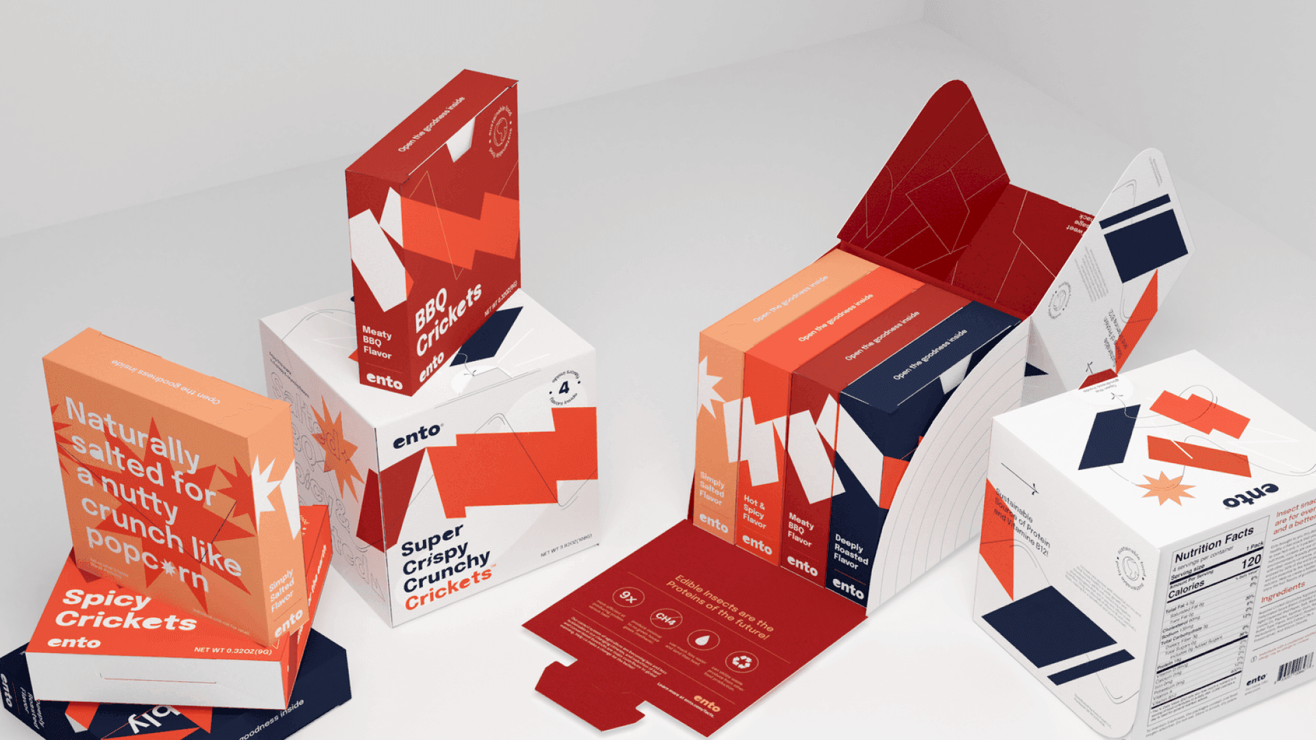
product packaging
Ento Packaging Design
Designing the packaging experience
At Collective Design Agency, we believe that the initial interaction with a product can significantly shape consumer perceptions and experiences. For Ento, we meticulously crafted a packaging experience that not only respects spatial constraints but also surprises and delights upon unveiling.
Here's how we transformed this initial consumer touchpoint into an integral part of the sensory adventure that awaits with every Ento snack.
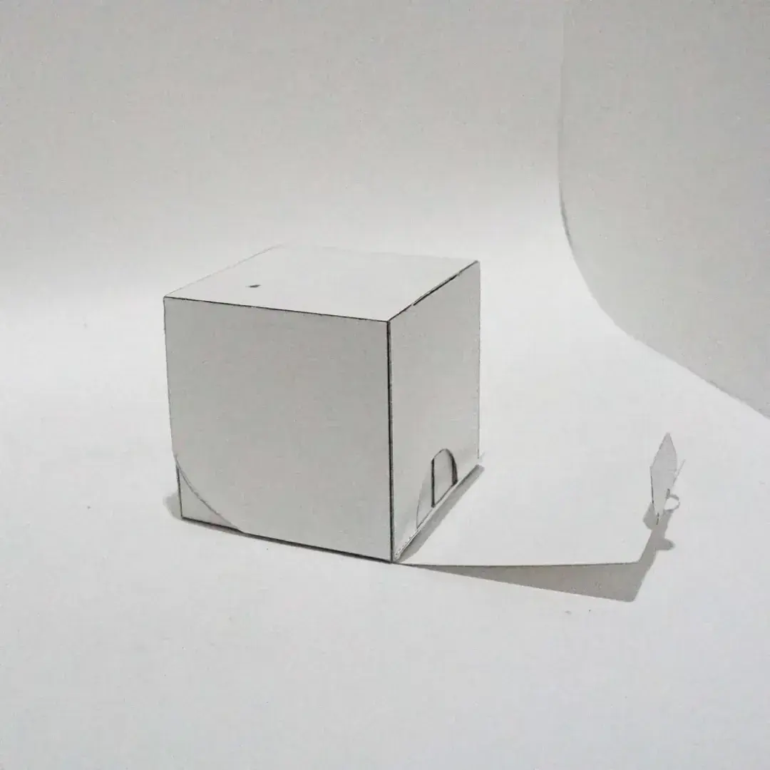
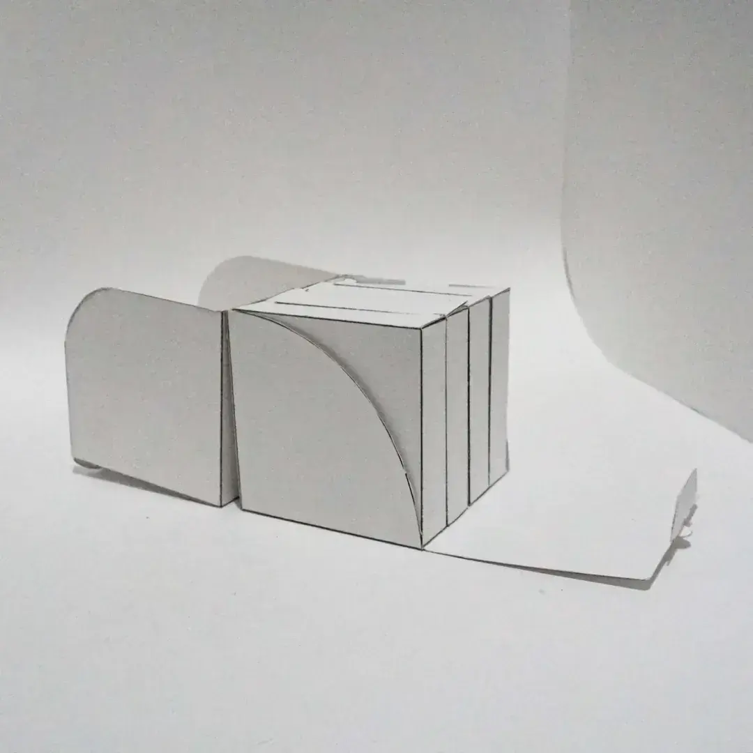
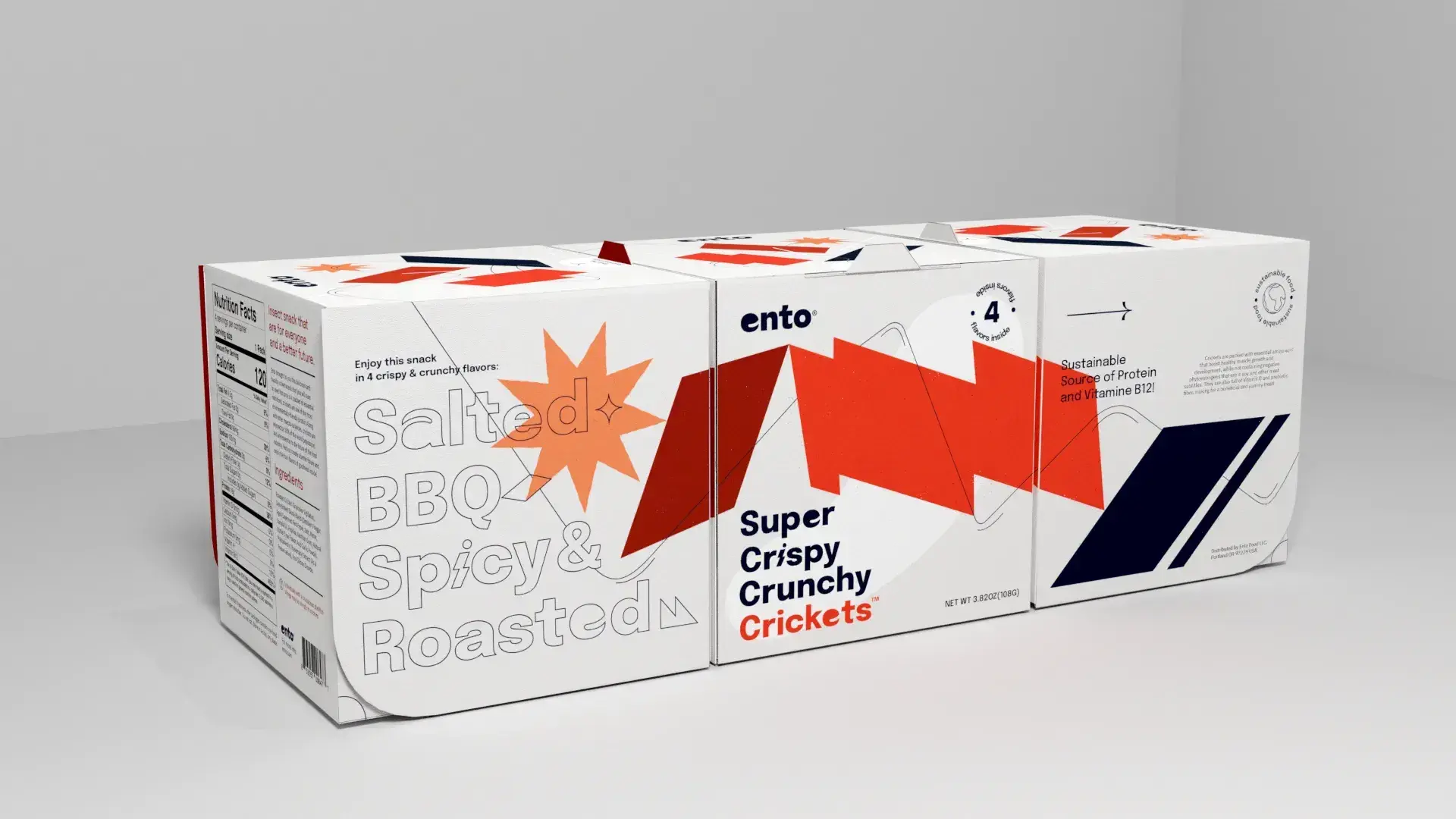
The packaging is restricted to a 4'x4' box that contained 4 different flavor of an insect, in this case it's the cricket.
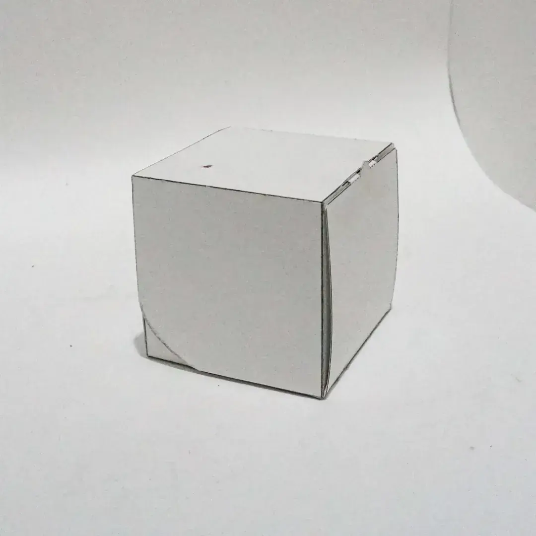
The box has an engaging experience that create a color-pop when you open it, with a wing-like openning mechanism.
Designed to evoke the sensations of eating these insect snack, the graphic and typography come together to suggest a flavorful experience.


Innovative and sustainable snack packaging solutions
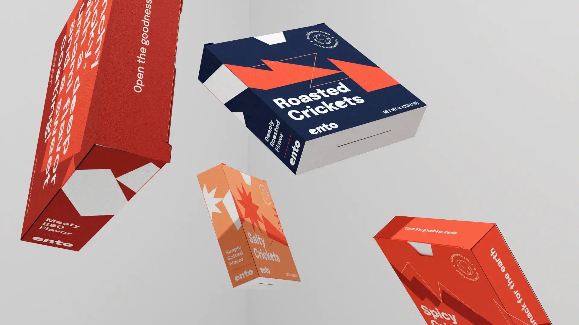
Innovative and sustainable snack packaging solutions
other applications
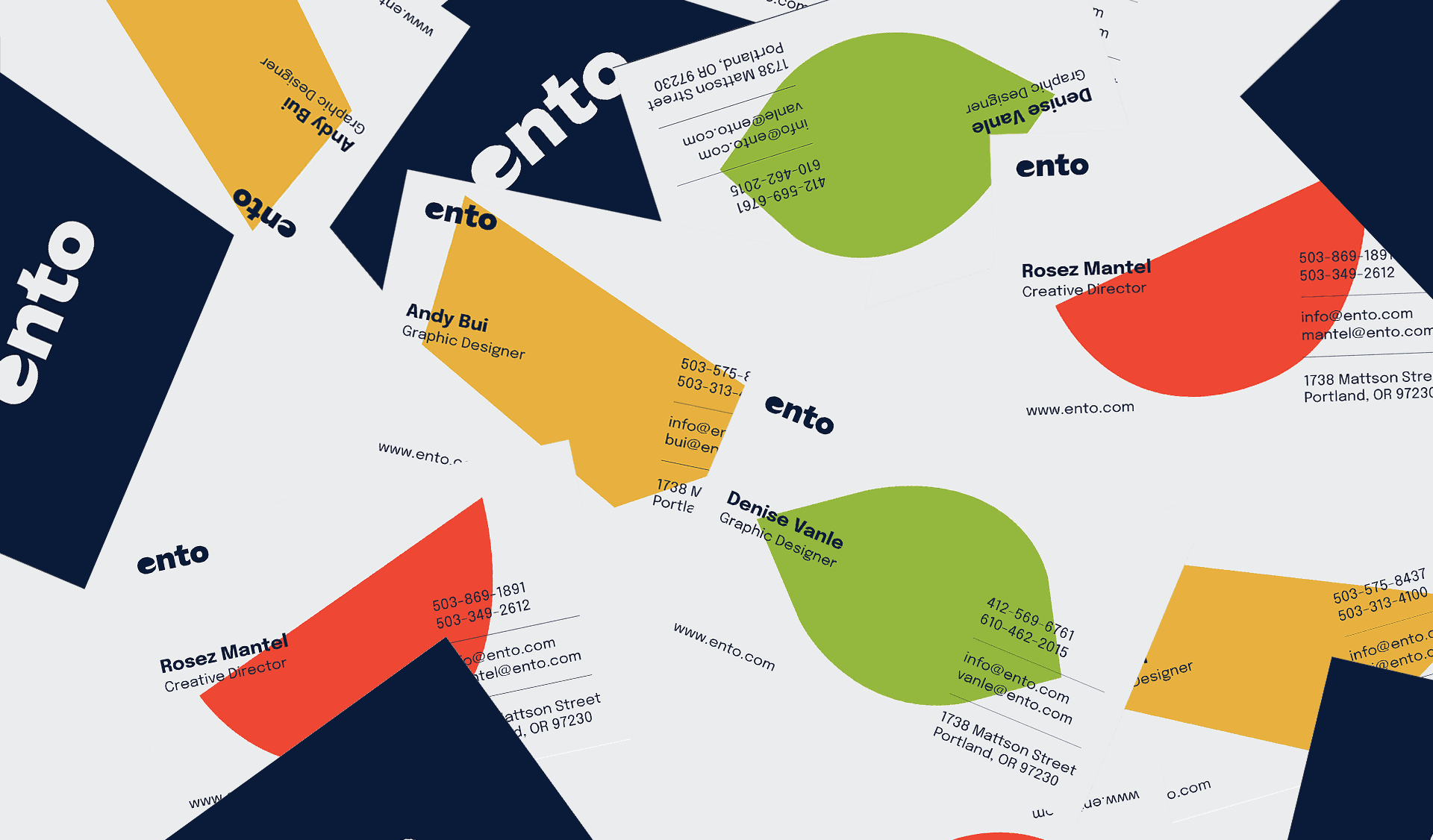
Ento brand physical applications
Ento brand physical applications
Ento brand physical applications
Ento brand physical applications
Ento brand physical applications
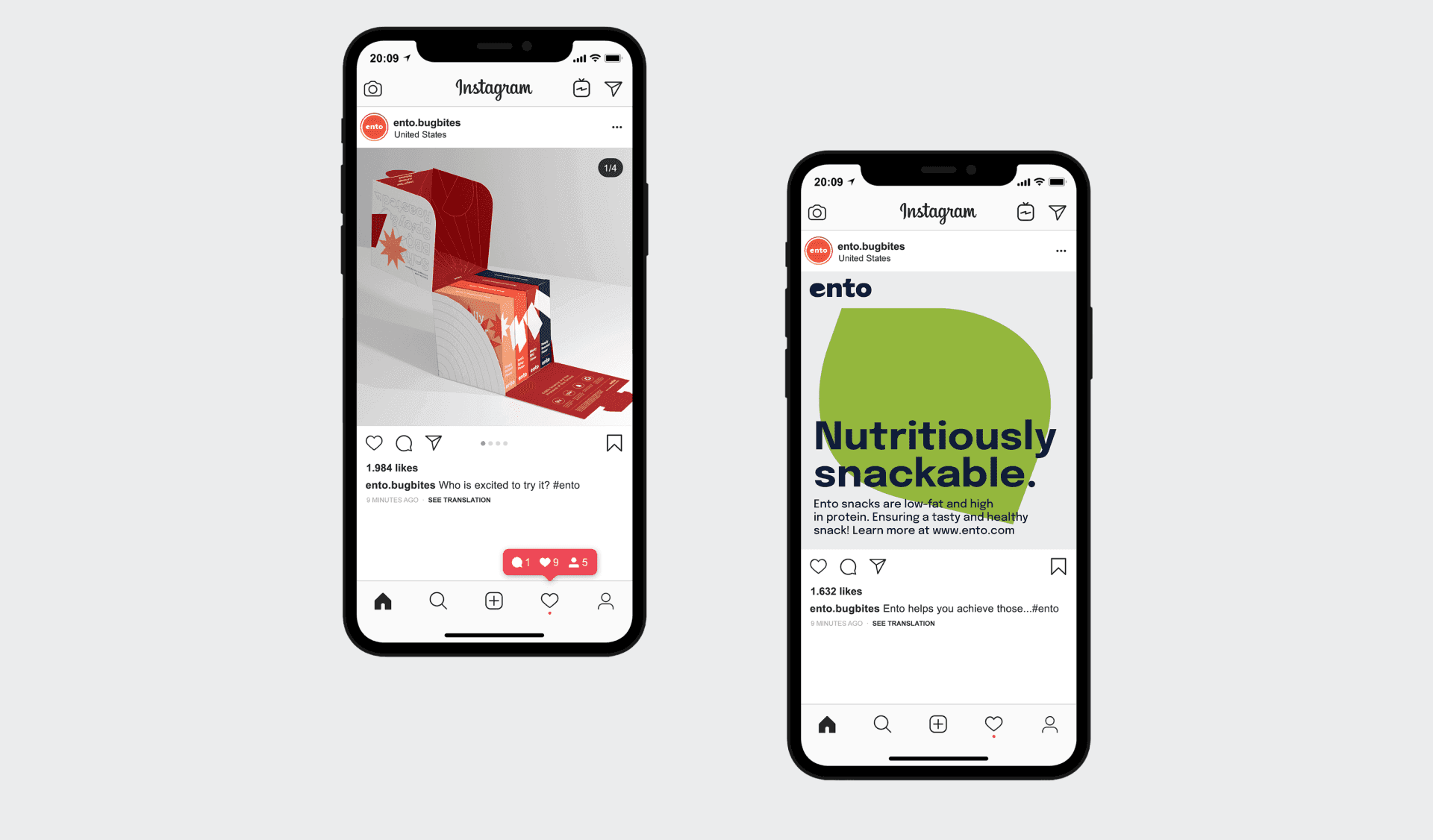
Ento brand across social platforms
Ento brand across social platforms
Ento brand physical applications