
client
CocoFood
year
2022
Sector
F&B
Scope
Overview
Collective has partnered with CocoFood - a food distribution brand to create a new brand identity that recognizes the emotional power of telling stories through gifting traditional snacks. With a focus on multiple brand touchpoints catering to a new generation of gift-givers, this rebranding effort aims to reimagine CocoFood as a new go-to brand for millennials.

Moodboard for CocoFood inspired by the love for food
Challenges
Goals
The challenge was to shift away from traditional branding strategies and towards something that embodied the spirit of gift-giving – a mix of joy, surprise, care, and warmth. The task was not to sell a product, but to convey a feeling, transforming the ordinary act of buying a box of snacks into a deeply emotional experience of love, care, and shared stories.
Our design goal for CocoFood was to forge a versatile, modern brand identity that resonates with a wide range of clients and seamlessly integrates across online and offline platforms.
Visual Concepts
Concept A - A mosaic of the relationships we share
We want to modernize these classic motifs to make the overall design to feel fresh, playful, and optimistic while still paying homage to traditional values such as family bonds, friendship and love. The use of striking cement tile patterns with warm tones such as cream, brown, earthy yellow or moss green creates a sense of luxury and the timeless aesthetics of Vietnamese architecture between the 1970s and 2000s.
Concept A - A mosaic of the relationships we share
Concept B - Food for honest living, with flavors that are as bold as you
This concept shows how fresh, honest and high-quality the products of CocoFood are, promoting a healthy lifestyle and encouraging the audience to cultivate their health and their love for others. A traditional warm tone with harsh lines inspired by the paper cut-out style is used to express the sense of minimalism, youth, and simplicity.
Concept B - Food for honest living
Concept C - Food with emotions, for new memories we will make together
With this concept, the CocoFood brand is positioned to be empathetic, caring, worry-free and its messaging is focused on reminding us of a feeling of nolstagia, warmth and gratefulness toward others in our lives. Bright gradient patterns with vertically-positioned text evoke the aesthetics of the Japanese tradition of caligraphy.
Concept C - Food with emotions
Through out the discussion, we agreed that concept C would best deliever the spirit of CocoFood: optimistic feelings associated with the act of giving like respect, sincerity, gratitude, and encouragement.
We uses the gradient and faded images of ingredient elements as the key visual, with rays of light shooting upwards and outwards to reveal a background of nature and the feeling of spreading love.
Revised Logo
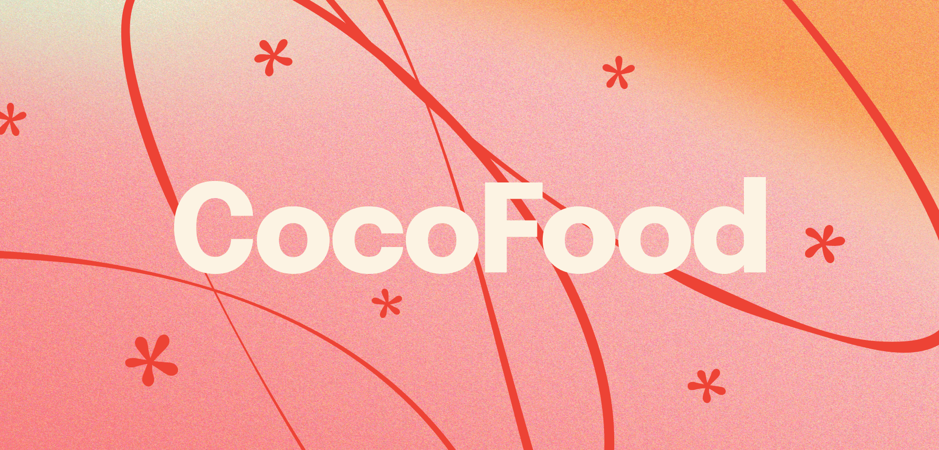
In response to the client's request, we retained the traditional form of the logo, stylistically reimagining the letters 'C' and 'O' using angular rectangles. However, by eliminating the rectangular frame from the original logo, we introduced a sense of freedom, comfort, and modernity. The vibrant red color infuses the logo with a youthful spirit, making it more appealing to our target customers.
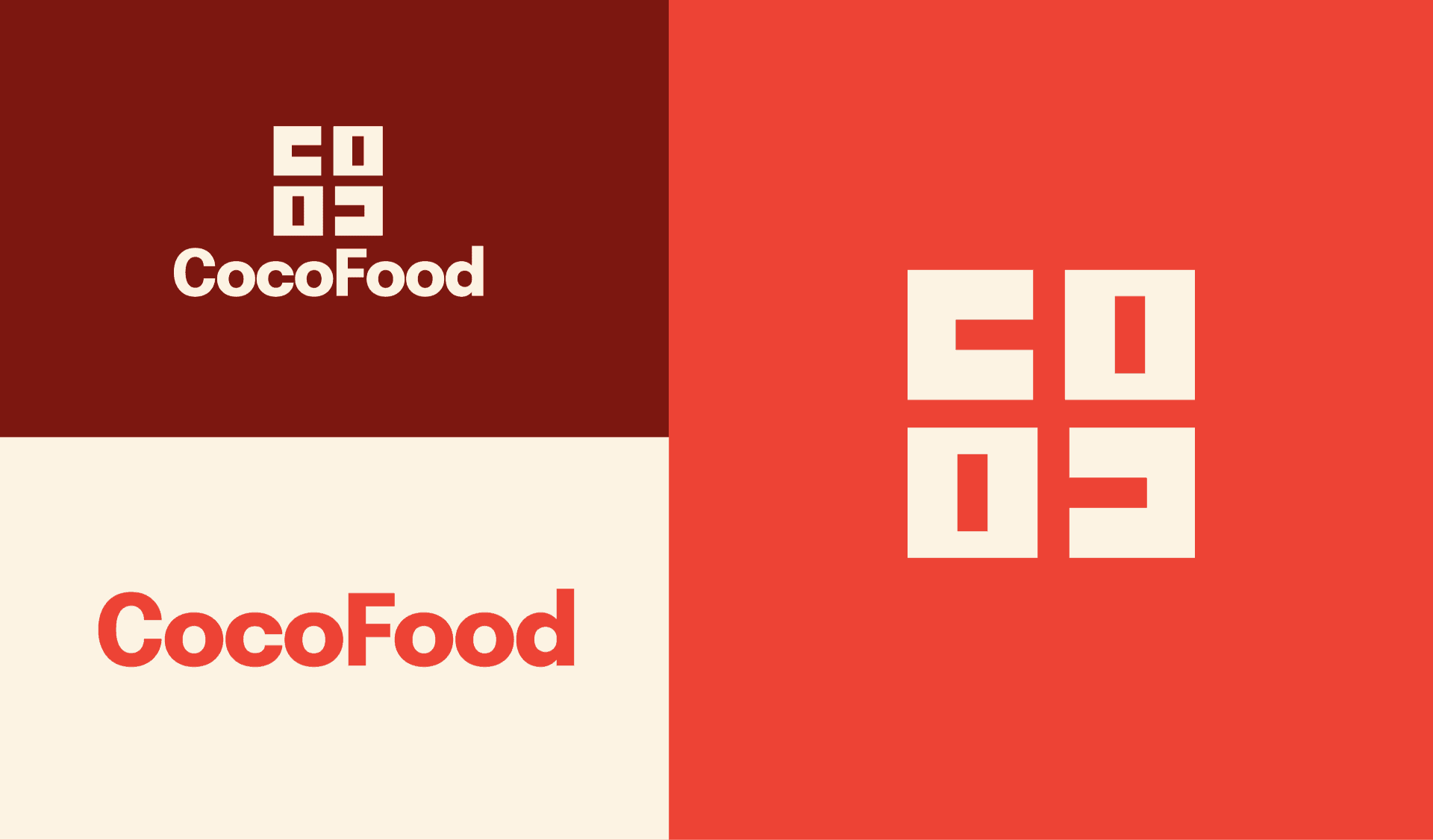
Reimagined CocoFood logo with vibrant red and angular design
Color Palette
The primary colors of our rebranding - Sundried Maroon, Tomato Red, and Coconut White - provide a versatile palette for diverse applications, with an array of shades for nuanced needs, especially document contexts. To further enhance visual depth and the brand's unique aesthetic, a layer of grain texture is applied, giving a nostalgic nod to traditional snacks while ensuring consistent brand recognition.
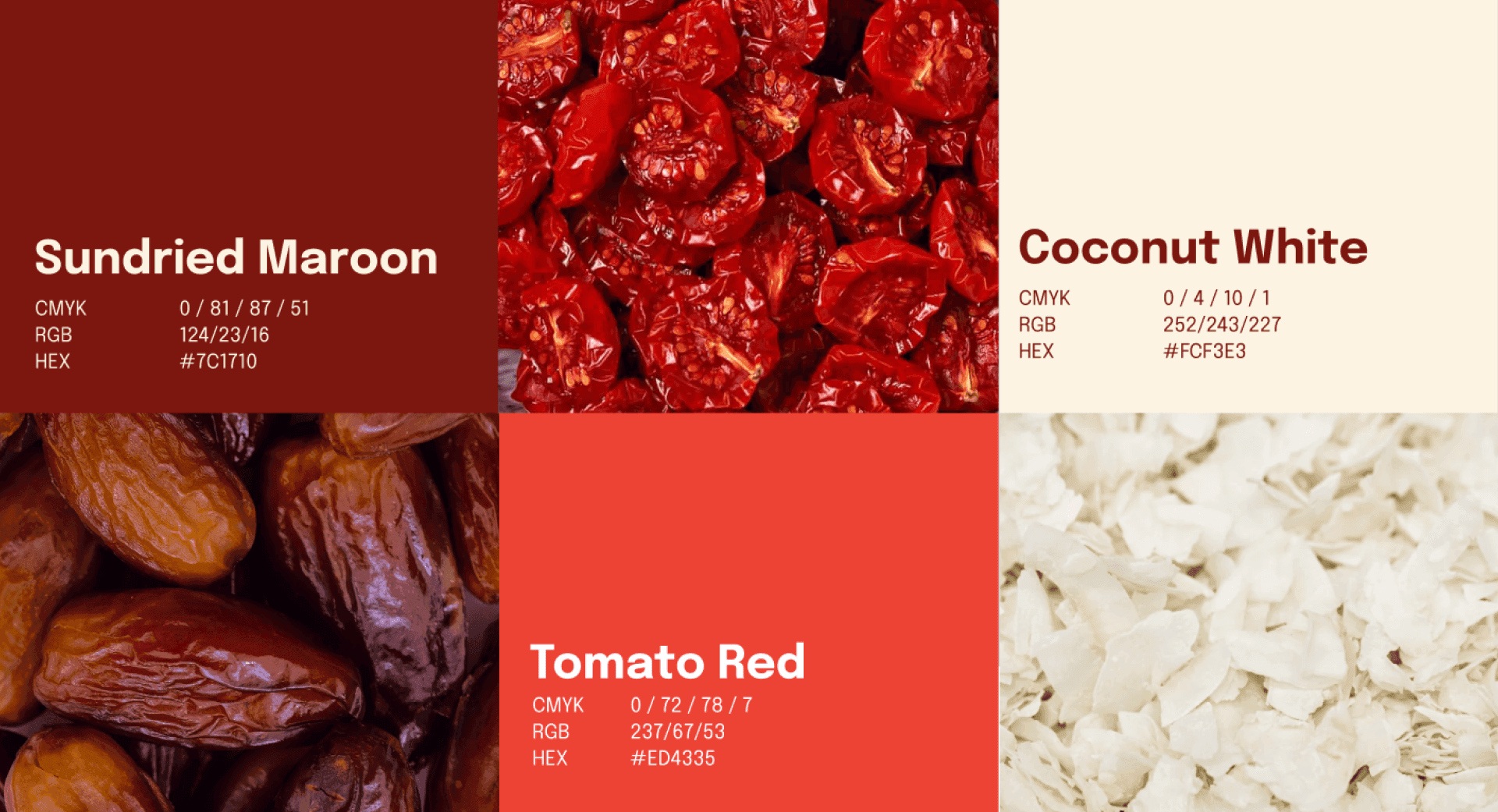
Nuanced CocoFood branding colors with textured grain effect
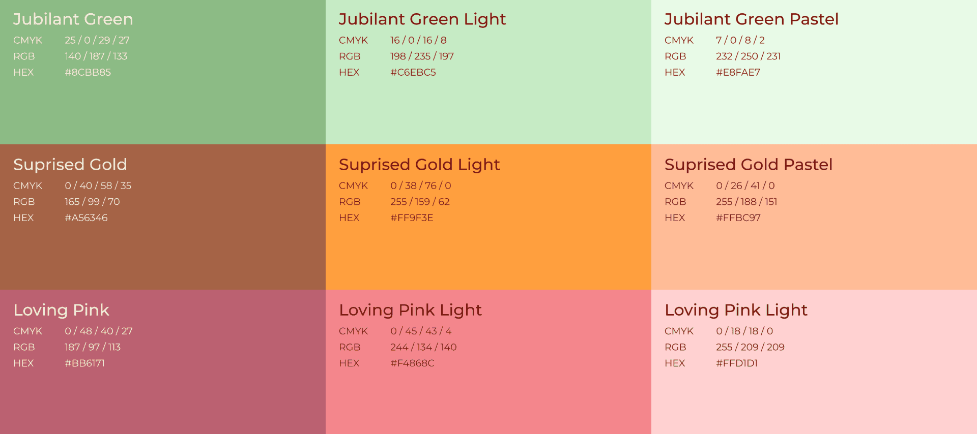
CocoFood branding colors
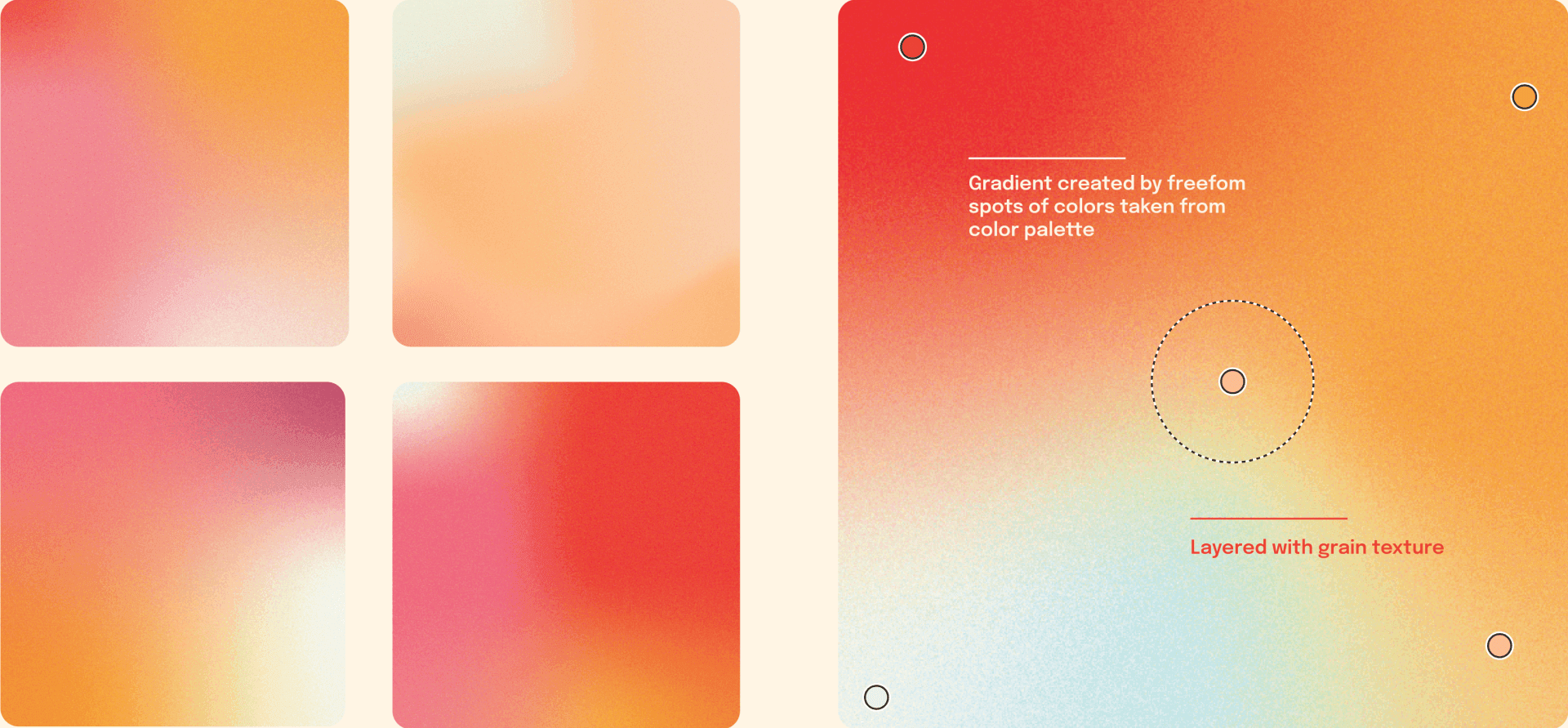
Creative gradient exploration with grain texture for CocoFood branding
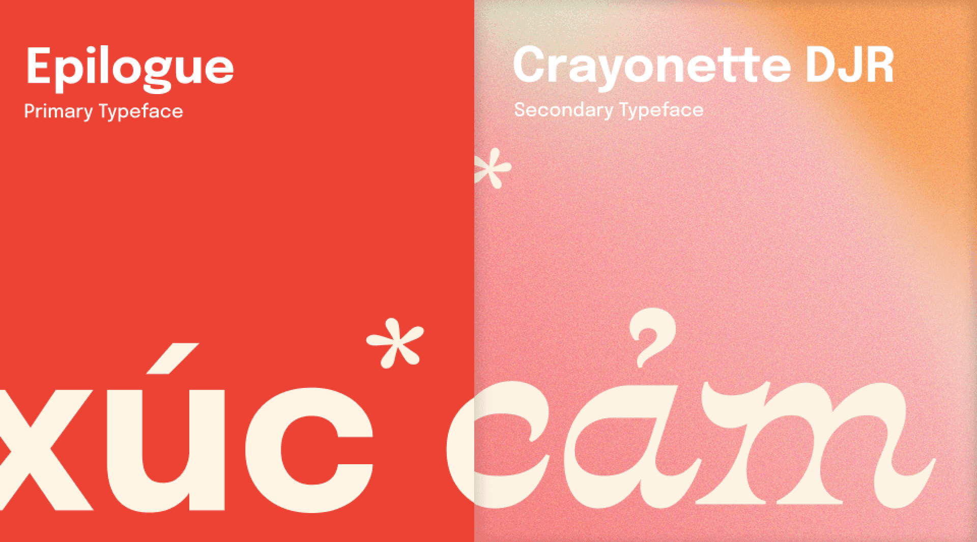
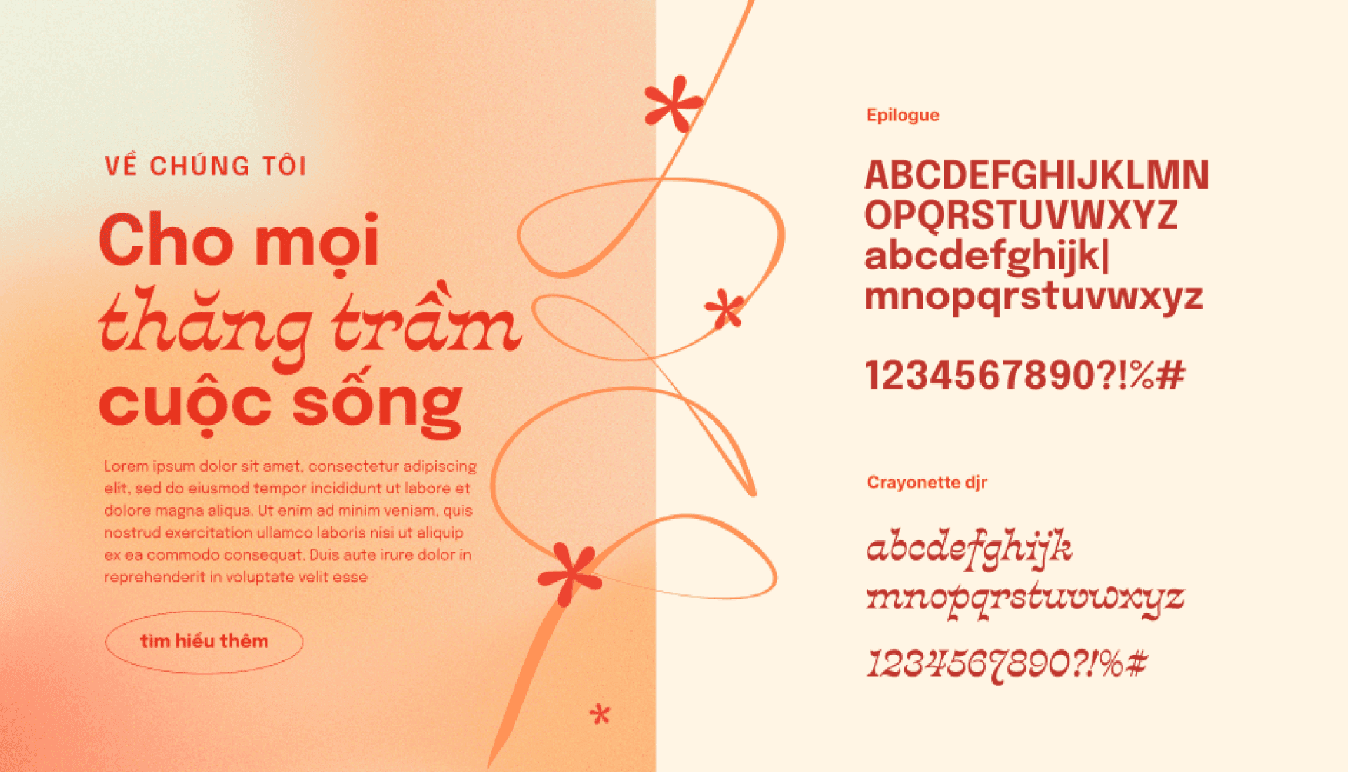
Typography System
Our brand identity features the modern and versatile Epilogue typeface as the main font, ensuring legibility across various platforms. Supplementing it, the dynamic Crayonette DJR font adds a layer of confidence and uniqueness through its expressive zigzag rhythm, which is perfectly balanced by a delicate floral motif. When needed, the traditional and versatile Gideon Roman typeface is also utilized, offering a timeless charm to our diverse applications.
CocoFood branding typefaces with floral and zigzag details
CocoFood branding typefaces
CocoFood branding main and support typefaces
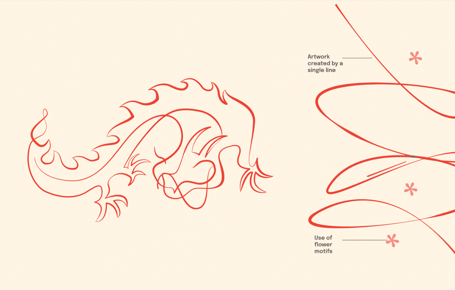
Visual Motif
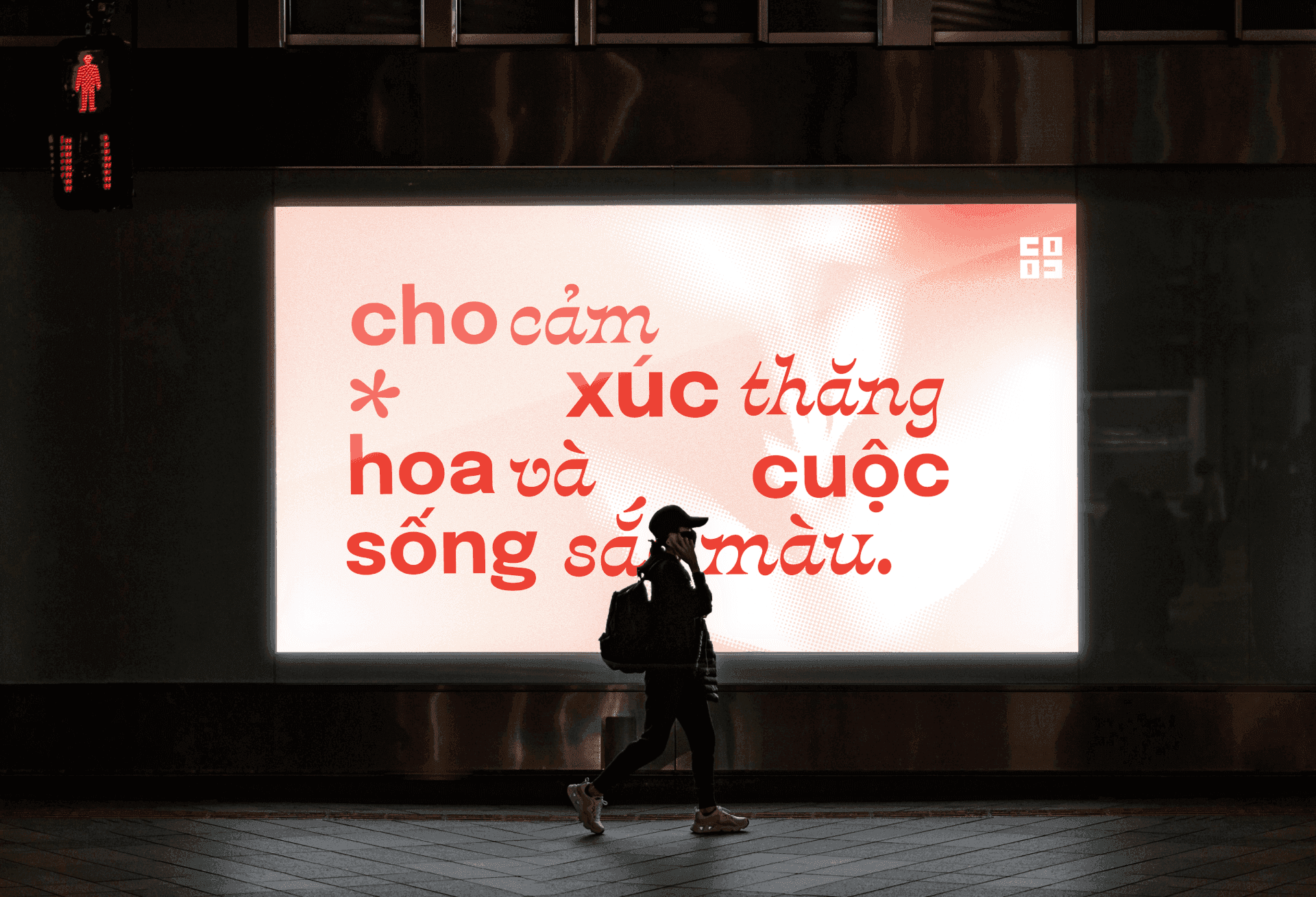
Our striking visual identity, resonating with nostalgic childhood memories of sharing meaningful gifts with loved ones, is consistently echoed in everything from pitch decks and social media infographics to packaging designs. Utilizing a blend of linear and fluid gradients, we create a sense of movement, imbuing our designs with a sense of humanity and emotional presence that is continually in flux. This dynamic blending effect serves to convey emotional vibrancy, adding another layer of depth to our brand communication.

CocoFood visual motif with dynamic gradients and emotional vibrancy
CocoFood visual motif
CocoFood visual motif
CocoFood visual motif

CocoFood visual motif
CocoFood branding applications across multiple platforms
CocoFood branding applications across multiple platformscocoFood packaging design showcase
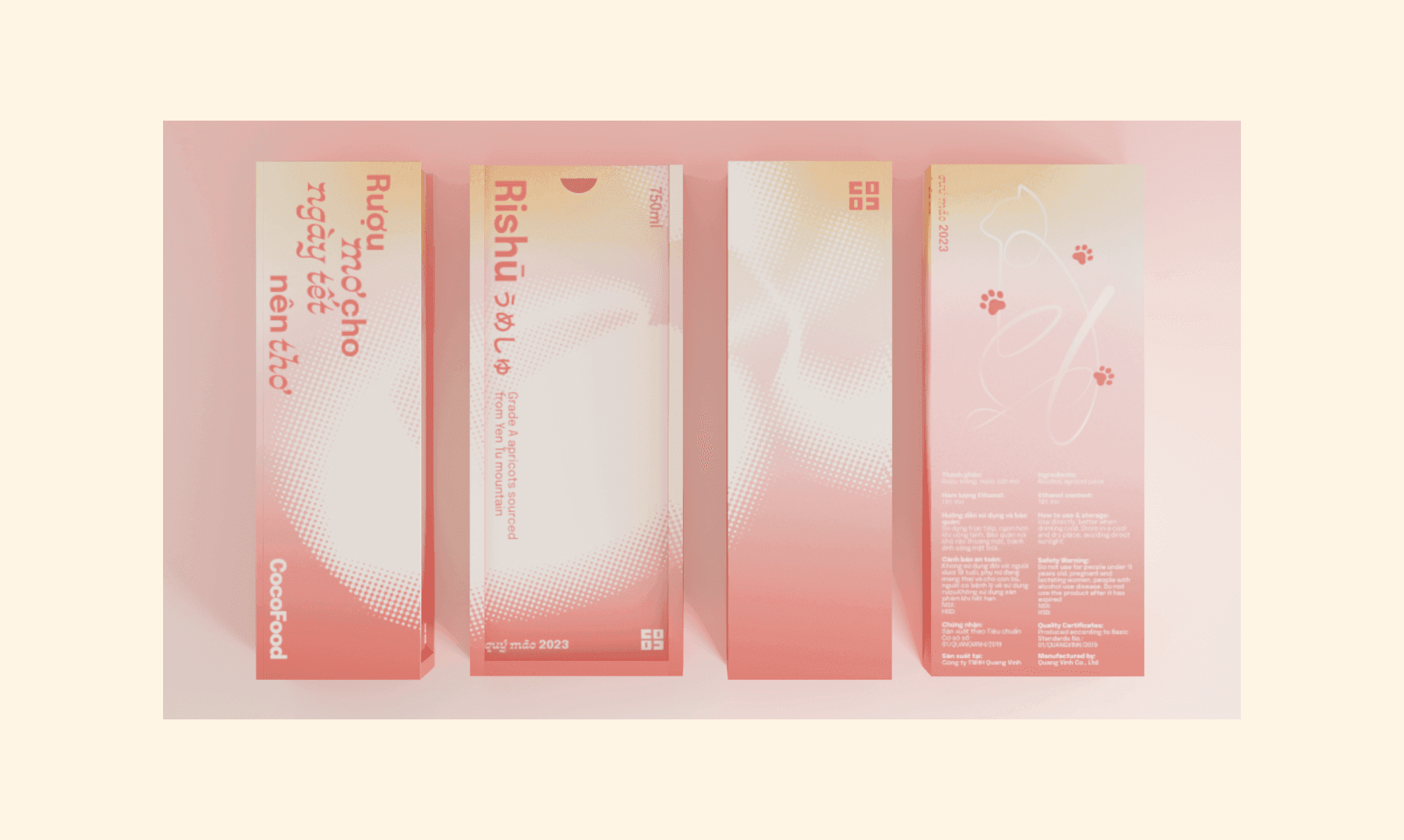
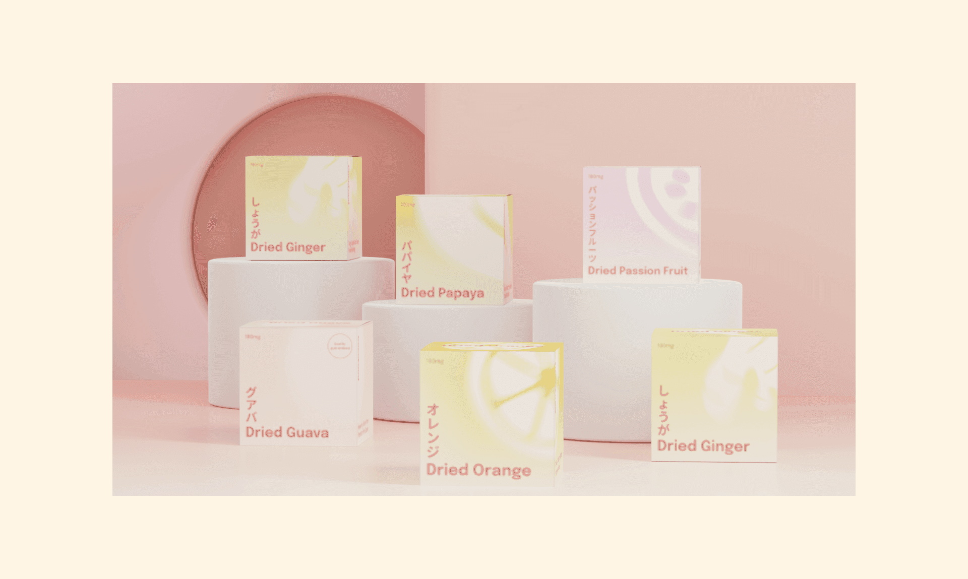
Product Packaging
CocoFood strives to transform the pleasure of receiving gifts into an emotional journey, encompassing surprise, excitement, thrill, and appreciation.

CocoFood packaging design showcase

CocoFood packaging design showcase

CocoFood packaging design showcase

CocoFood packaging design showcase
CocoFood packaging design showcase
CocoFood packaging design showcase


Brand Application
From user-friendly digital interfaces such as websites and social media platforms to tangible elements like packaging and print advertising, CocoFood stands out with its emotional storytelling and unique design aesthetics.
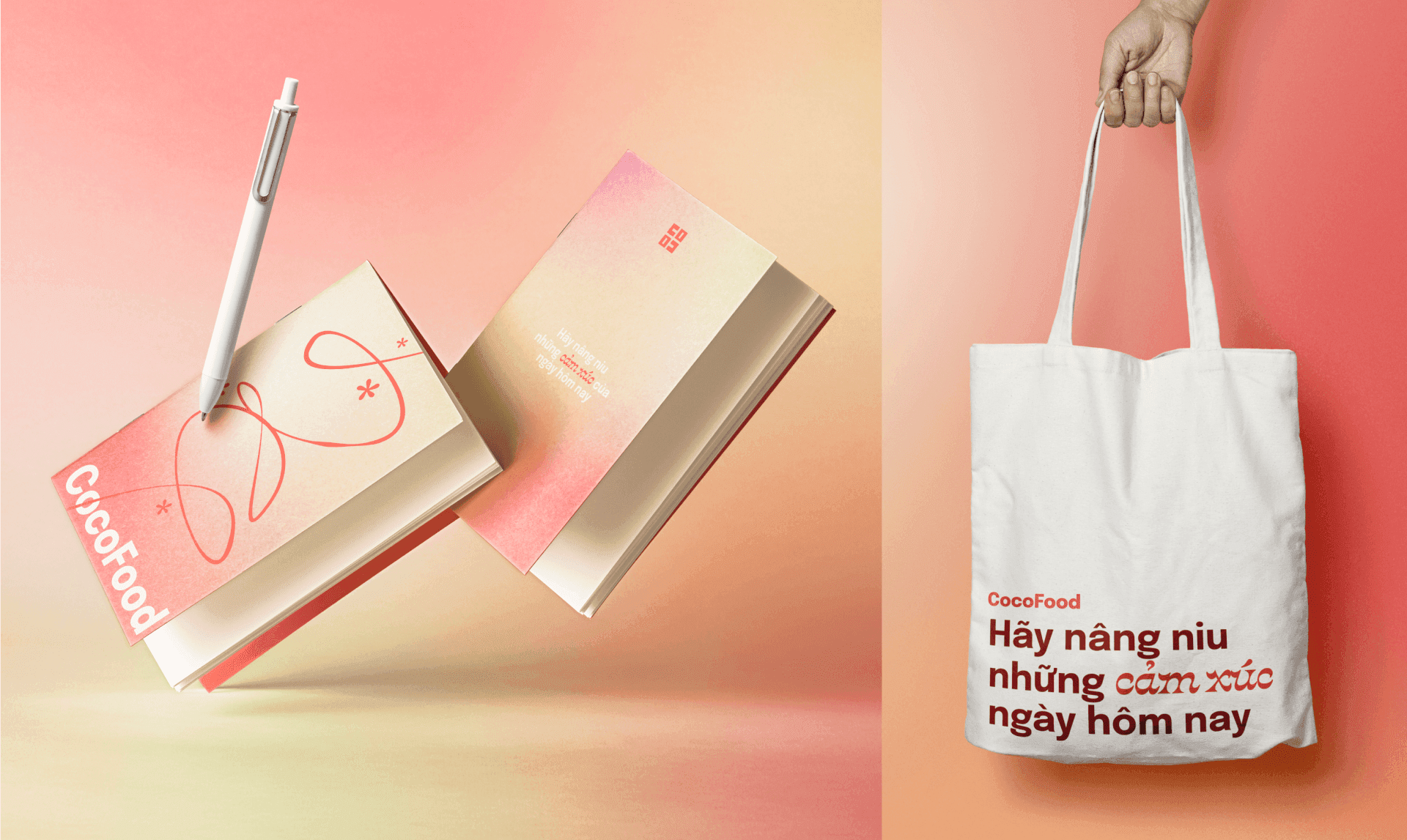
CocoFood physical branding applications
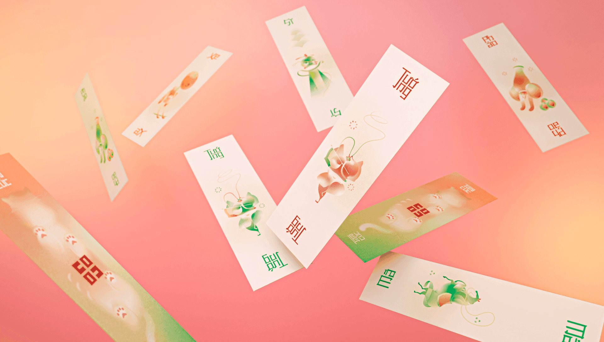
Tam Cuc game card in CocoFood Tet gift set
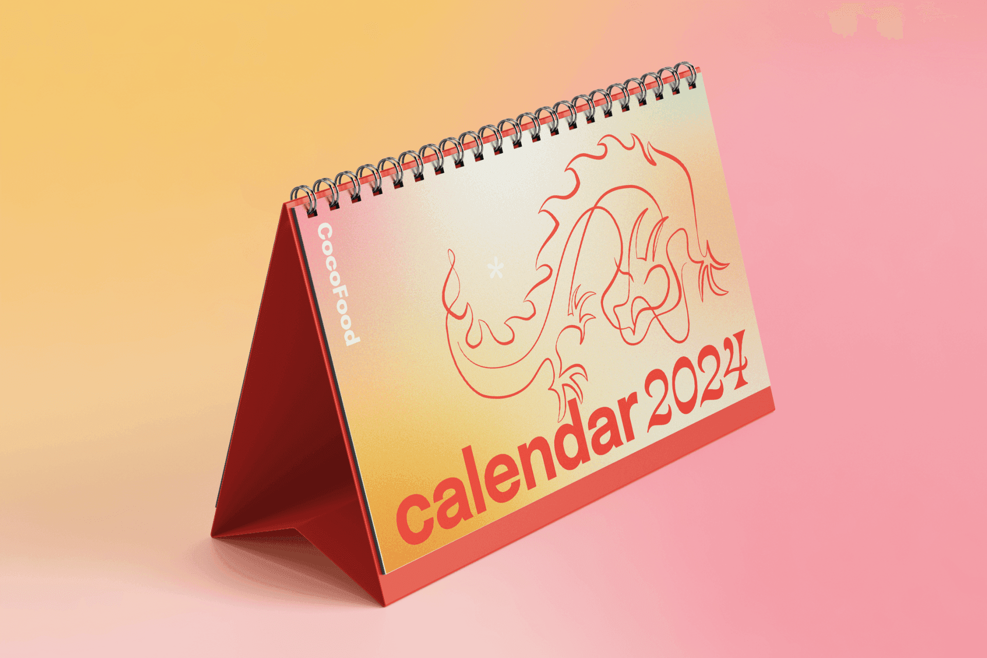
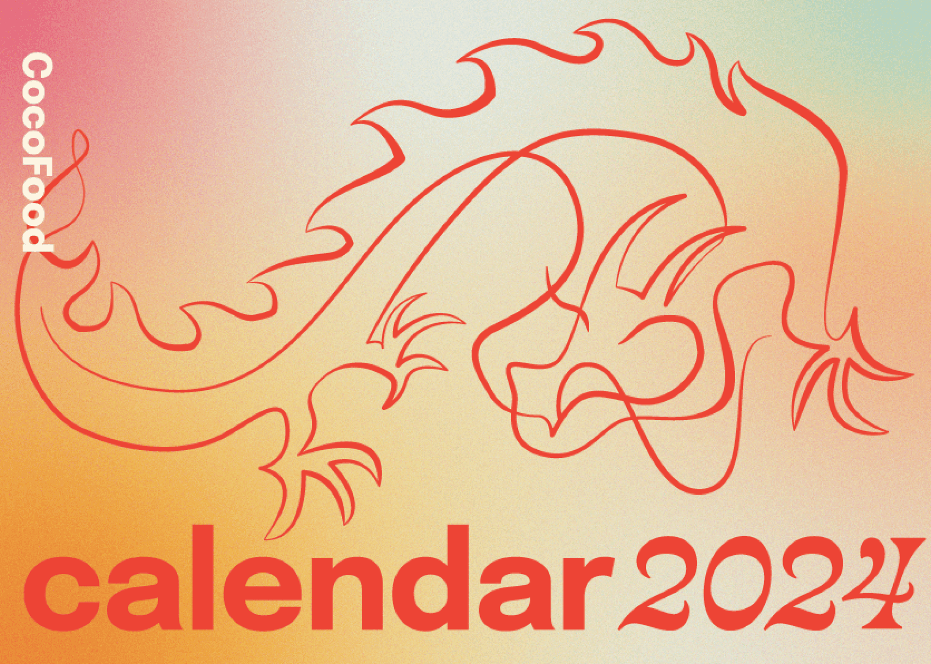
CocoFood calendar design
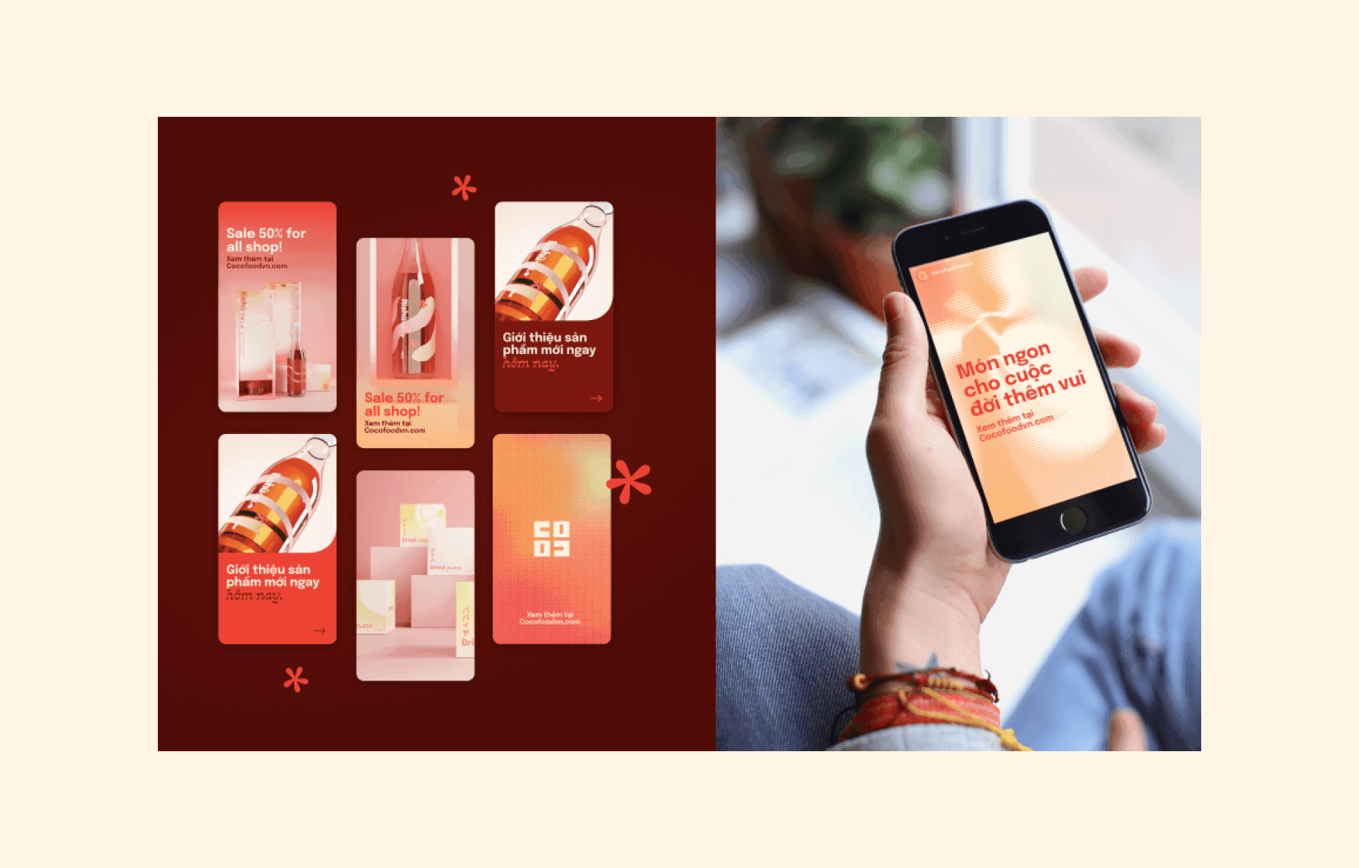
CocoFood branding on social media platforms
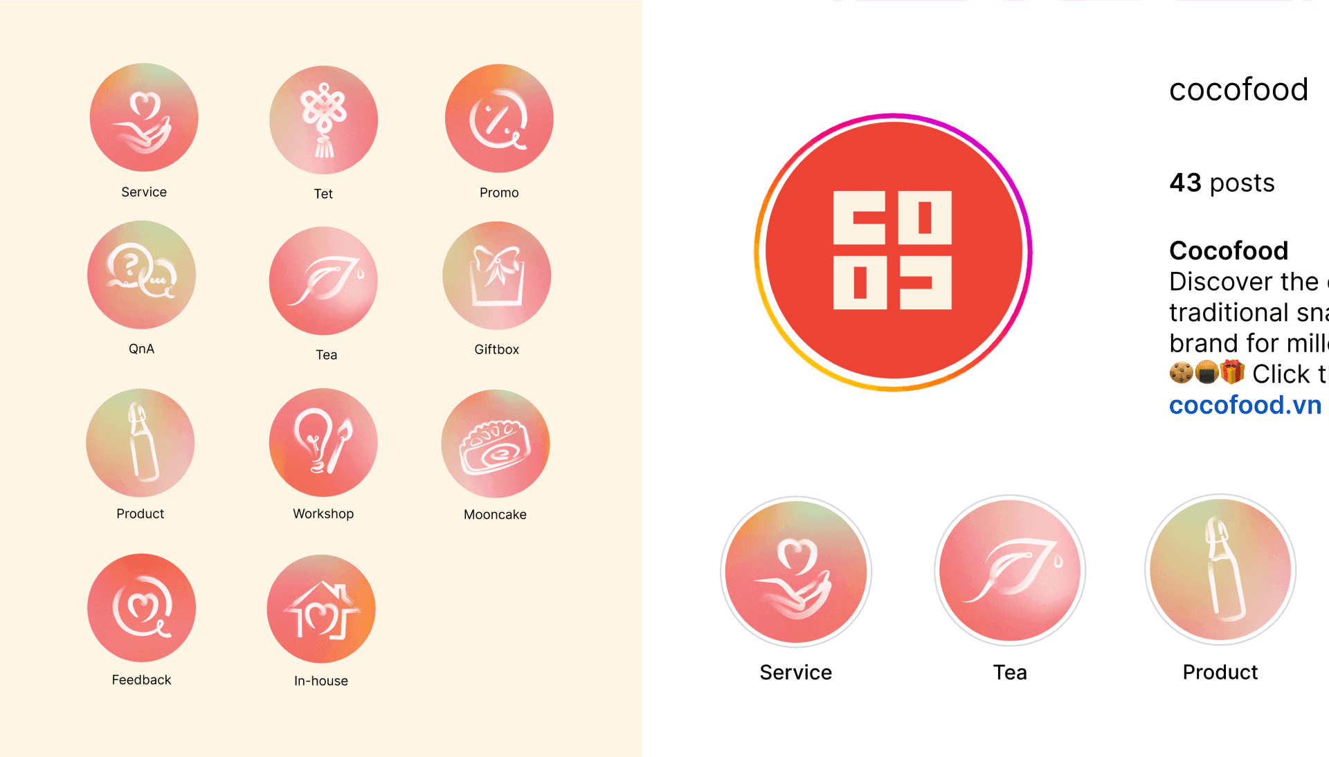
CocoFood icon system for social media
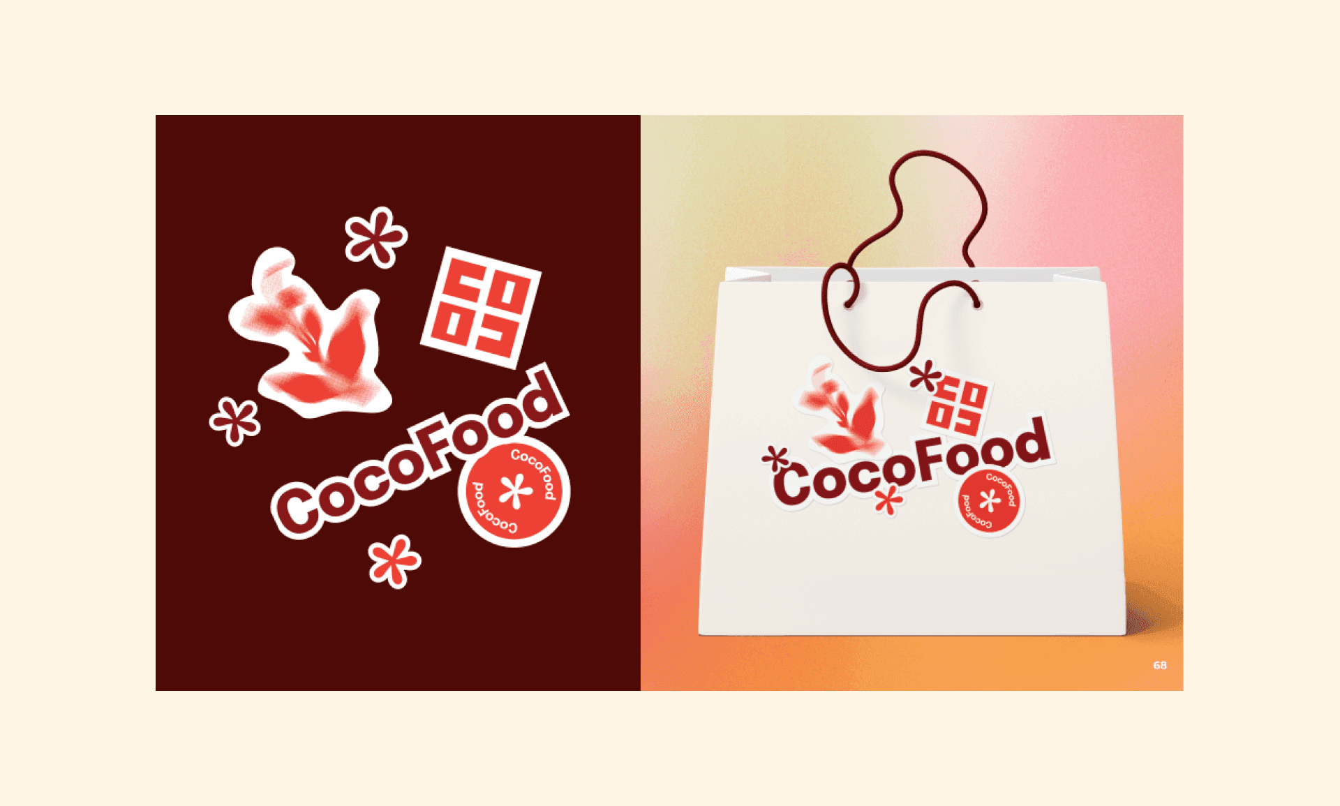
CocoFood physical branding applications

CocoFood physical branding applications