client
Auker
year
2022
Sector
Web3 / Blockchain
Scope
Overview
Looking to emphasize itself as an incubator and life-long partners for Vietnamese Web3 projects / startups, Auker was born with the mission of serving as a community-based platform for growth, networking and collaboration. As a tech-focused creative studio, Collective has partnered with Auker to establish a new branding identity and position itself as the one of the pioneers that leads the next revolution of internet in Vietnam.

Challenges
Goals
Designing Auker's brand involves turning complex Web3 concepts into clear visuals, balancing Vietnamese motifs, community focus, and Web3 links within a minimal, iconic design. We need to avoid overcomplicating the visuals or leaning too heavily on traditional imagery, while still showcasing Auker's innovative and future-oriented nature.
Our goal is to integrate traditional Vietnamese patterns and visual motifs into a design that emphasizes the importance of community, diversity, and collaboration. We aim to strengthen the connection between Vietnam's rich cultural heritage and the innovative possibilities of Web3, envisioning a future that values both tradition and technological advancement.
Creative Concepts
In the process of approaching some strategic & design directions, we created three concepts that were consistent with Auker’s core values:
A. The hatchery where ideas grow and where innovations blossom B. The sun that inspires & a beacon that lead the way for evolution C. Connecting technology and community, we push forward
Throughout our discussion, we realized that Concept A would be the most fitting start for Auker - to be presented as a hatchery where ideas grow and where innovations blossom.
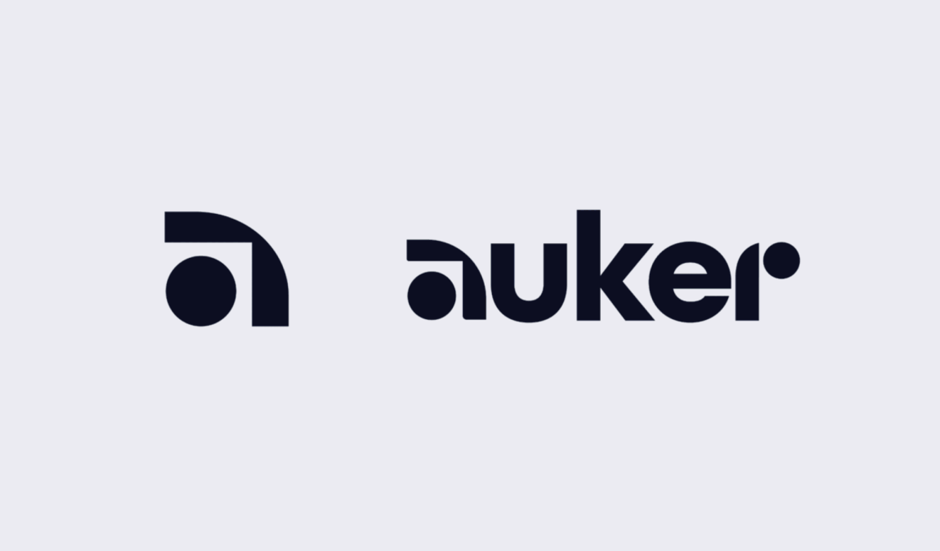
Brand Logo
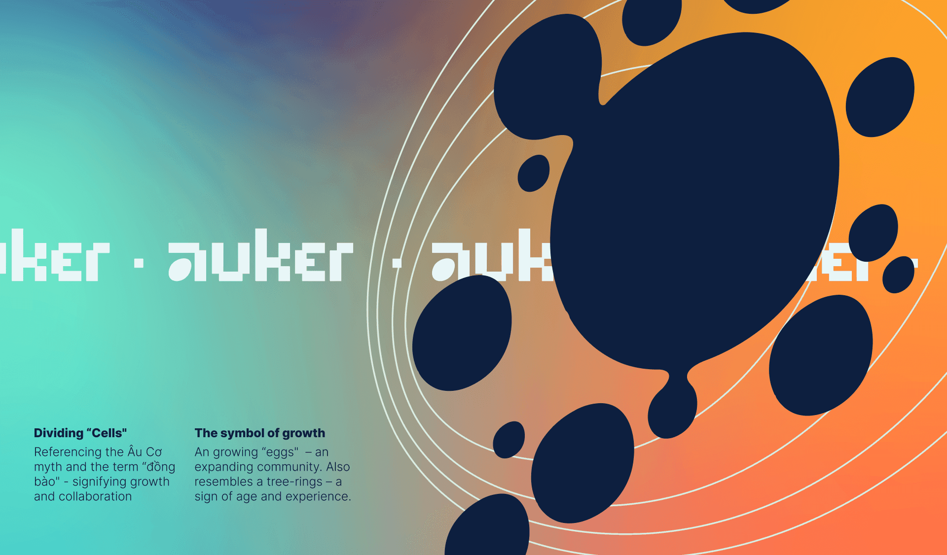
Utilizing the mythology of “Âu Cơ and the 100 eggs”, we want to emphasize Auker's role as not only as a incubator but also a partner and collaborator.
We also invoke geometric shapes and sharp angles to reinforce Auker's focus on reshaping the future of the web.
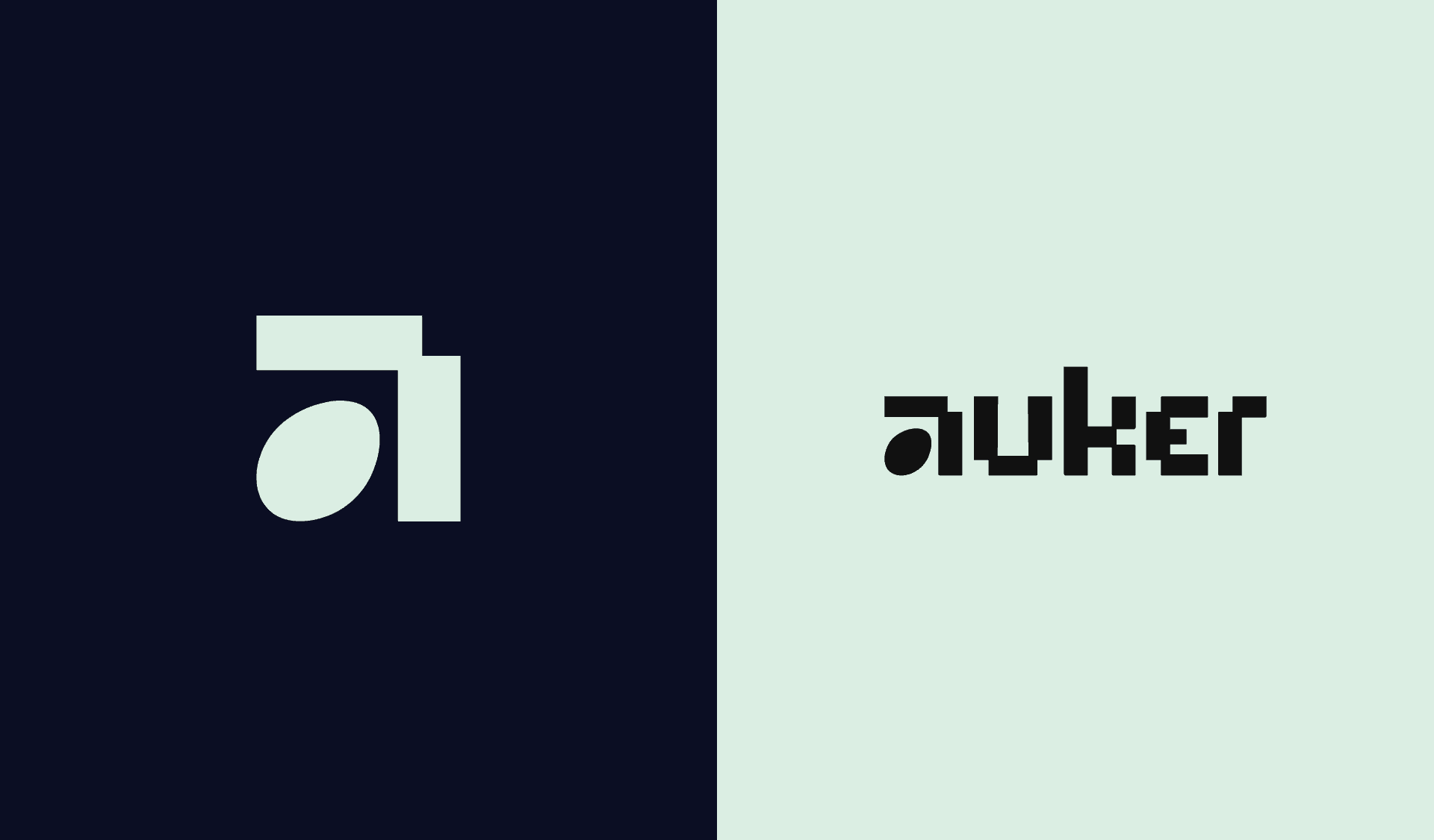
In response to feedback from its audience, Auker recently made some changes to its logo design. Auker wanted a logo that would be more visually accessible and immediately recognizable, helping to establish a stronger brand identity.
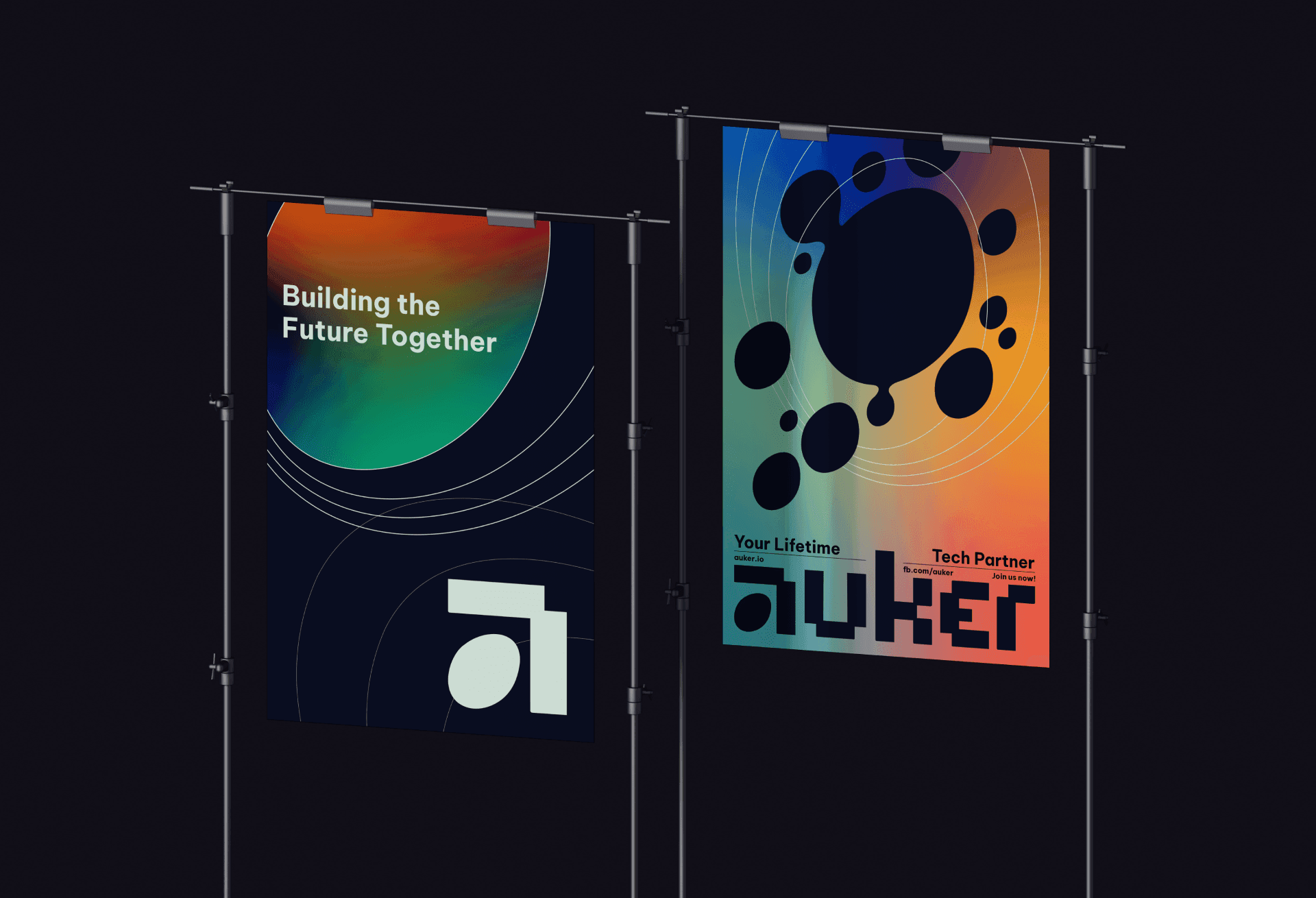
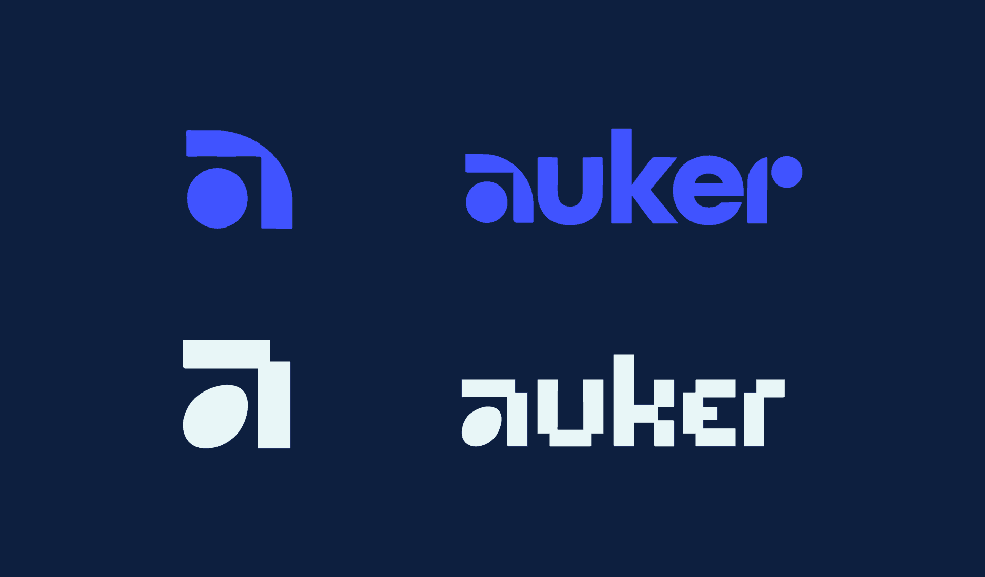
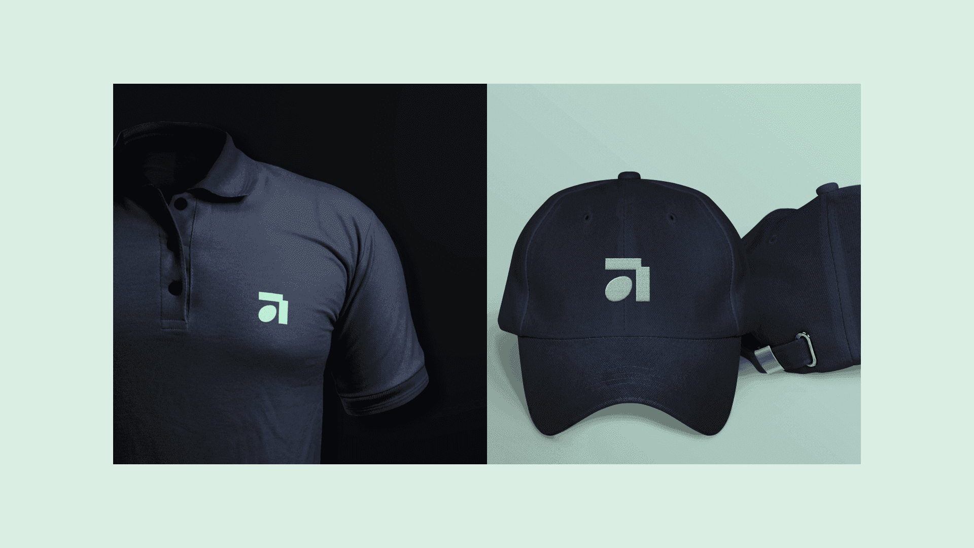
To achieve this goal, we created a new logo design that was more straightforward and intuitive. The new logo retains the core elements of Auker's original brand identity, but incorporates more recognizable symbols and shapes that convey the company's mission and values. The customized lettering is also made to create the full Auker wordmark that highlight the mark’s features.
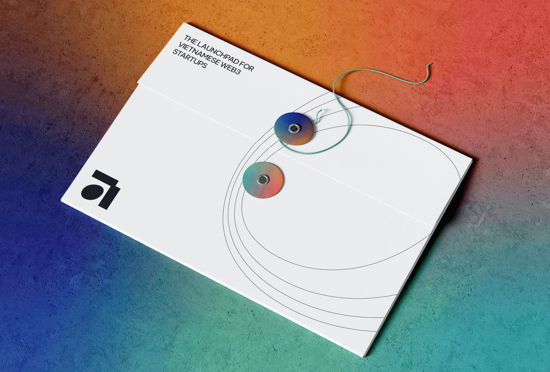
Incubator of Vietnamese Web3 startups

The Auker logo draws inspiration from three key elements - an egg, pixels, and the letter A. The egg represents birth and the beginning of life, symbolizing the potential for growth and new beginnings. The pixels represent technology and innovation, reflecting the brand's focus on being a tech-focused creative studio. Finally, the letter A is the first letter of the brand name, emphasizing the brand's identity and providing a visual anchor for the logo. Together, these elements create a logo that is clean, modern, and highly memorable.
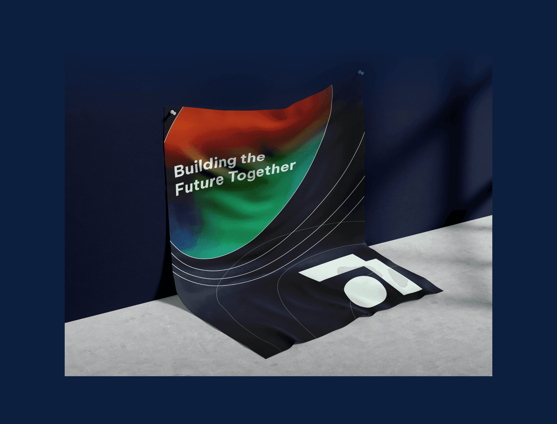
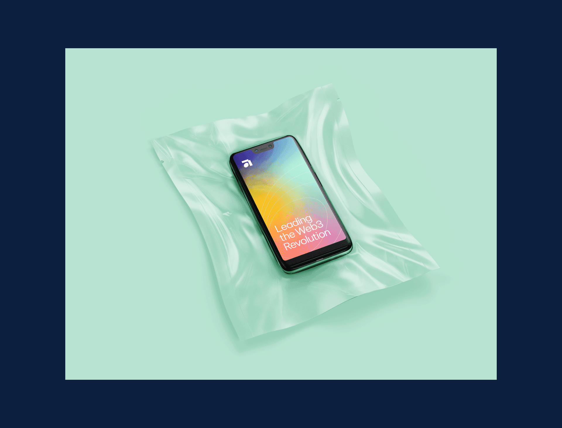
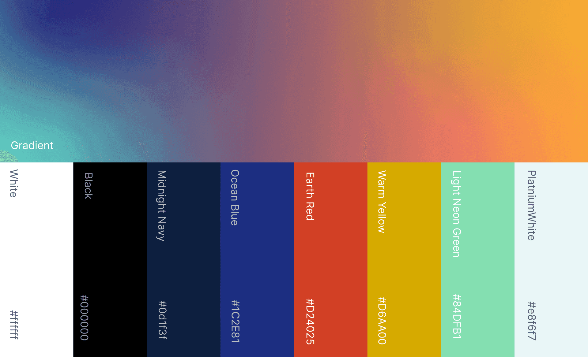
The midnight navy color provides a grounded backdrop for the vibrant accent colors. The mix of Ocean Blue, Earthy Red, Warm Yellow, and Light Neon Green within the main and alternative gradients symbolizes community dynamism, diversity, and the spirit of collaboration and innovation. Light Platinum White signifies Auker's forward-thinking nature, highlighting the bright future of Web3 technologies.
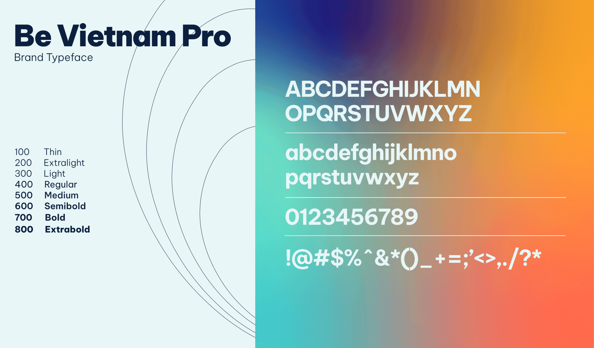
Typography System
Be Vietnam Pro's brand typeface is a modern and versatile font that reflects the brand's mission to be a leader in the Vietnamese technology industry.
The font's sleek lines and geometric shapes give it a contemporary feel, while its legibility and clarity ensure that it is highly readable in both print and digital formats. The typeface was chosen for its ability to convey professionalism, innovation, and forward-thinking, all of which are key values of the Be Vietnam Pro brand. With its clean, modern design, the Be Vietnam Pro typeface is a perfect match for the brand's commitment to serving as a platform for growth and collaboration in the Vietnamese Web3 space.

Visual Motif
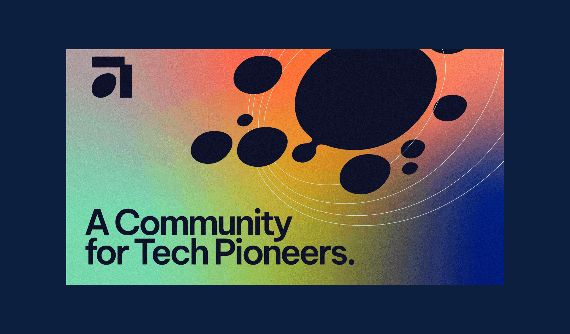
Auker's visual motifs feature a gradient reflecting an evolving, innovative community, growing "eggs" symbolizing an expanding community and experience, and dividing "cells" referencing the Âu Cơ myth and signifying growth and collaboration.