The Dreadful UX of Pop-ups
Why Should Consider Abandoning Website Pop-ups?
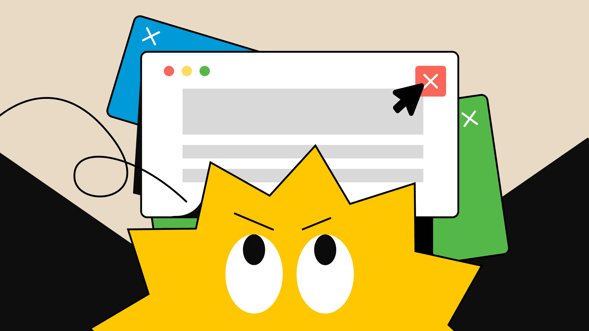
Imagine walking into a store and having an employee leap at you with an advertisement that you're not at all interested in. When you wave him off to proceed, you accidentally touch the ad – an action that gives the clueless employee the impression you're intensely interested, without further inquiries, he promptly escorts you to the product booth displayed in the ad. This is precisely what you would experience on a website with Pop-ups. They jump out and occupy the entire space (especially on mobile interfaces), forcing you to look at something you're not interested in, and making you take an extra step to close them. If you miss the tiny 'X' button on the ad, you're directed straight to a page you did not intend to visit.
With such a dreadful user experience from the onset, users will not want to revisit your website. If they are forced to return due to lack of alternatives, they might resort to solutions such as installing ad blocks. This would directly harm the advertising activities of your business and sponsors.
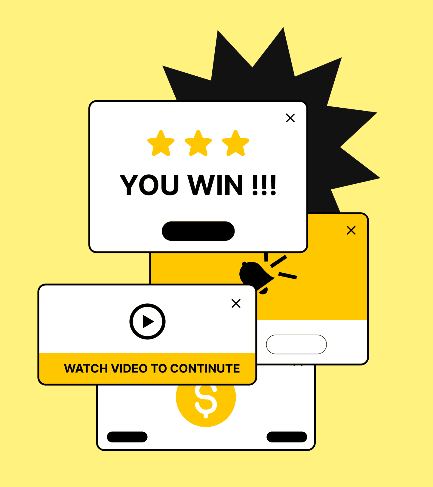

Apart from being annoying, pop-ups can affect the website's loading speed, and therefore, negatively impact SEO ranking.
Due to the immediate negative psychological reaction upon their appearance, Pop-ups can drag the reputation of the advertised product/service down along with them. Have you ever decided not to buy from a company and switched to purchasing their competitor's product just because of a terrible ad? I bet you have.
Here are some effective and user-friendly alternatives to pop-ups:
Inline Banners
Place banners within the content or at the top/bottom of the page. These are less intrusive and allow users to engage with the content naturally. They can still be effective for capturing attention without disrupting the user experience.
Embedded Forms
Place signup forms or offers directly within the content or on the sidebar. This approach integrates the call-to-action naturally within the site’s layout, making it part of the user journey rather than an interruption.
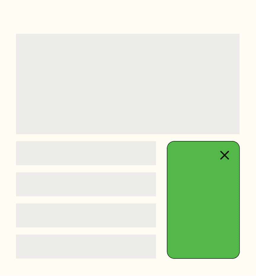
Interactive Chatbots
Implement chatbots that can engage users in conversation, offering assistance, answering questions, or providing offers in a more personalized and less disruptive manner.
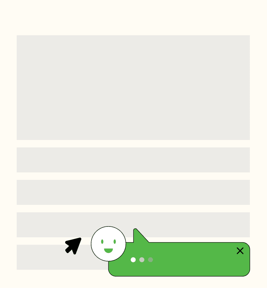
Slide-in Callouts
Use slide-in messages that appear at the bottom corner of the screen. These can provide important information or offers without blocking the main content, allowing users to interact with them at their convenience.
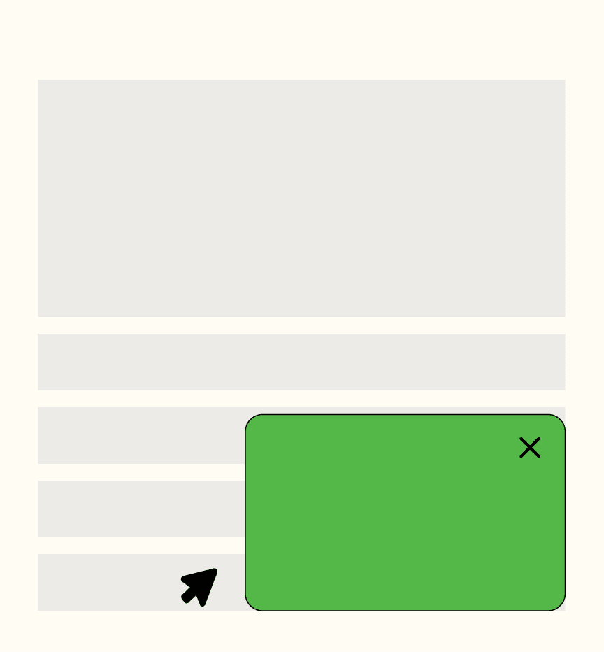
Contextual Call-to-Actions (CTAs)
Present CTAs based on user behavior and content interaction. For example, after a user scrolls a certain percentage of a page or after they've spent a specific amount of time reading, a CTA can appear relevant to the content they are engaging with.
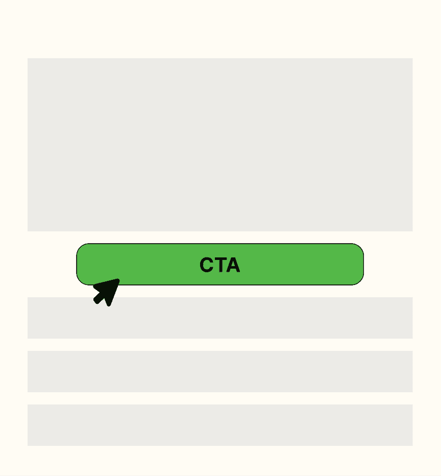
Timed Offers
Display offers or messages after the user has spent a certain amount of time on the page. This respects the user's initial intent to explore the content before presenting them with additional options.
